Akatre.
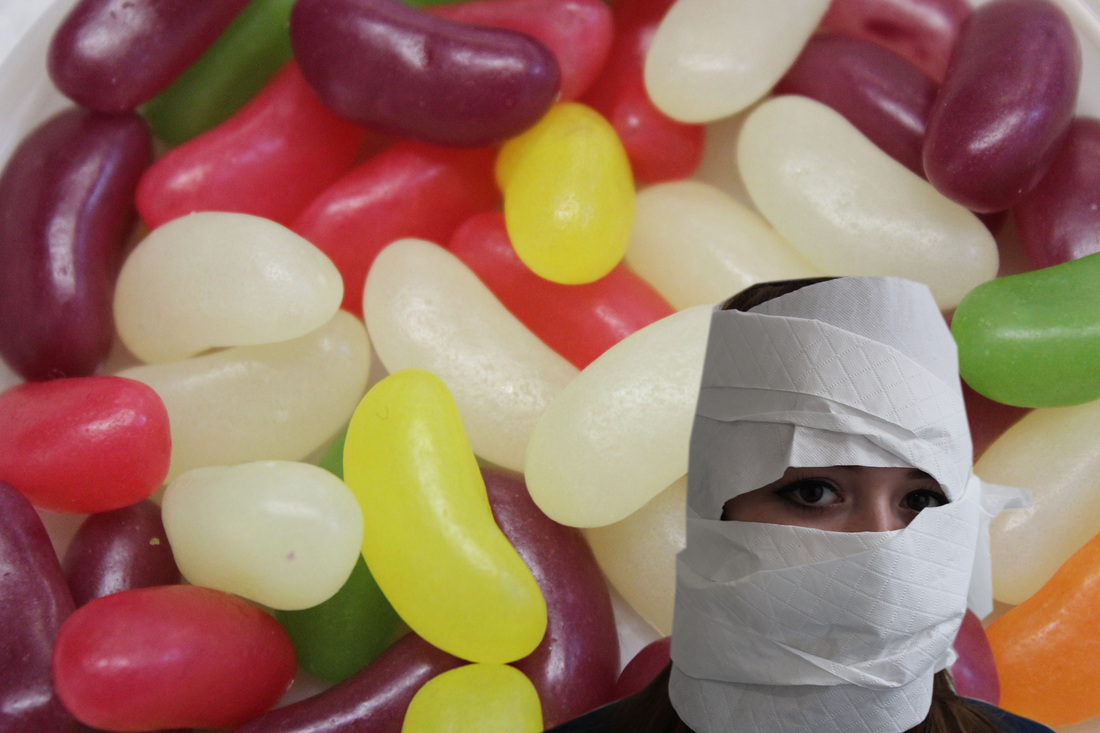
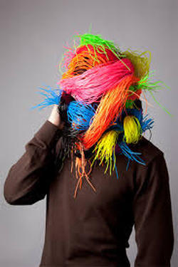
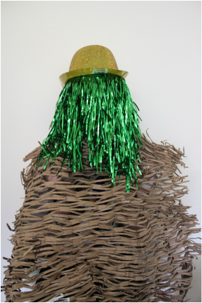
I really like Akatres photography because they have quite obviously been to great lengths to create these images by making sure that none of the models identity is given away. Their work is very eye-catching and makes you want to look deeper into the image to find out more about the person behind the disguise. Most of Akatres' images use grey or dull backgrounds so that the bright colour or the focus point of the image is actually the focus. He also uses quite soft lighting so that the colours aren't washed out with the light.
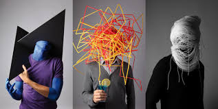
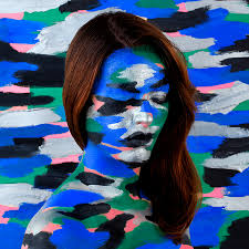
I really like this photo constructed by Akatre because the person behind the bright and colourful hat is on the phone. This could mean that he/she is a business man/woman who has a very busy life. The dark clothes represent a dull personality and the head piece uses lots of colour representing the person wanting to be more exciting. Akatre has used a soft light with a grey background for this image, a bright studio light isn't needed for this image because the bright colours across the face stands out enough so a harsh light isn't needed. This image really uses the formal element of texture, across the persons face looks like you could touch the material, you can almost imagine what the material feels like.
My response to akatre.
|
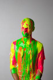
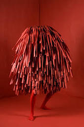
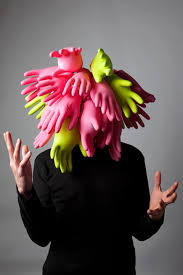
In these photos below I tried to recreate Akatres work. I tried many different ways however these photos were the only ones that turned out well. In Akatres work a plain background is needed with most of the face has to be covered so that you can tell nothing about the person.
|
Below this is my favourite picture I took because the person under the props is completely covered. The identity of the person is completely hidden. You can't tell the persons gender, race or any details about the person.
|
backgrounds.
To develop the Akatre project I have taken these photos to use for backgrounds for when I photo shop another photo on top of the photos which will then refine the photos.
my response to recreating akatre.
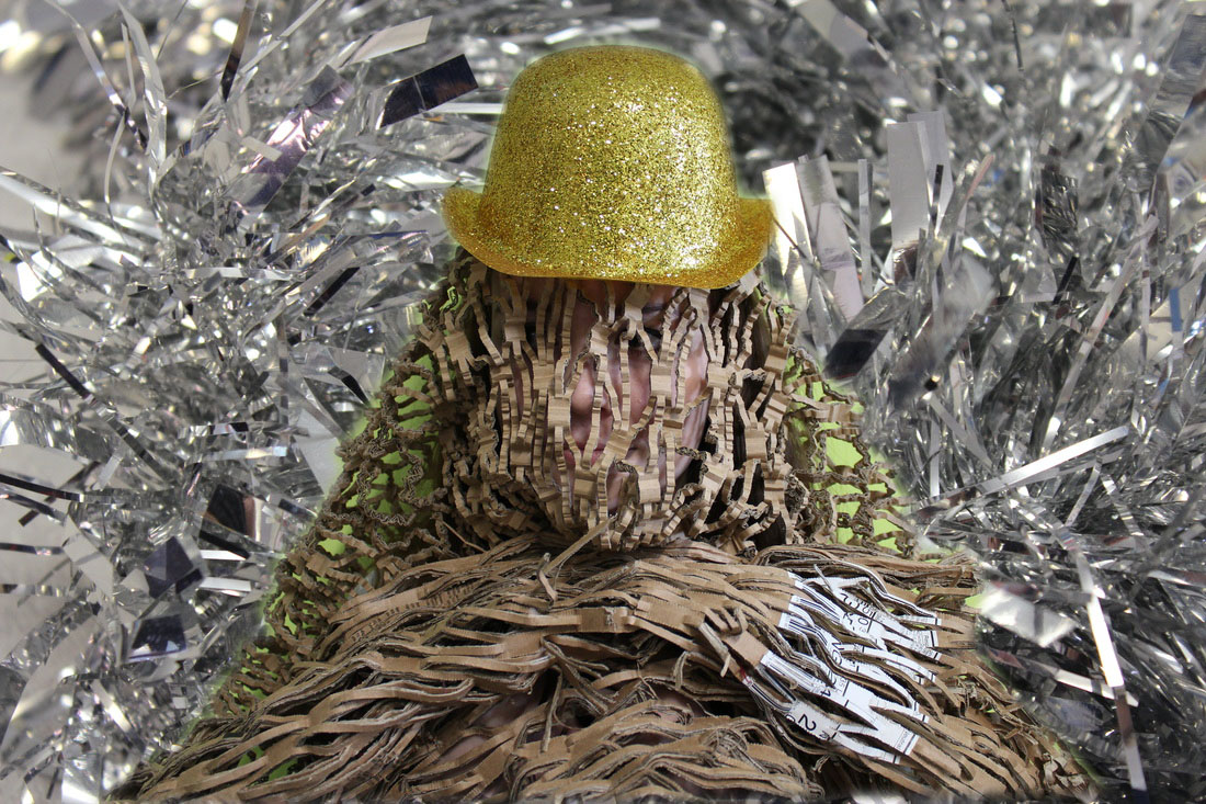
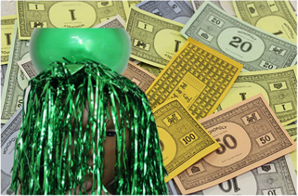
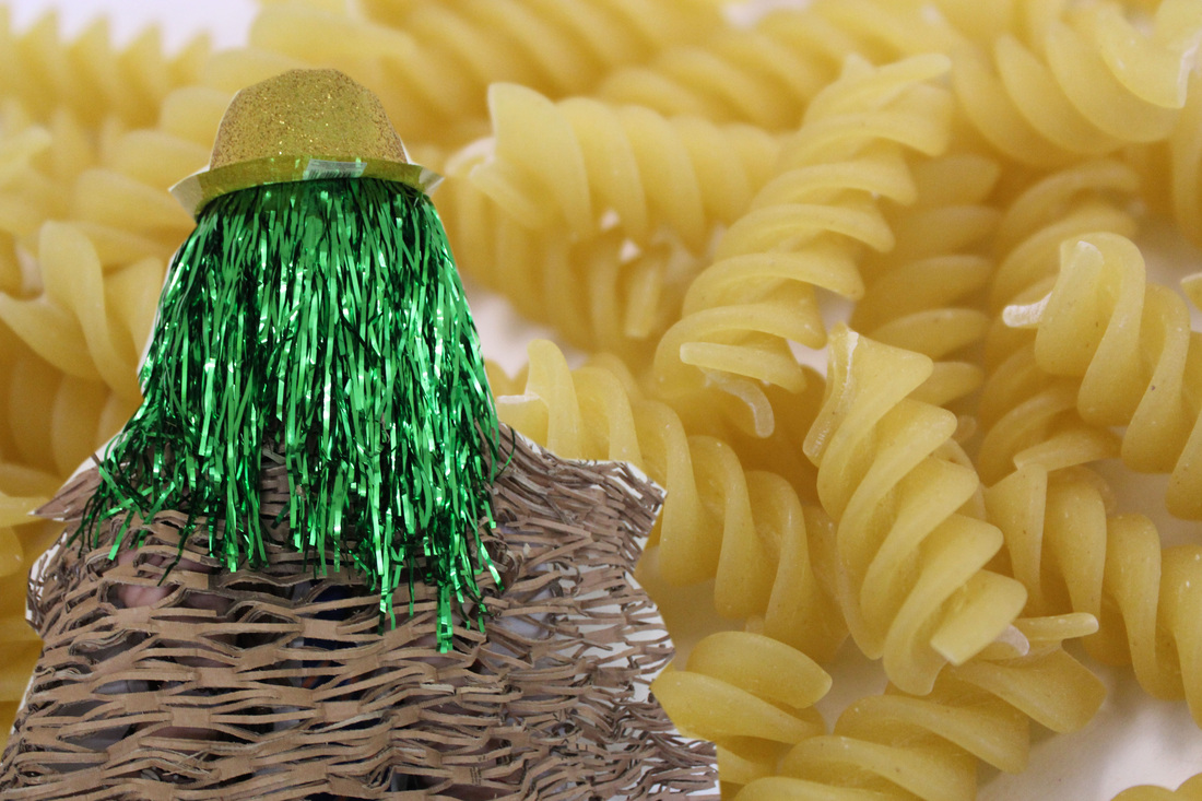
I attempted to recreate Akatre photos by taking the photos on top, then took the background and edited them on photo-shop. I used the pen tool to cut around the image of the person. I then right clicked and selected 'make selection.' Change the pixels to 5. Then I clicked edit copy, then go onto the background page then click edit paste.
I like the top two but the bottom left isn't as good because the person in the picture looks stretched and it doesn't look very good.
I like the top two but the bottom left isn't as good because the person in the picture looks stretched and it doesn't look very good.