Nina chakrabarti.
|
|
Nina's work is a normal photograph with pattern embellished into the face. Nina focuses on line, she used thin and bold lines around the contours of the face. The artist has used a variety of formal elements to design the outcomes on each face. There are a selection of lines such as curved and wavy to create texture.
Nina covers up identity by filling in the models eyes. This makes you wonder do they have big, small eyes, light or dark eyes which hides the identity. Nina covers most of the face in dark, bold shapes because it gives ideas about the models identity, is she happy? Sad? Angry? |
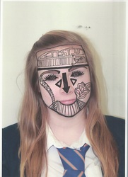
(Top left.) I attempted to do my own version of Nina Chakrabarti's work three times, the first time is an image of myself which I drew on. On my first attempt I didn't understand the concept of Ninas work, I hadn't heard of her either so I didn't do it as well as I could have. I don't like this attempt at Nina's attempt at Nina's work because I didn't follow the contours of my face or show any of my identity. I just drew meaningless patterns to fill gaps.
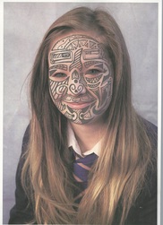
(Top right.) On my second attempt of Nina Chakrabarti's work I took a head and shoulder photo of my friend, its close up so I can see the contours of her face. I think that this attempt is a lot better than the first because I filled in her eyes to hide her identity, I then drew bold patterns to represent her bold and bright personality. I drew curly and rounded shapes on her face to represent the random and funny parts of her personality. To improve this attempt I would neaten up parts of the drawings to make the sharper edges and make it look more professional.
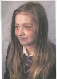
(Bottom left.) On my third attempt of Nina Chakrabarti's work I took a photo of my friend where she is facing to the left slightly. I used colour. I used bright colours along all across her face representing her bright and excitable personality. I drew circles around her forehead and to the right of her face to show the shaping of her face. I drew rounded shapes under her eyes and on her mouth to show the contours of her face. I didn't fill in her forehead or her nose because it doesn't show off any of her personality or identity. to improve I would use even brighter colours to show off her personality even more.
(Top right.) On my second attempt of Nina Chakrabarti's work I took a head and shoulder photo of my friend, its close up so I can see the contours of her face. I think that this attempt is a lot better than the first because I filled in her eyes to hide her identity, I then drew bold patterns to represent her bold and bright personality. I drew curly and rounded shapes on her face to represent the random and funny parts of her personality. To improve this attempt I would neaten up parts of the drawings to make the sharper edges and make it look more professional.
(Bottom left.) On my third attempt of Nina Chakrabarti's work I took a photo of my friend where she is facing to the left slightly. I used colour. I used bright colours along all across her face representing her bright and excitable personality. I drew circles around her forehead and to the right of her face to show the shaping of her face. I drew rounded shapes under her eyes and on her mouth to show the contours of her face. I didn't fill in her forehead or her nose because it doesn't show off any of her personality or identity. to improve I would use even brighter colours to show off her personality even more.
