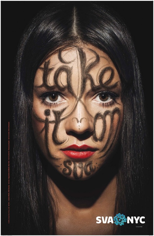
DESIGN DEVELOPMENT.
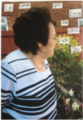
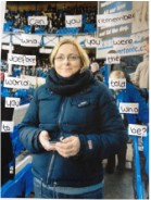
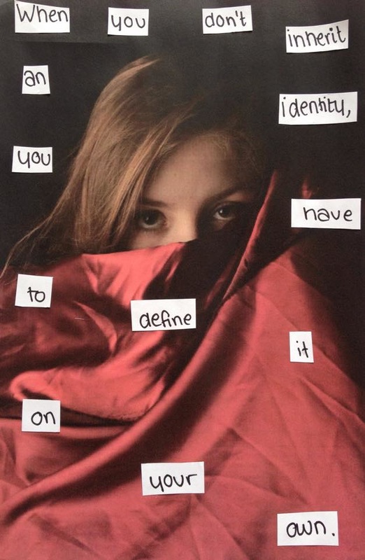
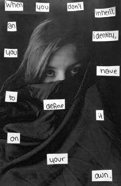
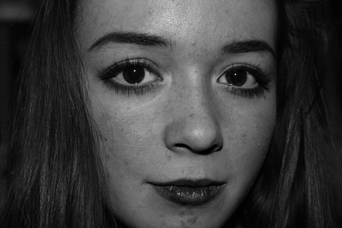
Stefan sagmeister.
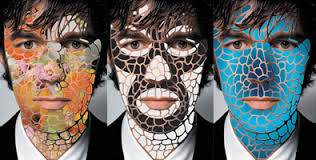
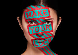
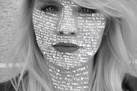
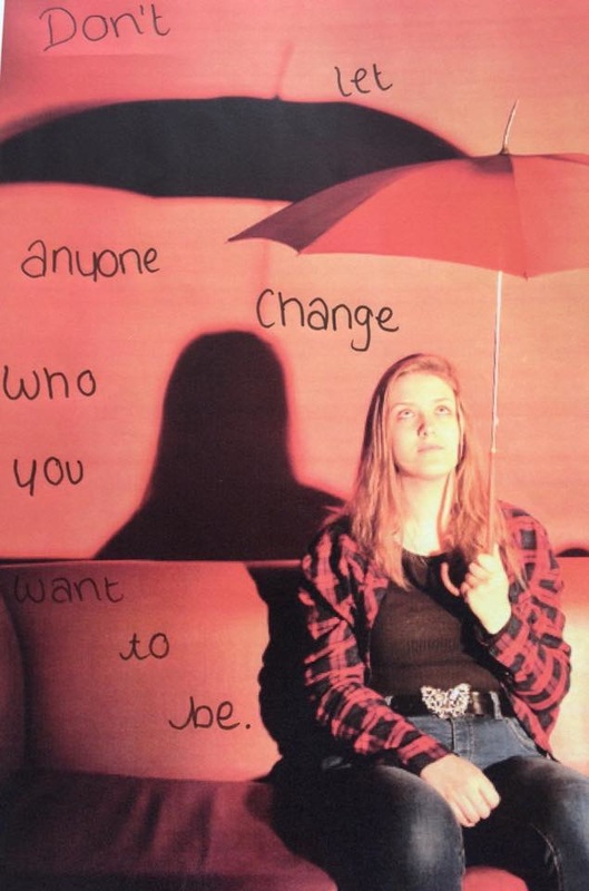
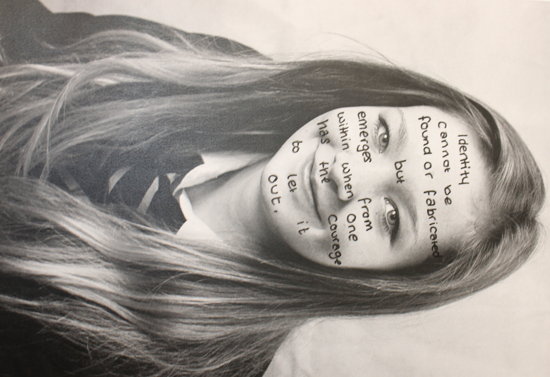
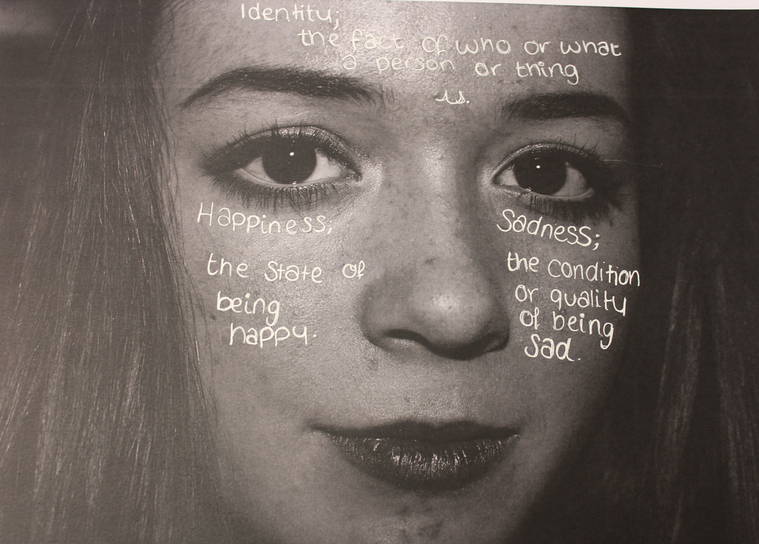
Stefan Sagmeister is my inspiration for this project, I think I can re-create images like these but in my own way.
finalising ideas.
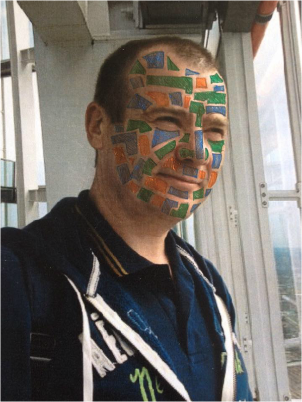
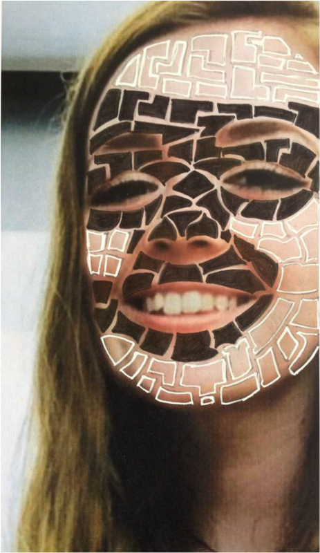
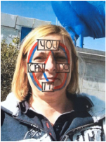
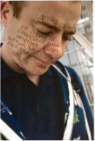
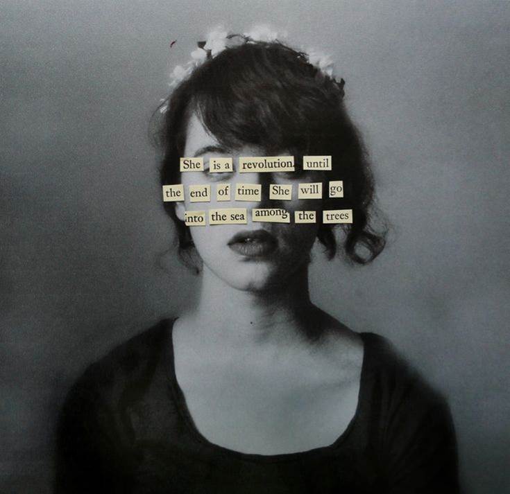
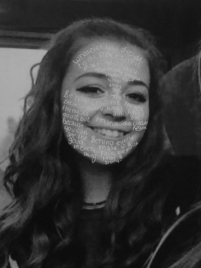
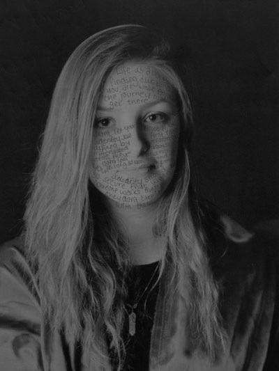
I created these images a few weeks ago, I took the photos, printed them, did the pattern or quote on the face and then uploaded them. For my next photoshoot on this topic I will take higher quality photos and find better quotes. I will also use more adventurous patterns and colours on the faces.
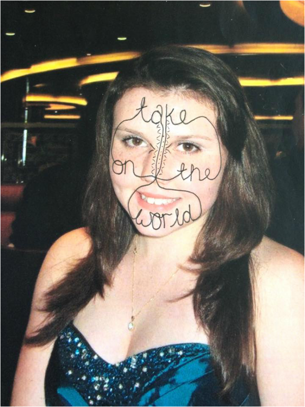
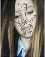
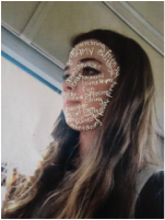
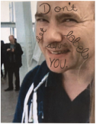
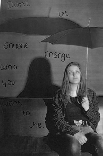
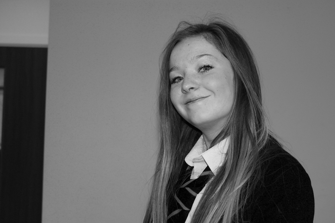
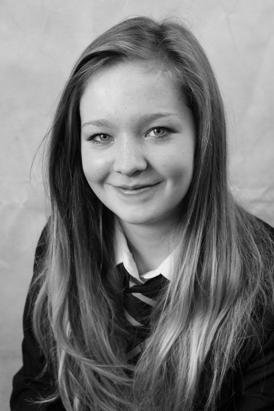
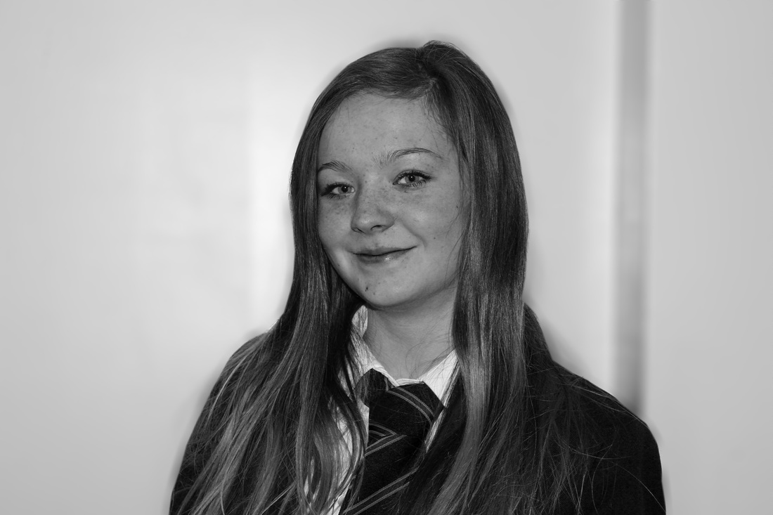
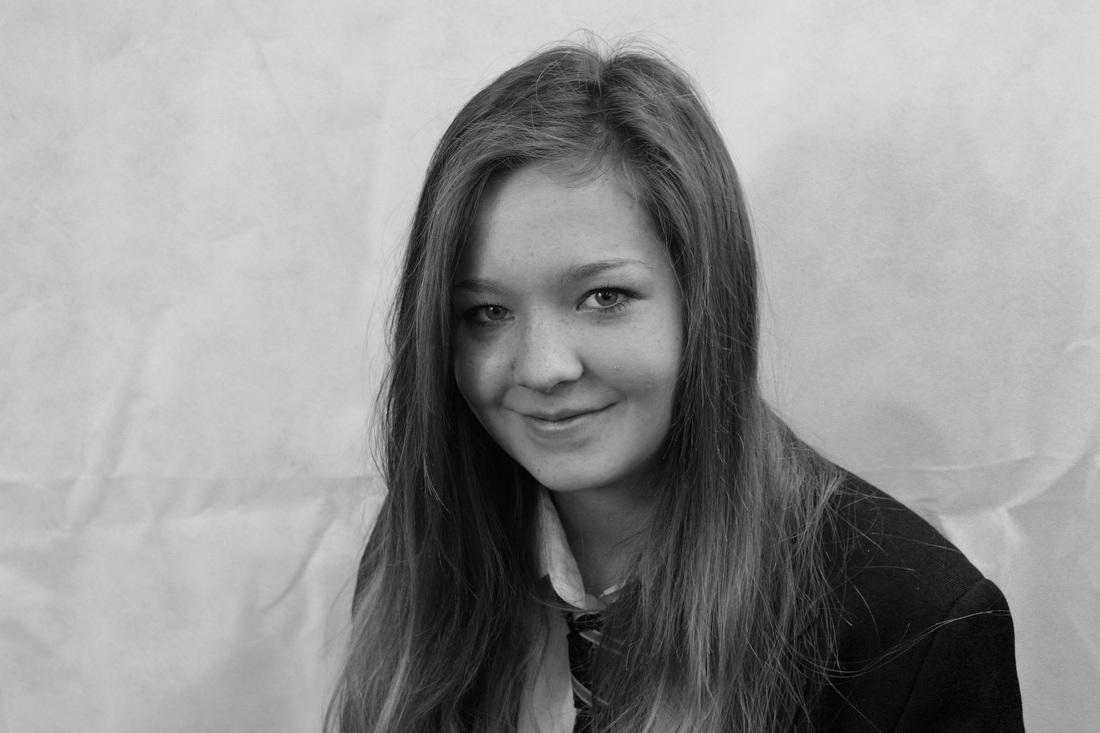
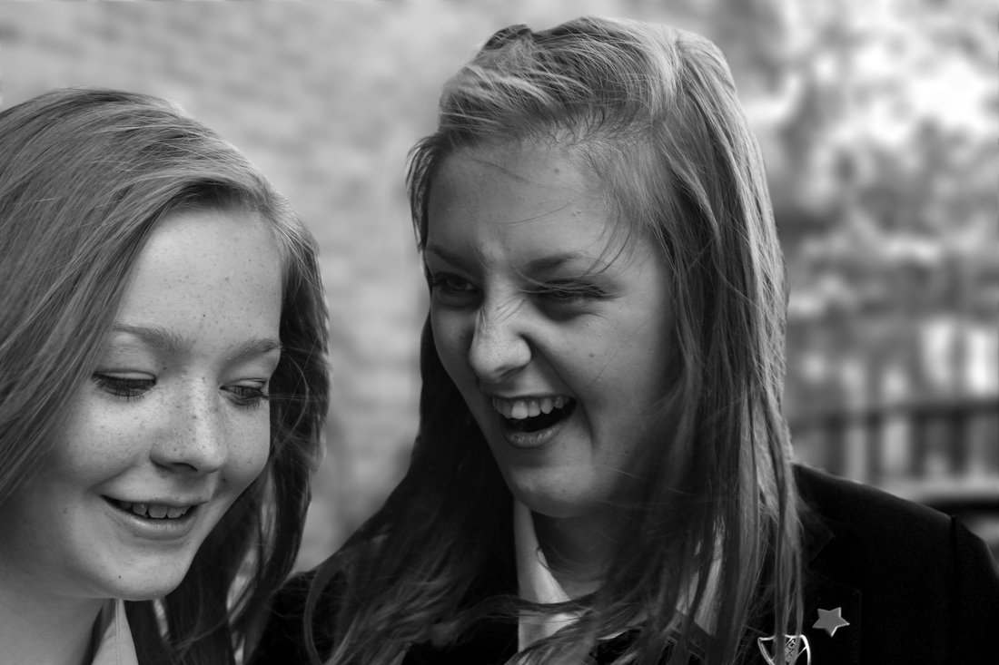
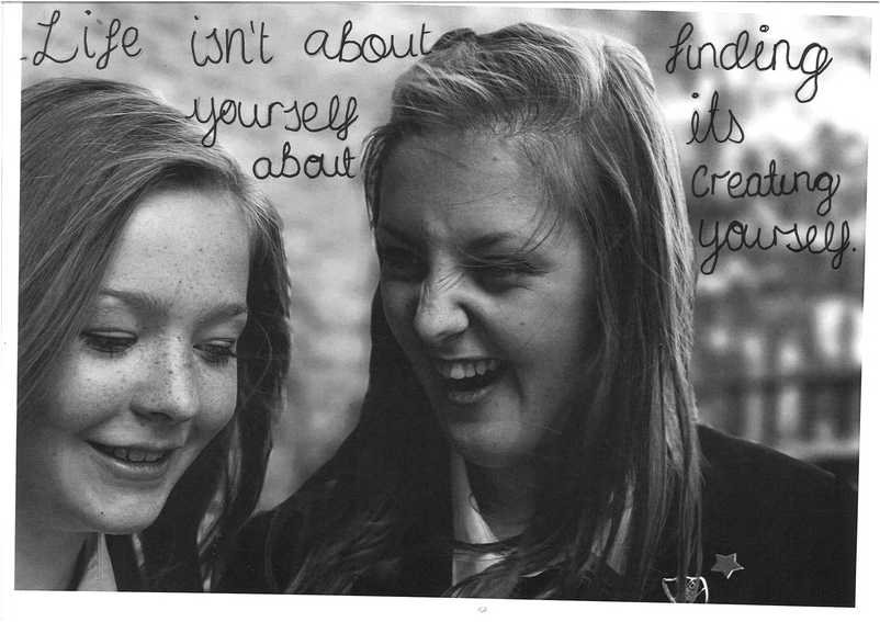
Second photoshoot.
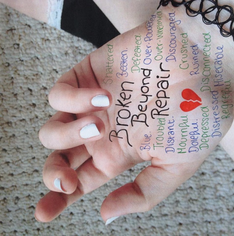
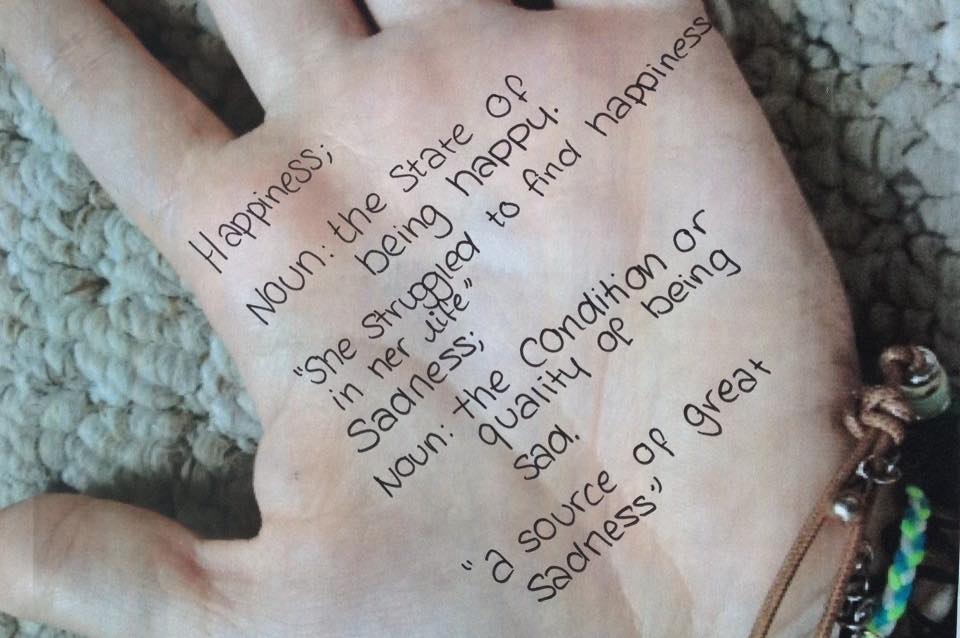
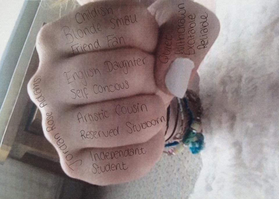
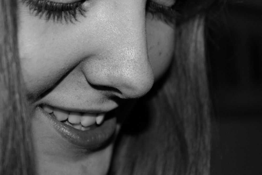
This is my second photoshoot for this project. I took photos of faces, arms and hands, I then found quotes and words that fit with the persons identity and personality. I am going to edit these pictures into black and white too see if they look better because certain pictures will look better edited.
edited images.

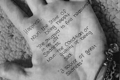

Above are the photos that I edited, I put the black and white effect on it then changed the hue and saturation on it. A few of the hand photos look good in black and white but the photos of people look better in colour I think.
more edits.

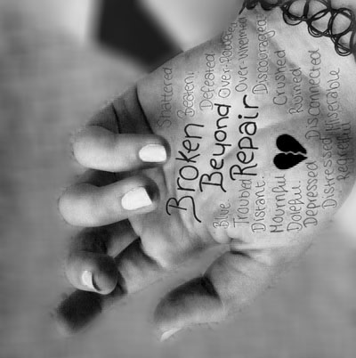
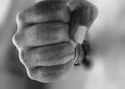
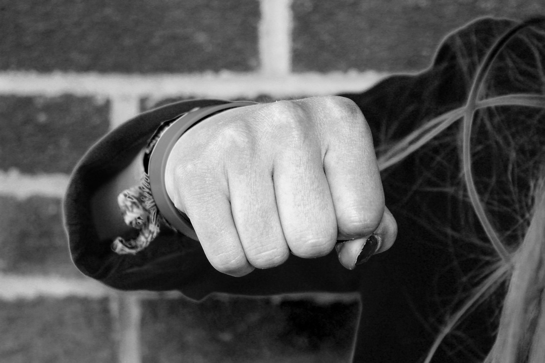
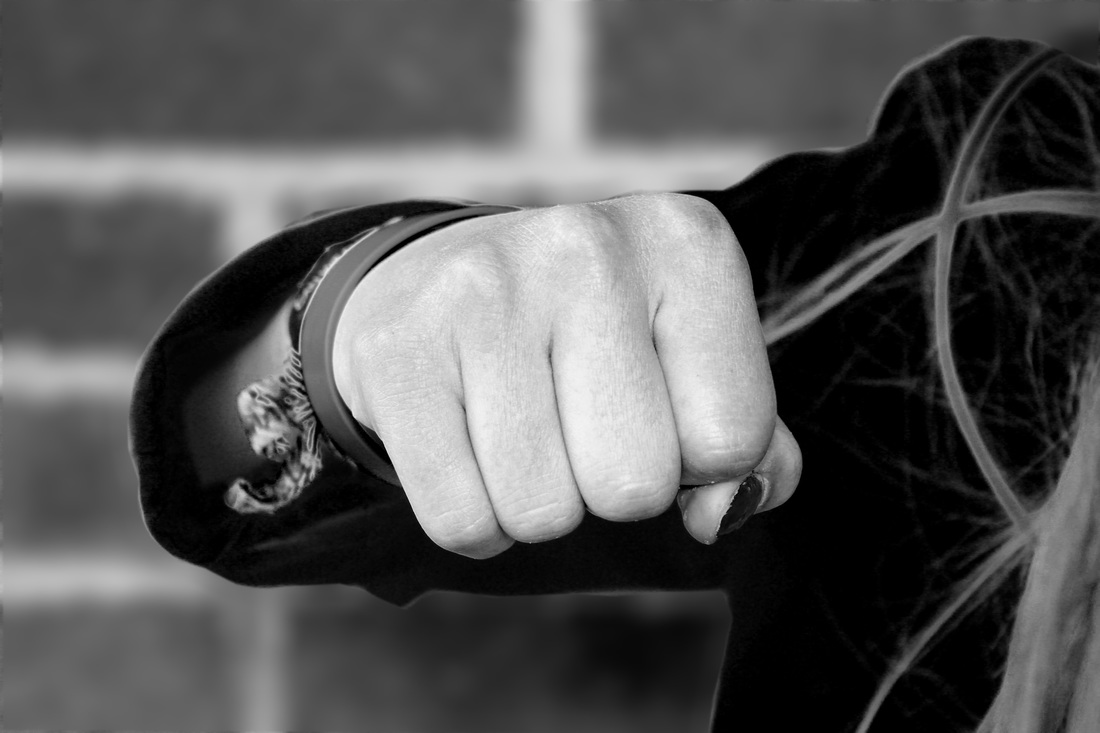
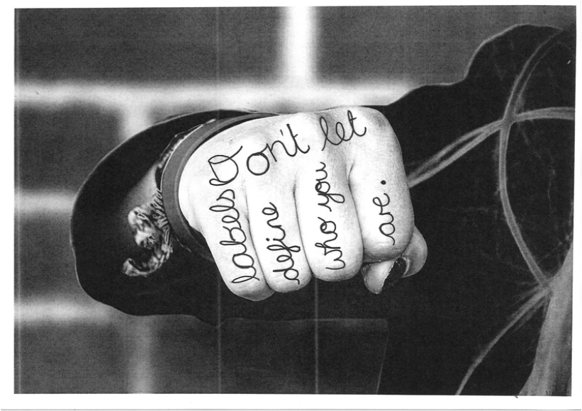
In these photos I have blurred the back ground using three different types of blur in photoshop. I think that the last one is my favourite because its not too blurred but enough that the hand is the main focus. The first one is not blurred enough so you can still see the busy background. The second one is too blurred and looks slightly messy.
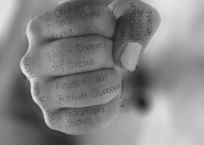
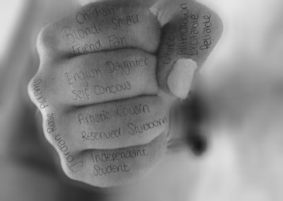

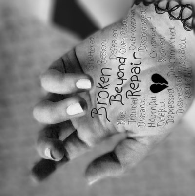
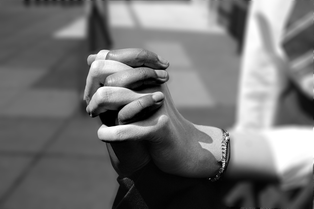
I have blurred the busy background of this photo which makes it look slightly better. I think that the last picture is the best again. However now I have blurred the back ground the writing is much more difficult to see. I have edited the image again to make the brightness and contrast on the image higher so the writing is clearer.
ways to display images.
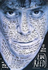
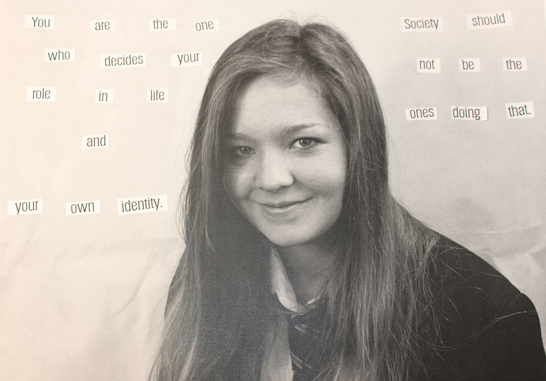
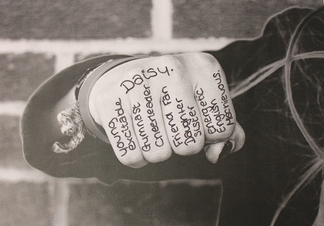
I have chosen images a few images to see how they looked when I display them, I firstly chose portrait images in the style of Rankin and I chose hand images in the style of Stefan Segmiester. I am going to write on the images with quotes to do with identity to link them to both the photographer and the theme of identity.
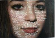
After more editing.
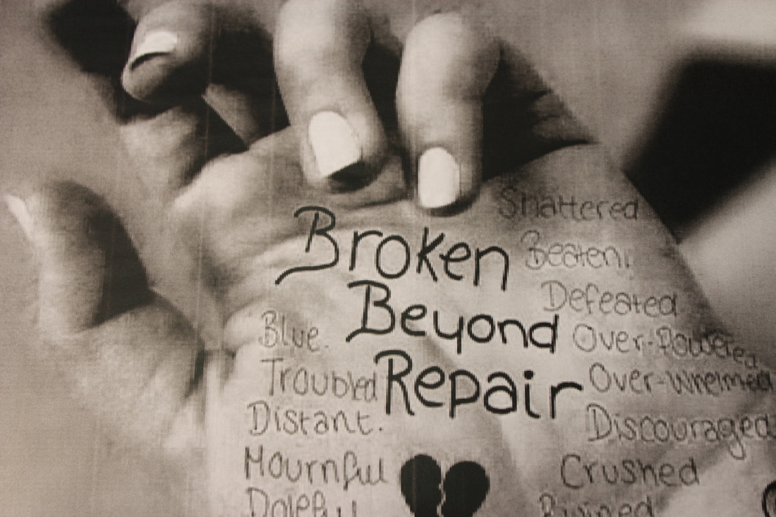
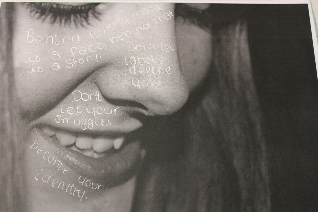
I have now edited these photos with quotes that represent the persons identity. Next I am going to cut the images so they either have a shattered effect or a slanted effect.
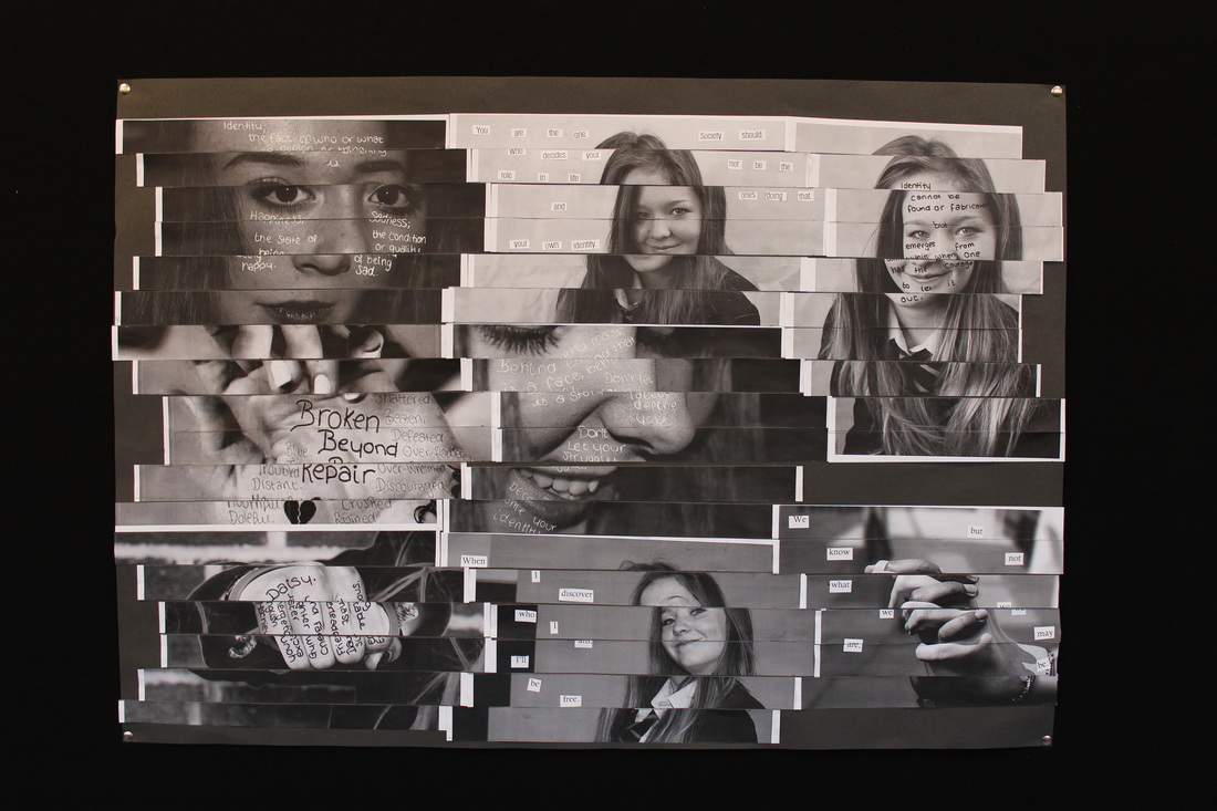
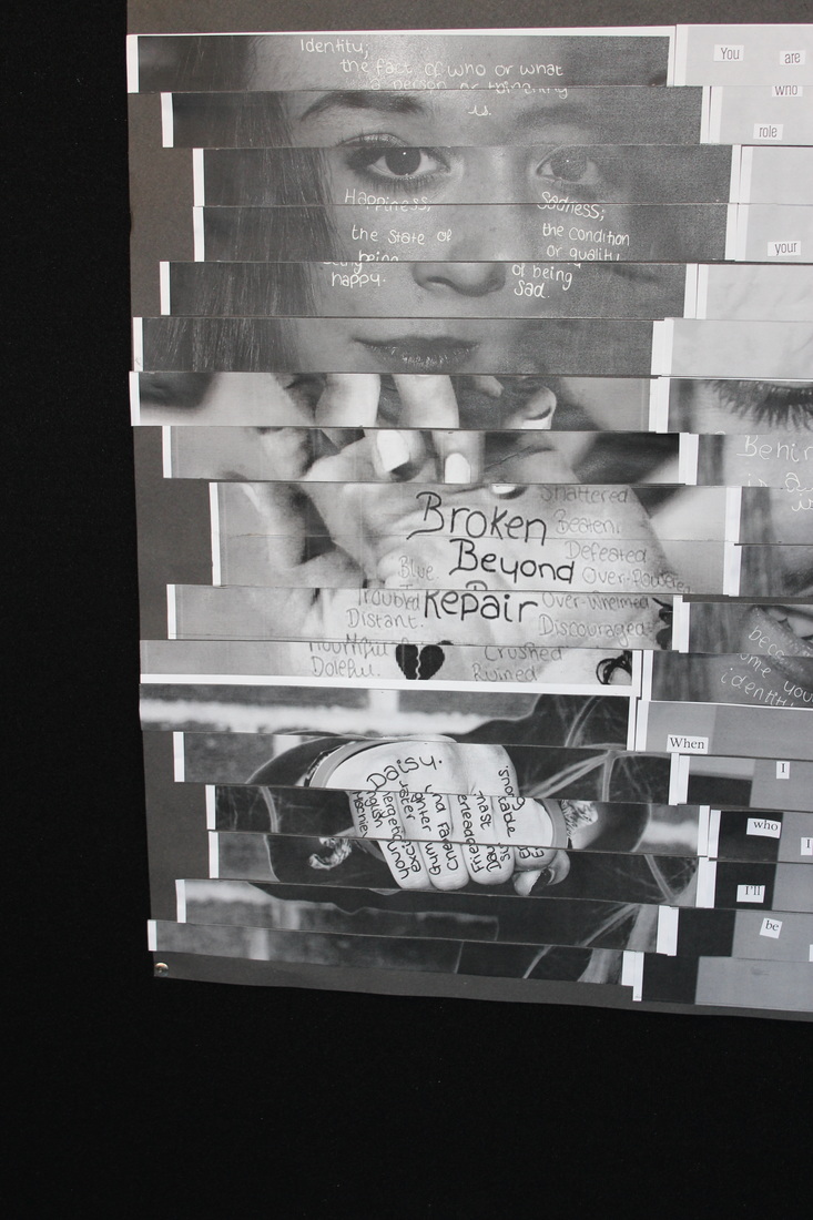
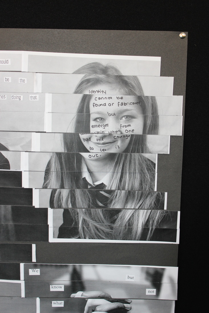
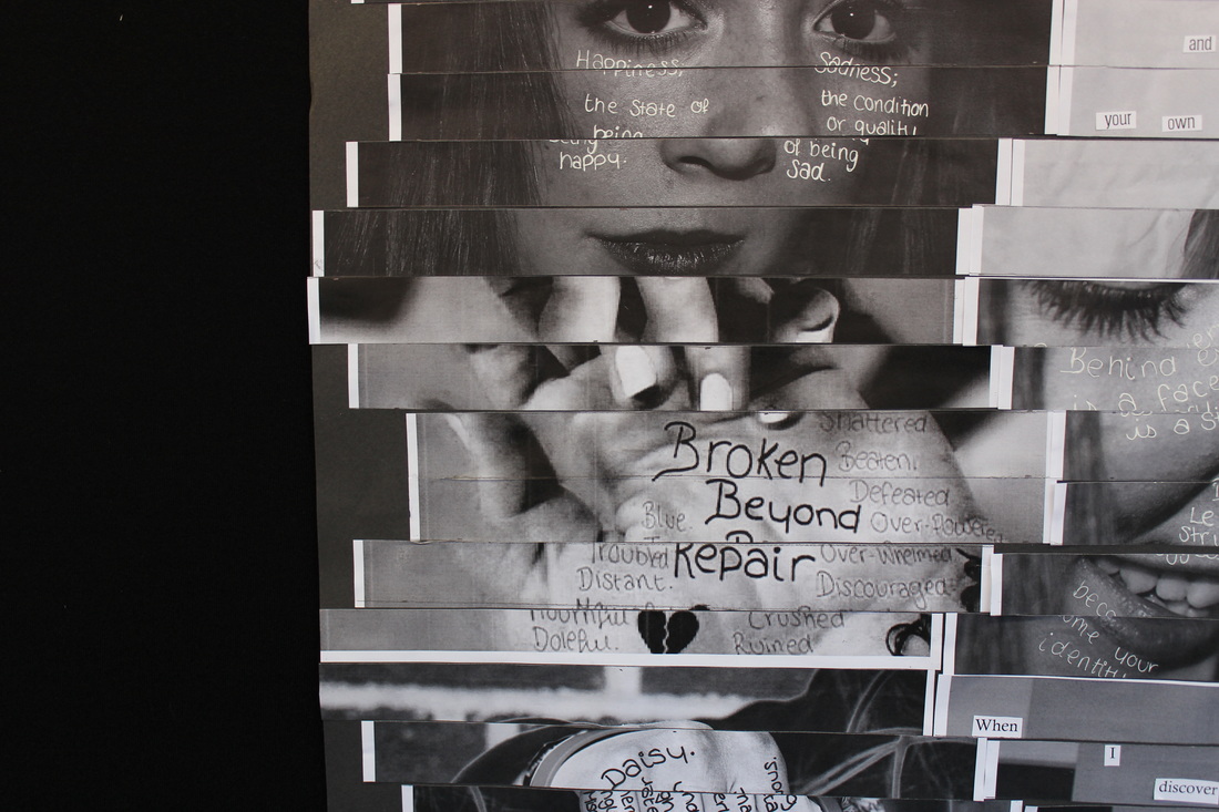
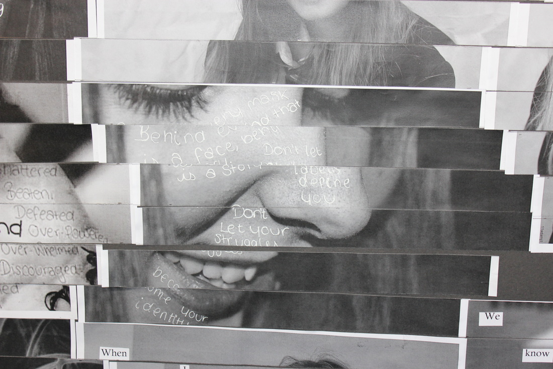
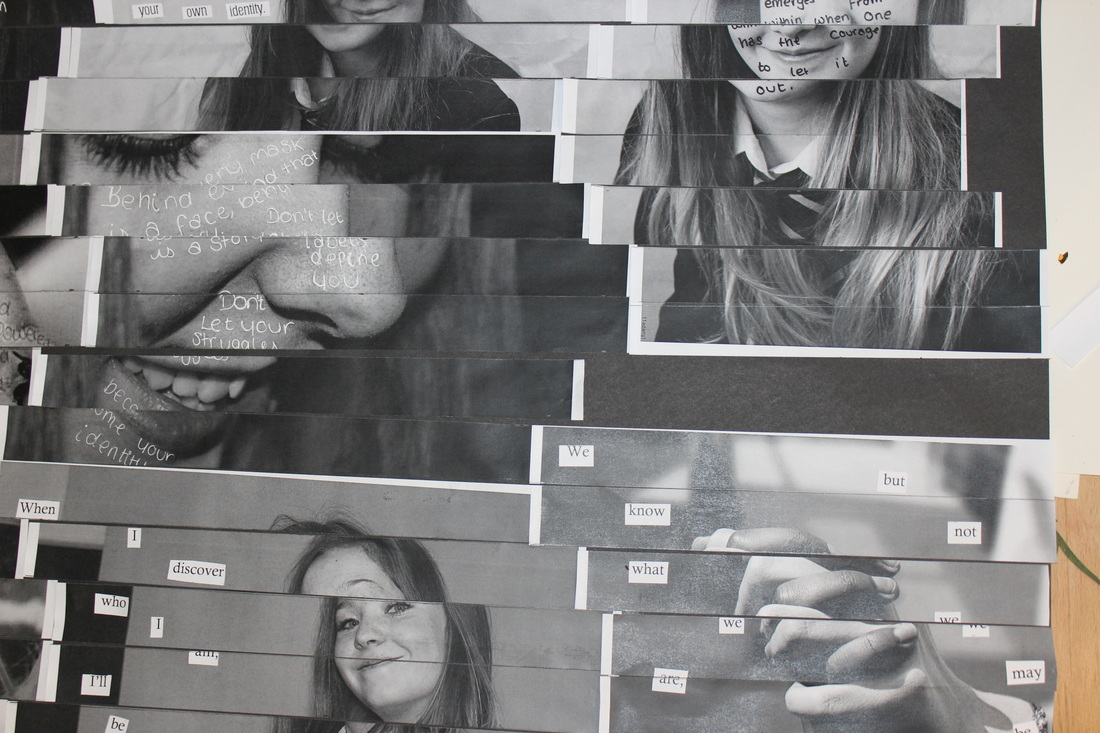
ways to display images.
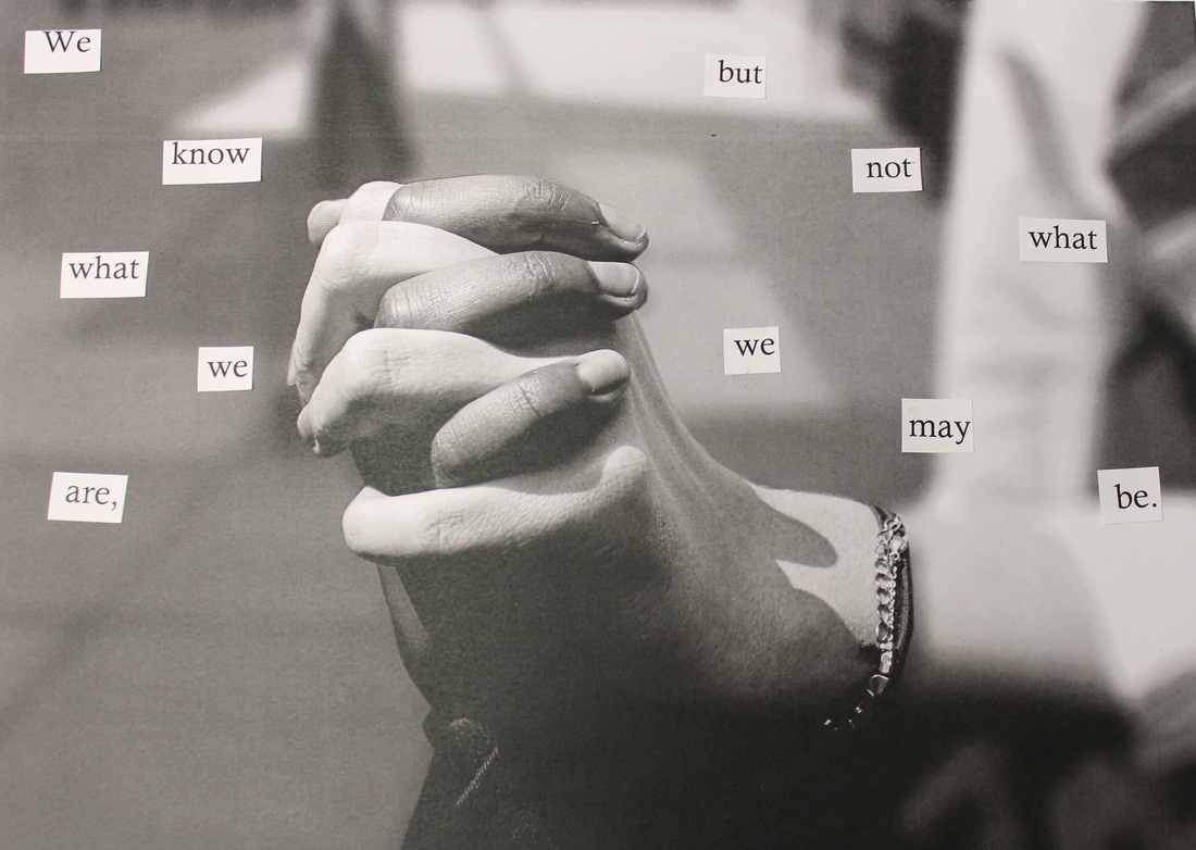
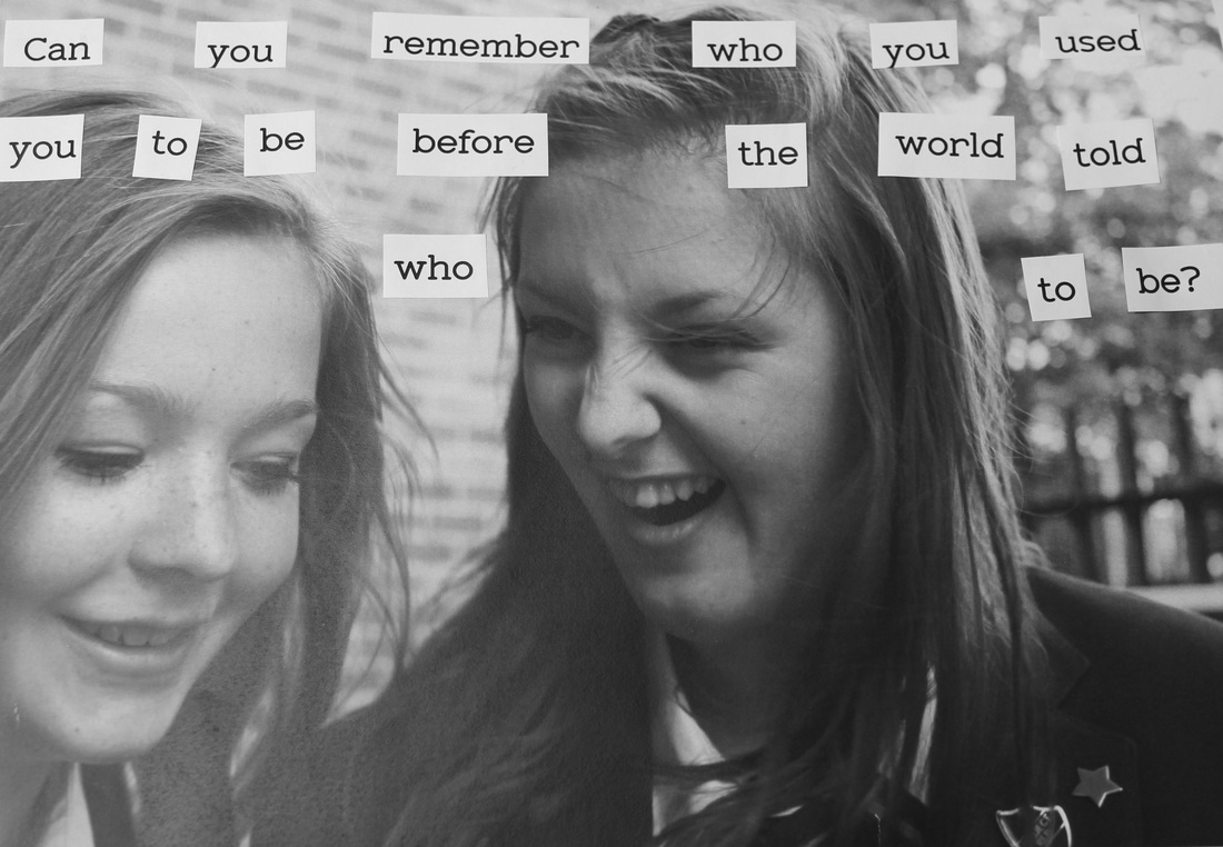
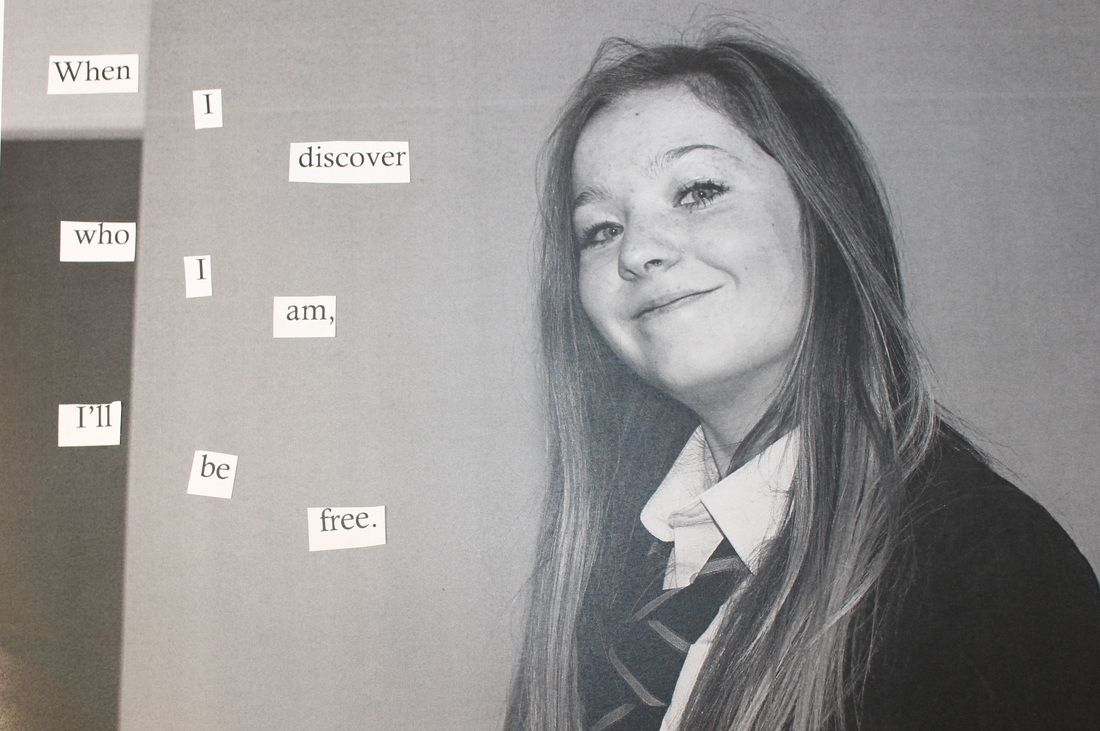
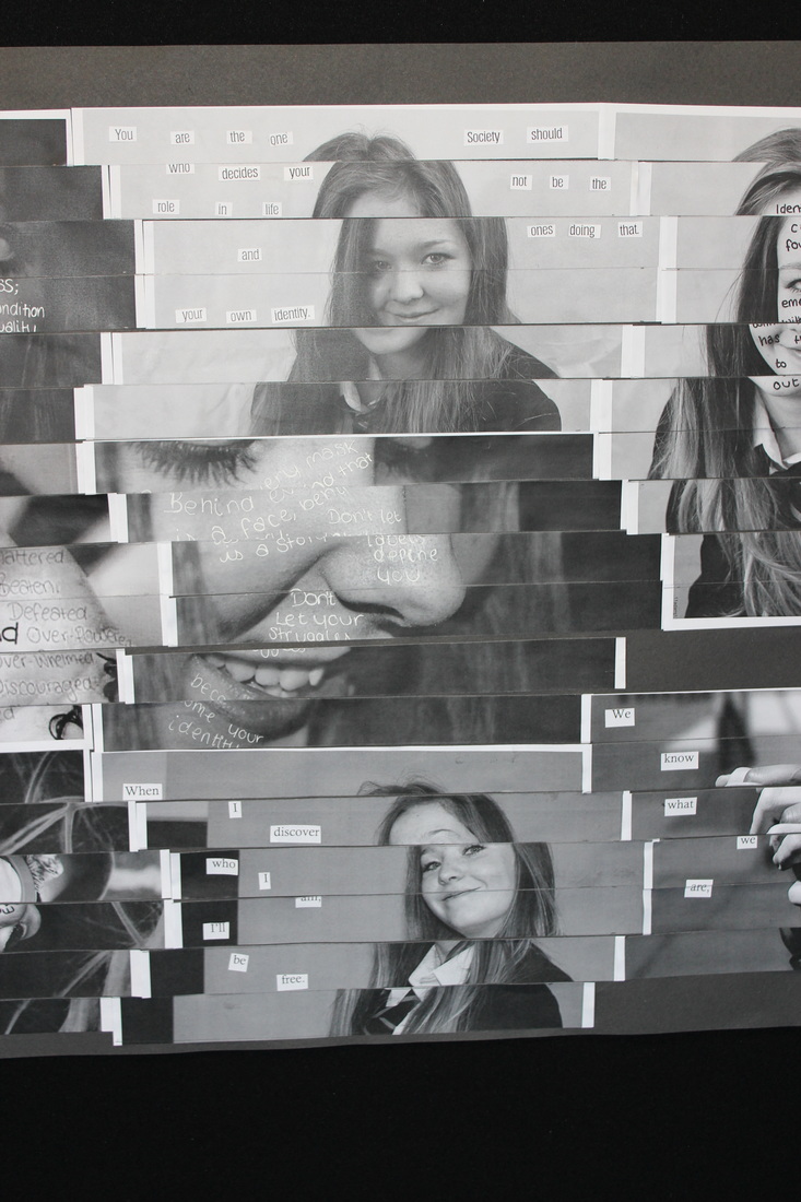
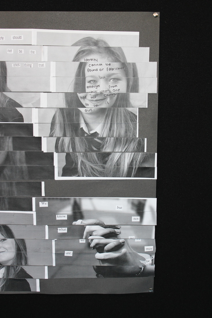
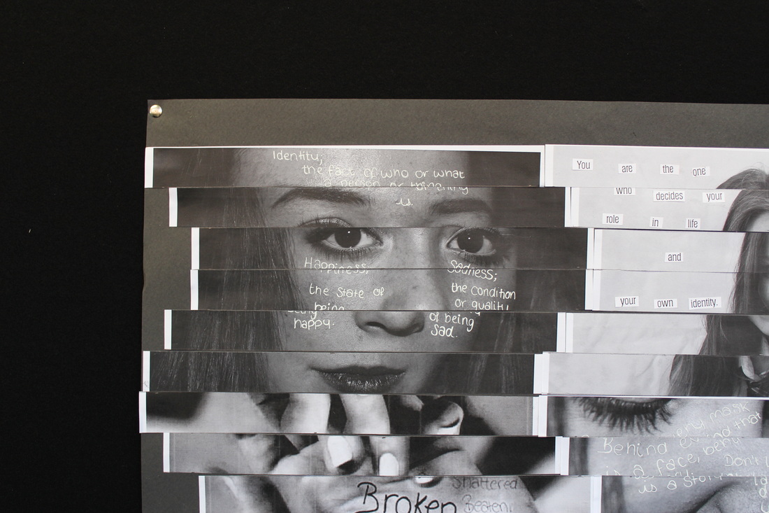
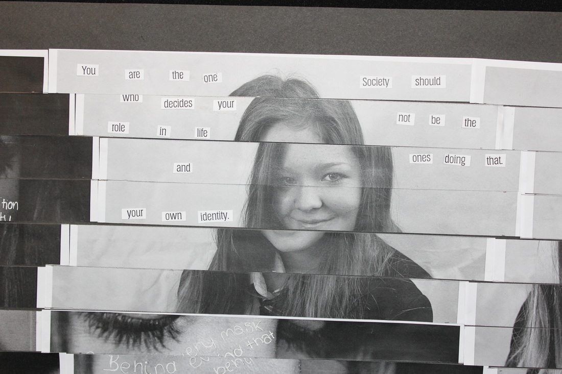
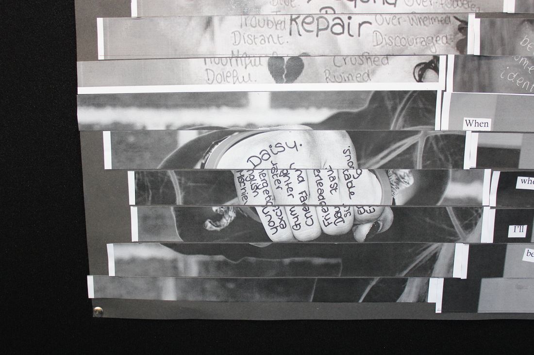
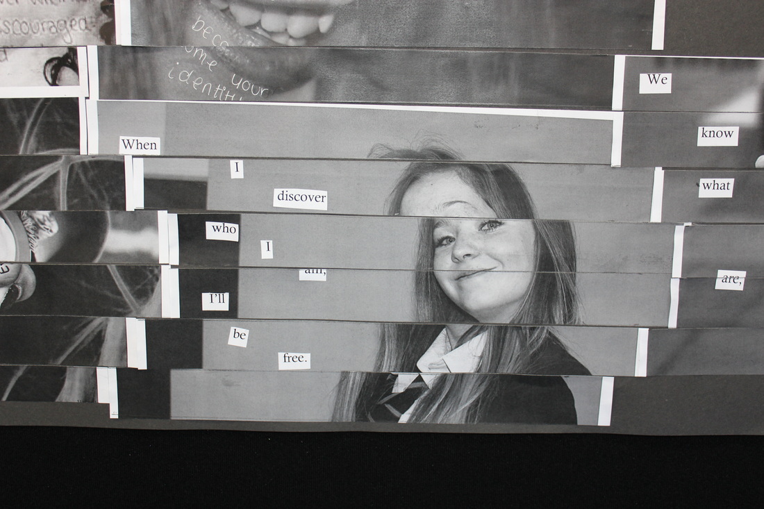
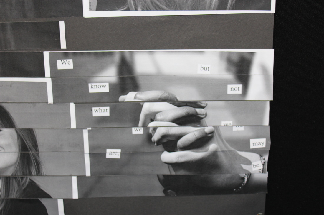
My final piece is finished. I am quite pleased with how it has turned out. I sliced all the strips of each image into 3cm strips to make sure they all fitted together without major gaps which I have managed to do. I then made sure you can still read what each images says, on most of the eight images that I presented you can but on the photo of the fist it looks slightly odd but still looks presentable. I then laid out all the strips of the images and stuck them down, it was difficult to get them to fit together without them all moving.
These images relate to identity because the quotes are about identity, also most of the quotes relate to the person in the image. the photo of the fist has a name and then words that all complete and identity and who they are.
These images relate to identity because the quotes are about identity, also most of the quotes relate to the person in the image. the photo of the fist has a name and then words that all complete and identity and who they are.
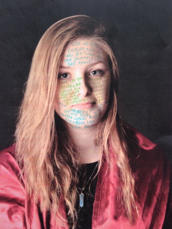
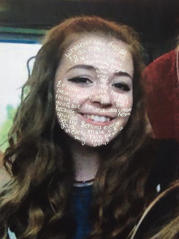
developing a final piece.
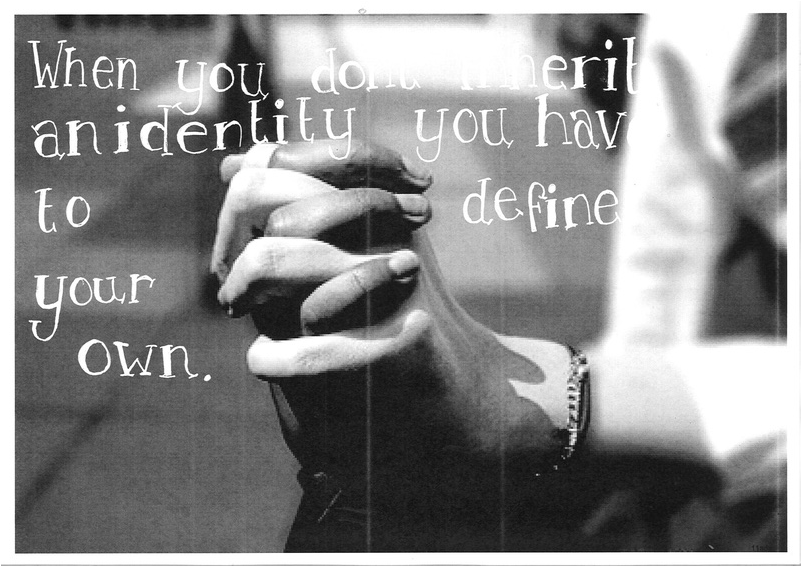
I have chosen to use these three images as my final piece because I think that they are my strongest pieces of work. To create these images I tried out many different fonts on different images. I printed these image out firstly and chose the right quotes and font to make the image look really strong. Once I'd finished that I then scanned the image into the laptops to present here. I also have a physical copy where I got some black cartridge paper and stuck the images down
