URBAN.
abstract.
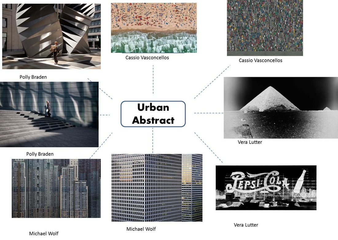
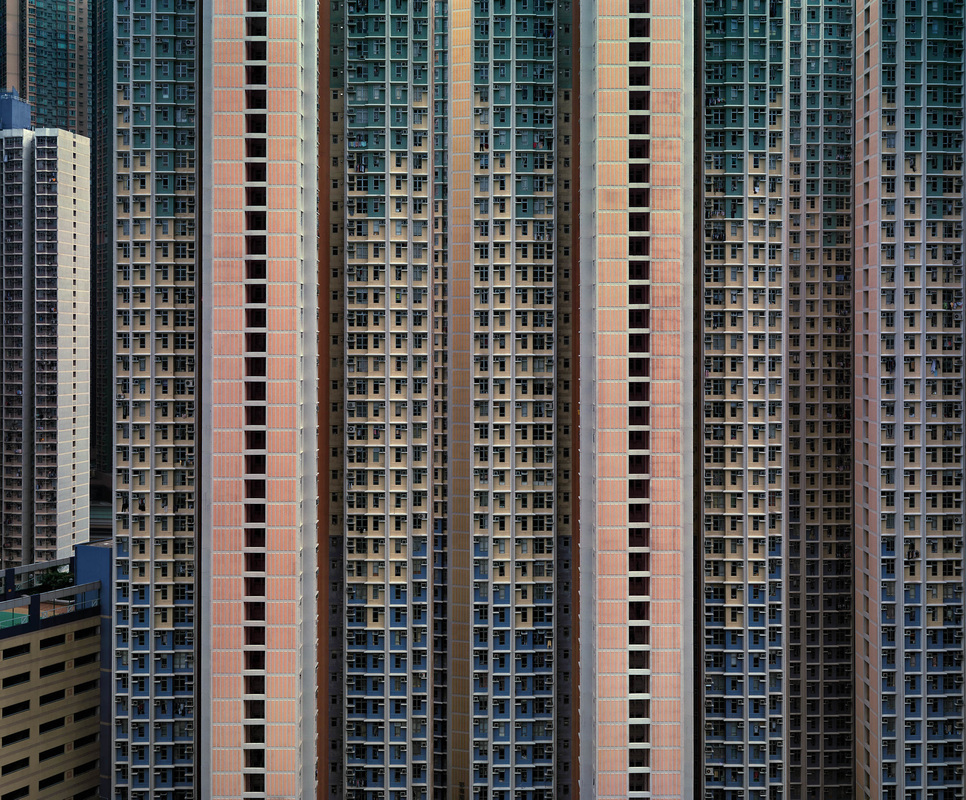
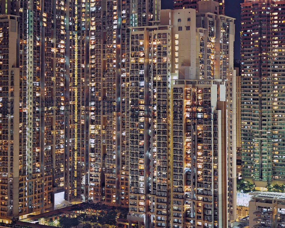
Michael wolff
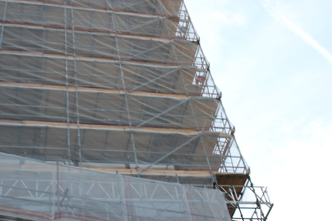
Michael Wolfs' style is very unique and original, he usually take photos of cities and tall buildings. It is quite repetitive and abstract, the photos he takes consist of many lines, angles and squares, the lines are bold and lead to a vocal point, lines of direction. Michael takes photos with natural lighting, the photos aren't staged so he is lucky to capture the moment. Sometimes he will take photos and crop the image closely to reveal another aspect to the image. The photos don't consist of much colour as buildings are usually dull black, silver and grey, they are reflective and look metallic. This makes the photos look better and have more depth.
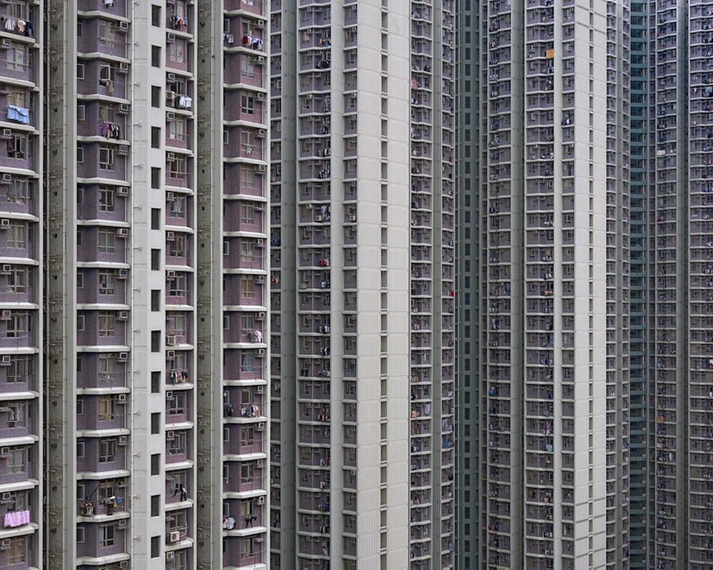
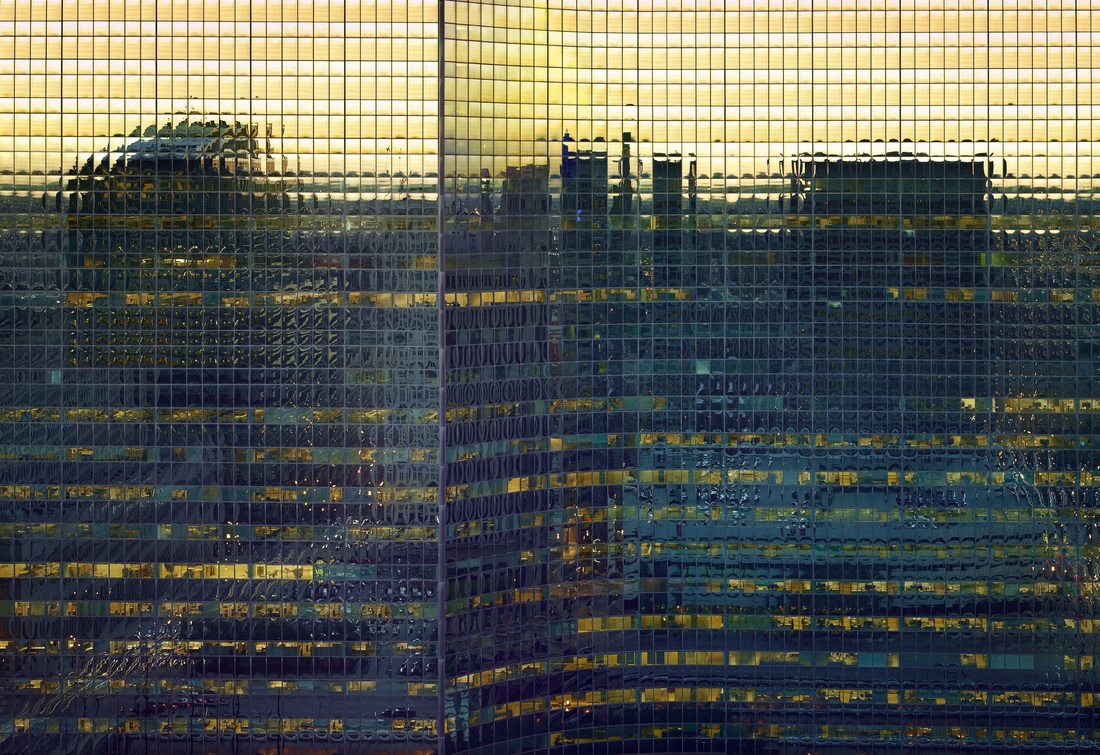
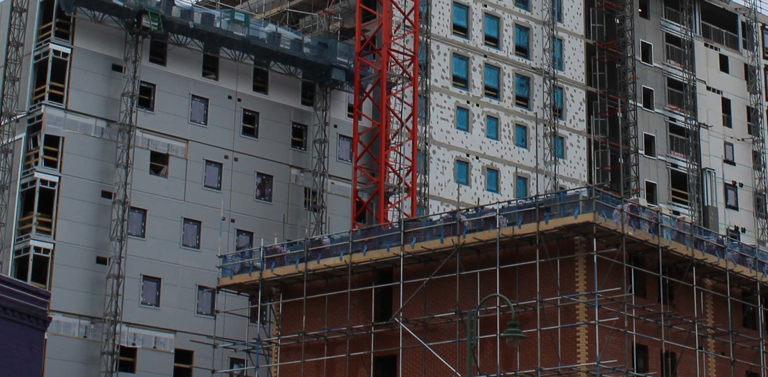
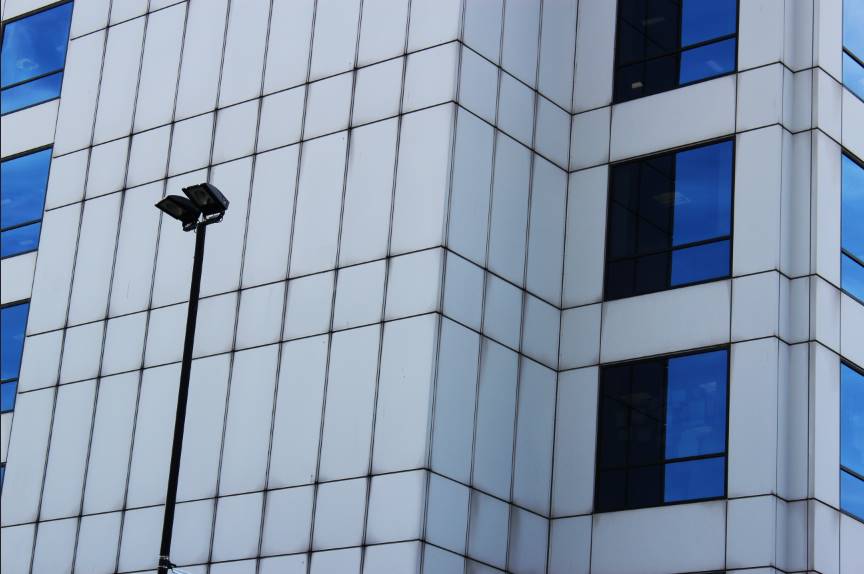
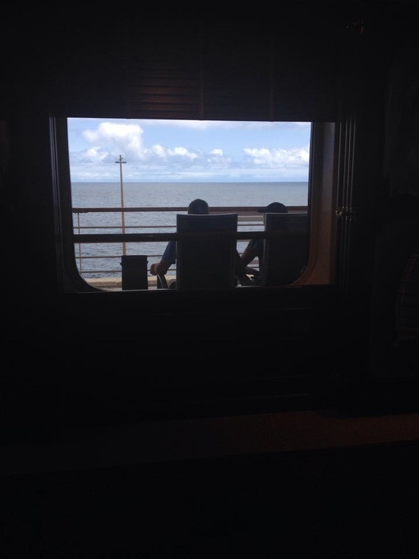
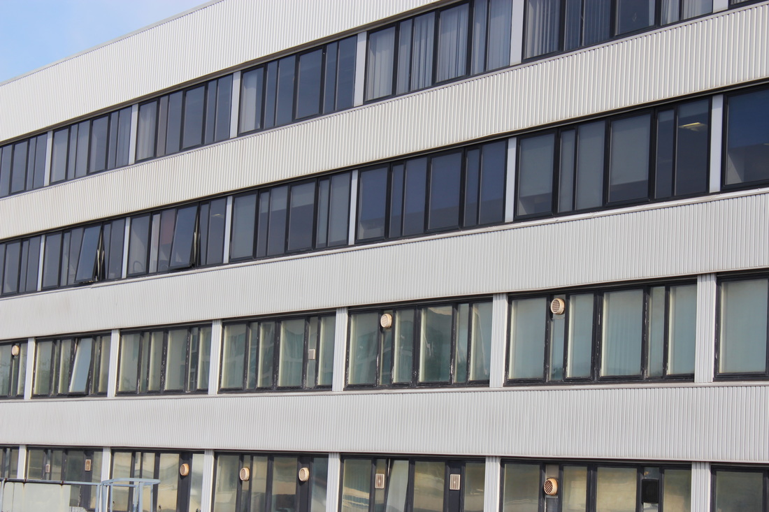
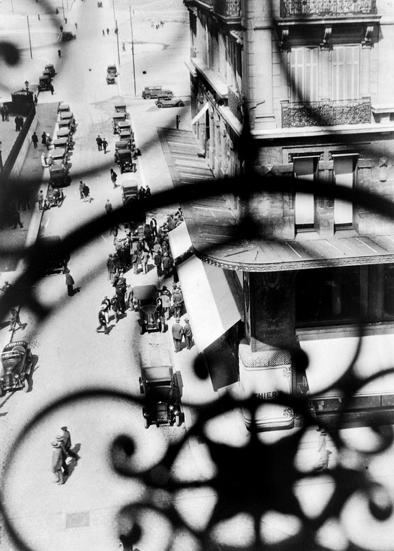
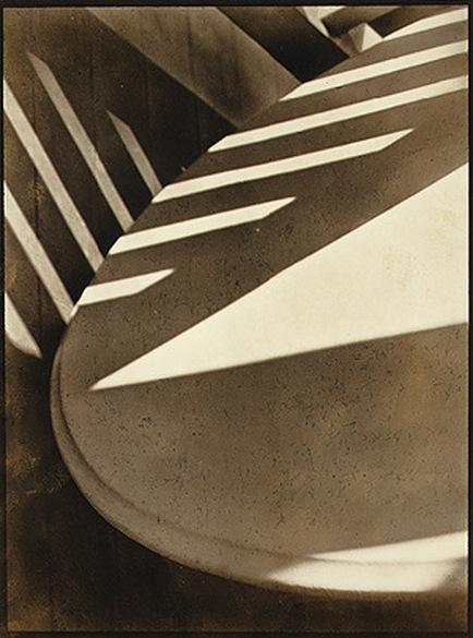
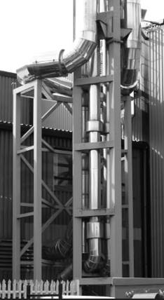
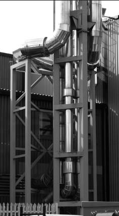
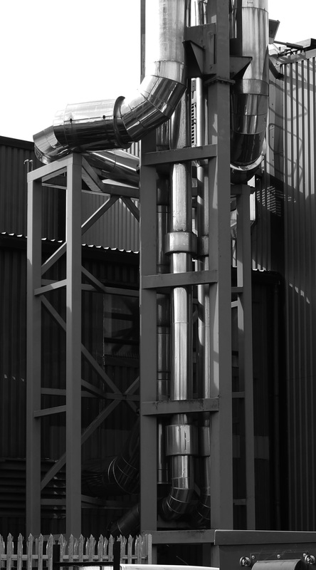
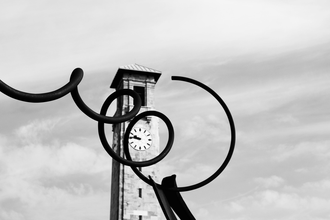
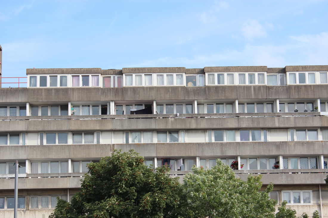
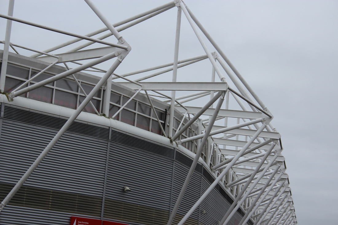
FAVOURITE MICHAEL WOLF IMAGE.
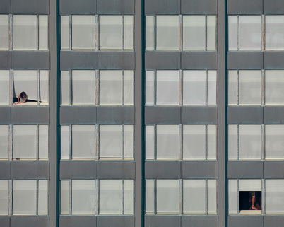
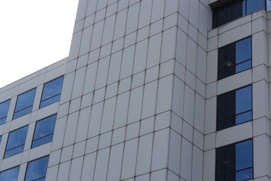
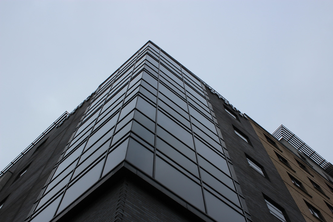
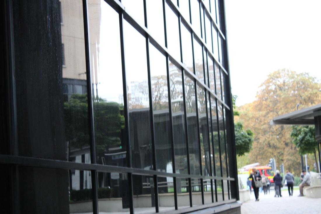
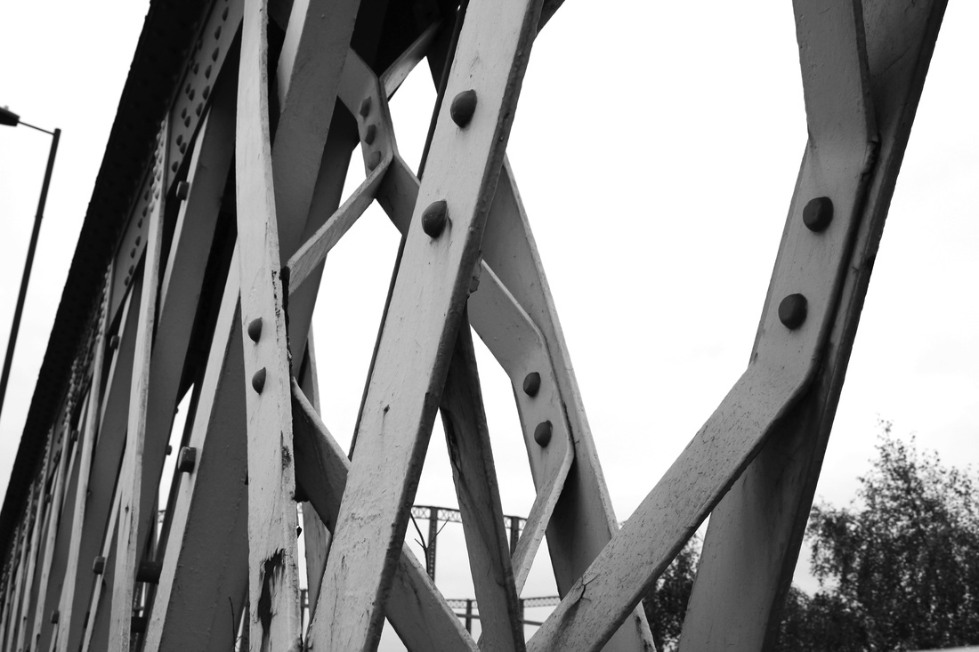
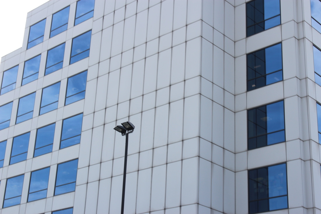
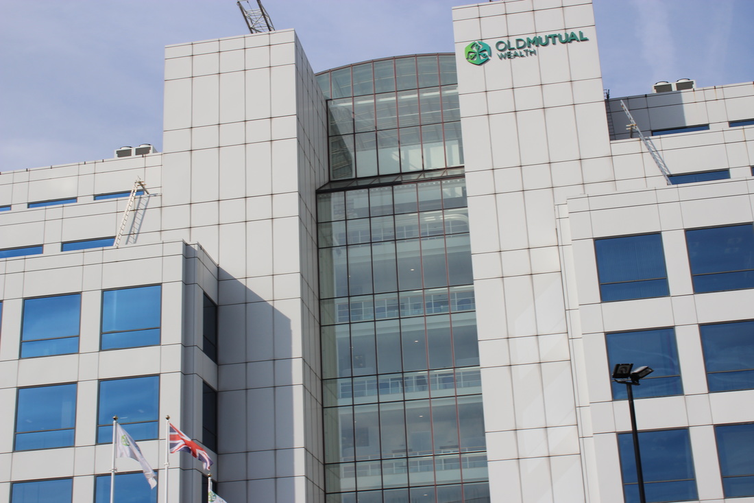
This is my favourite Michael Wolf image, this is because I think that the image was a full image but was cropped down really far to create this close up photo. The photo contains many vertical and horizontal lines that are all perfectly straight, with right angles. The colours are very limited with dark and light greys. The windows and walls are all matte so they make the people look more defined. I think that this photo was unplanned.
|
|
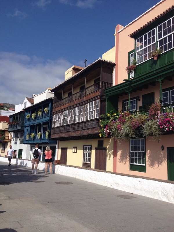
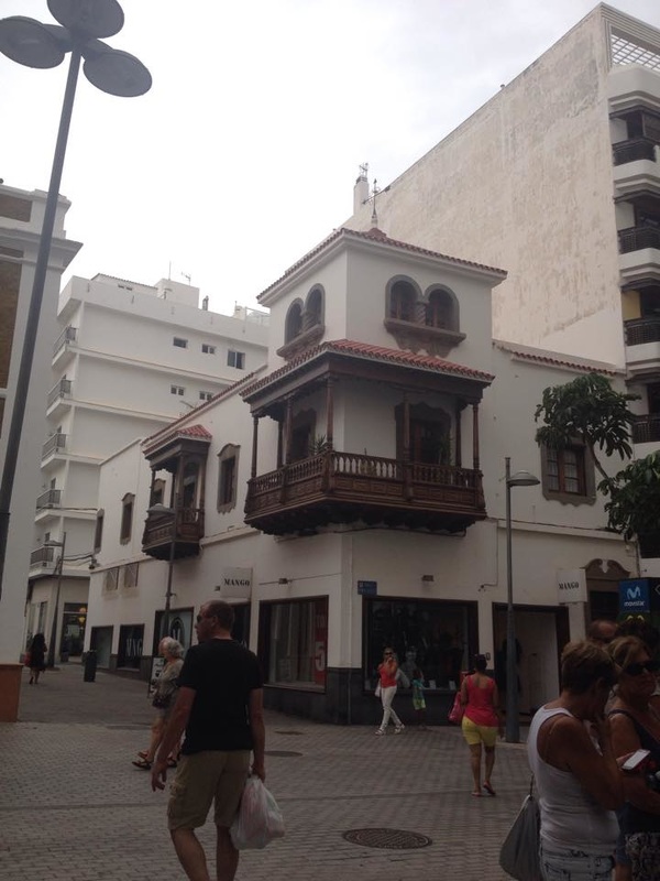
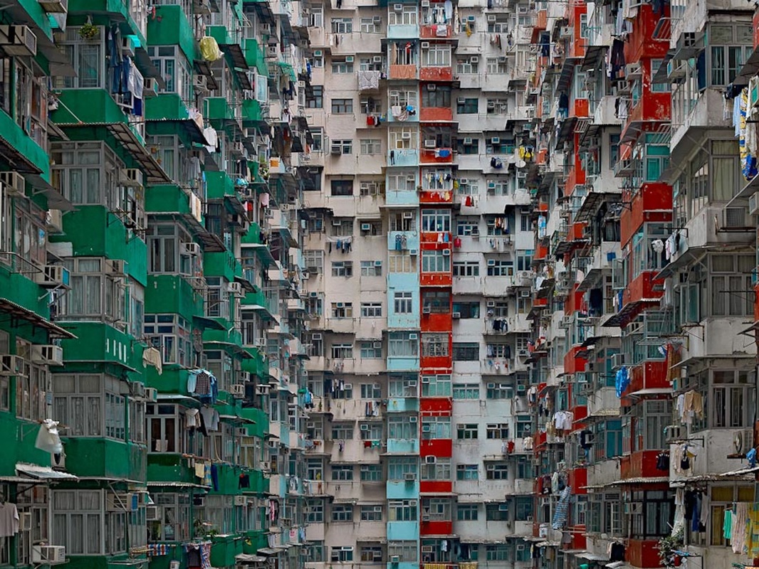
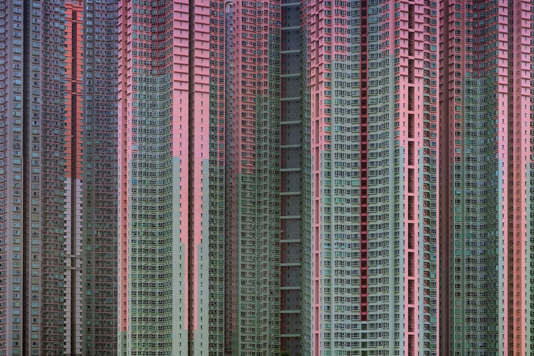
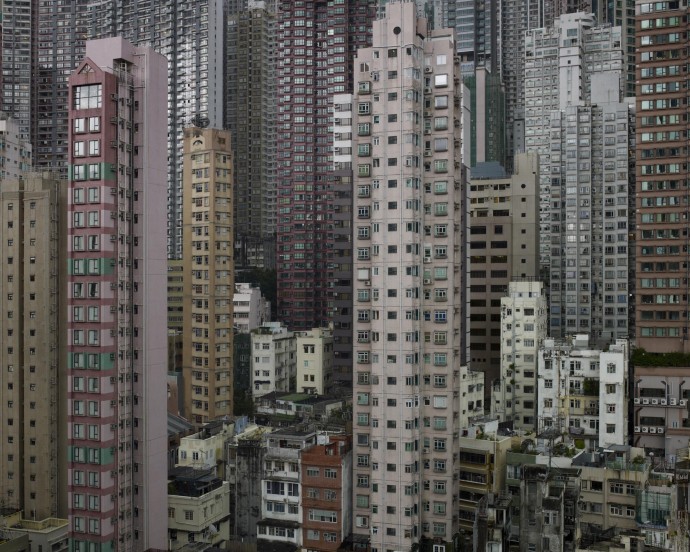
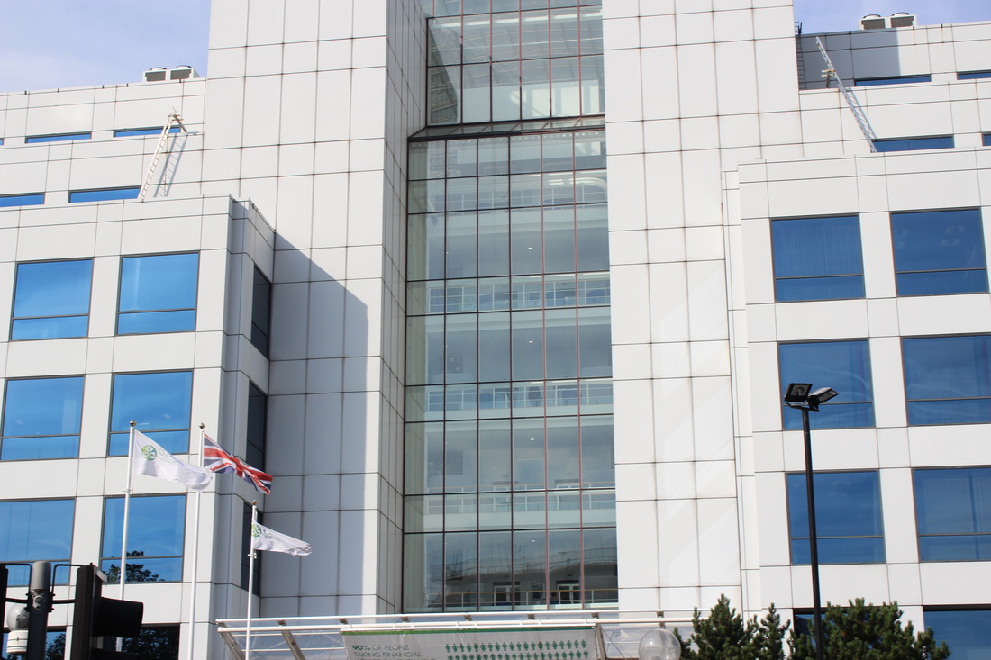
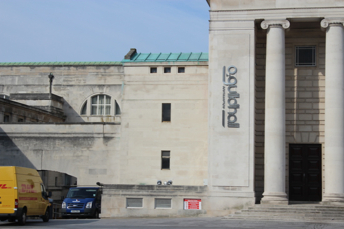
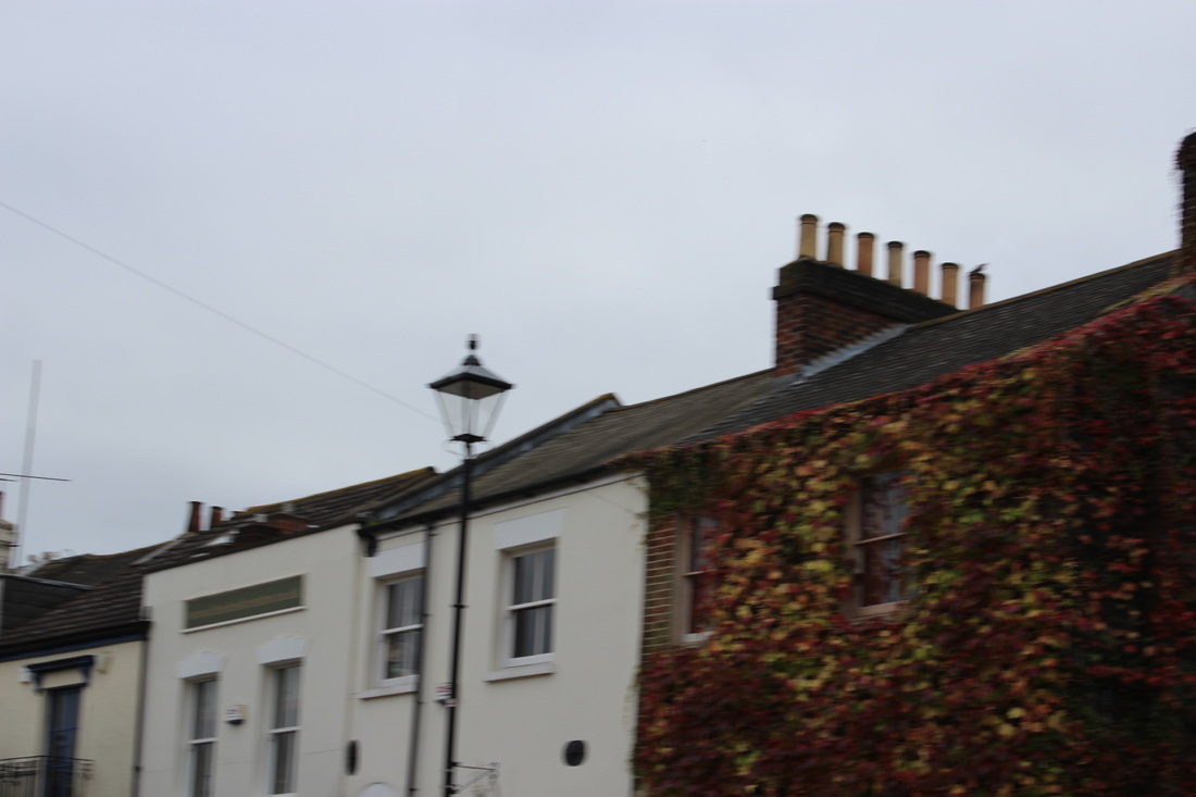
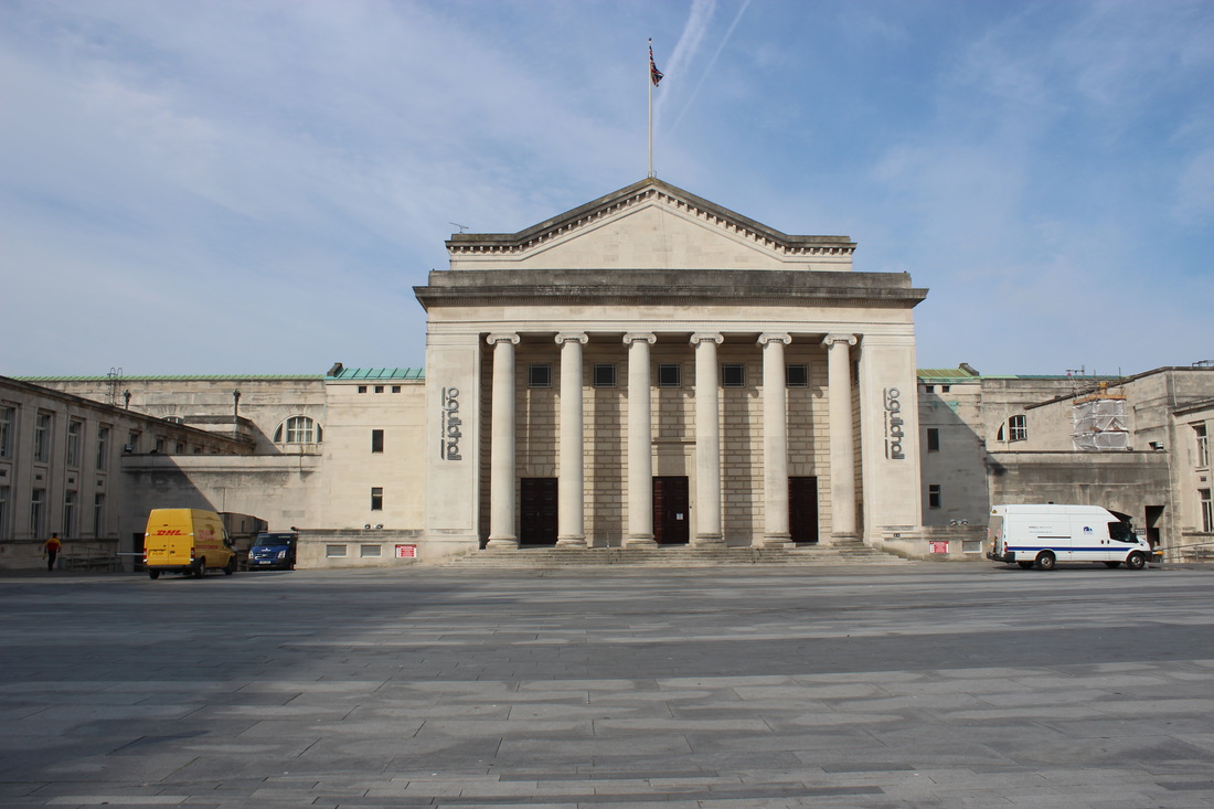
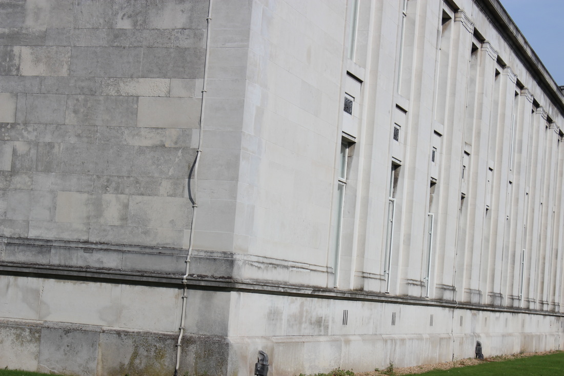
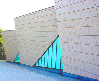
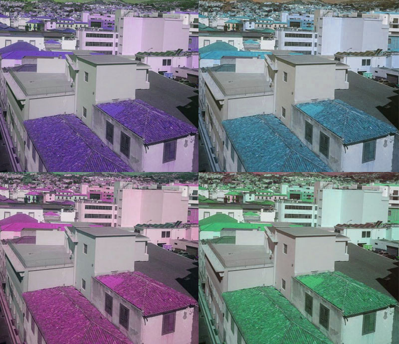
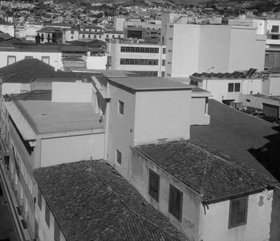
These photos are abstract buildings from different countries and places within England, they have different structures and outdoor interior which make them look pretty and exciting.

|
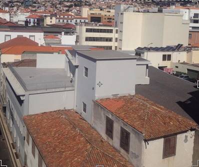
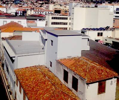
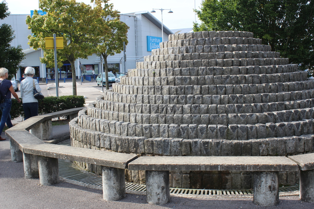
I selected this image as my favourite of the 'Abstract Buildings' photos.
I like this one because there are multiple houses and buildings that all fit together, it looks like a really busy and loud area from how compact the houses are. When this image is cropped it looks like a Michael Wolf image, with just focusing on the buildings and how compact they are. 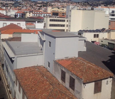
|
my response to Michael wolff.

This is my original image, I cropped it down slightly to get the busy edges out.
|
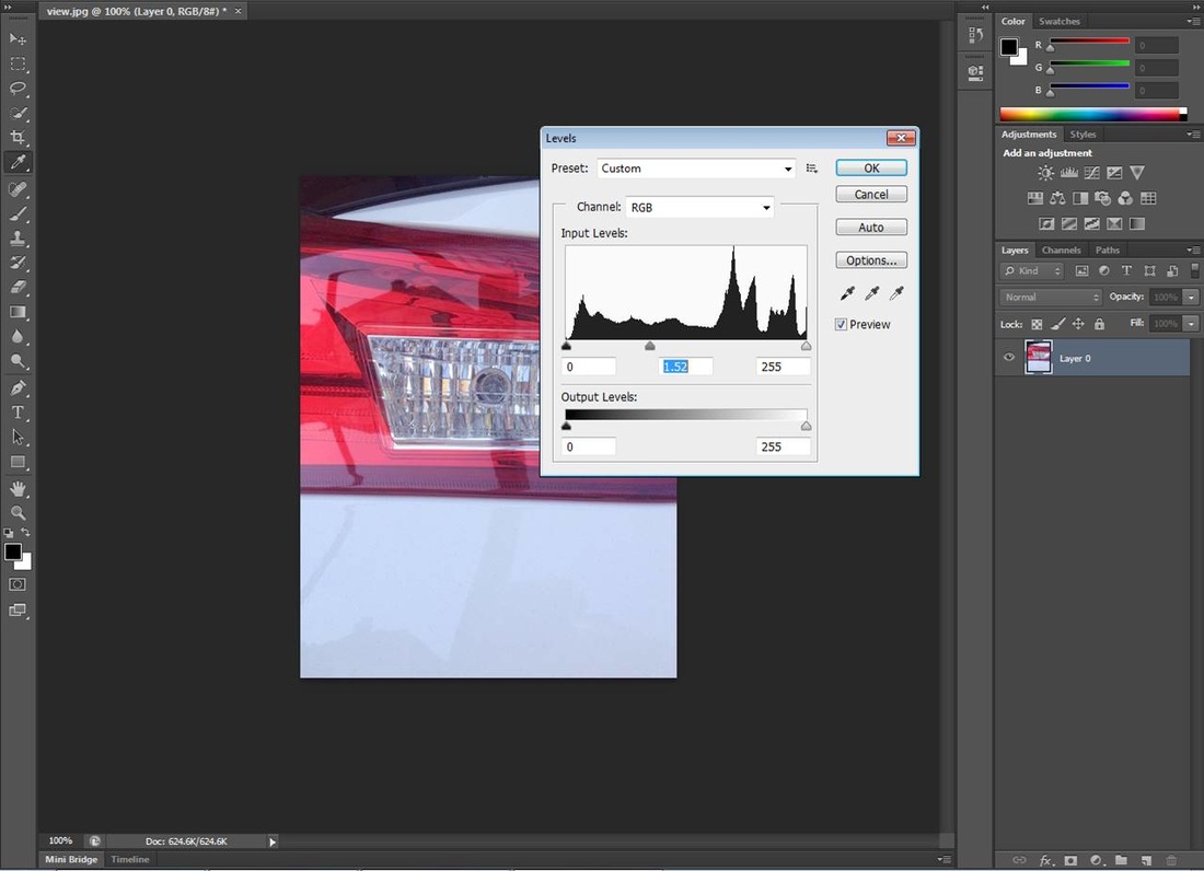
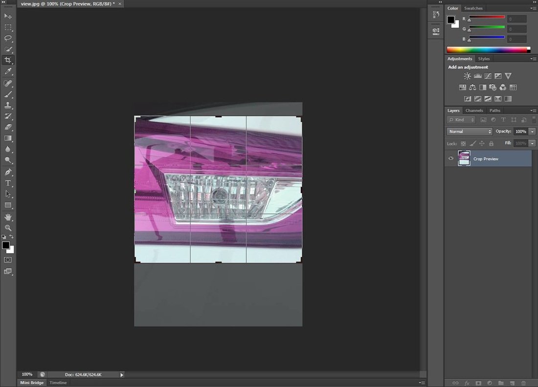
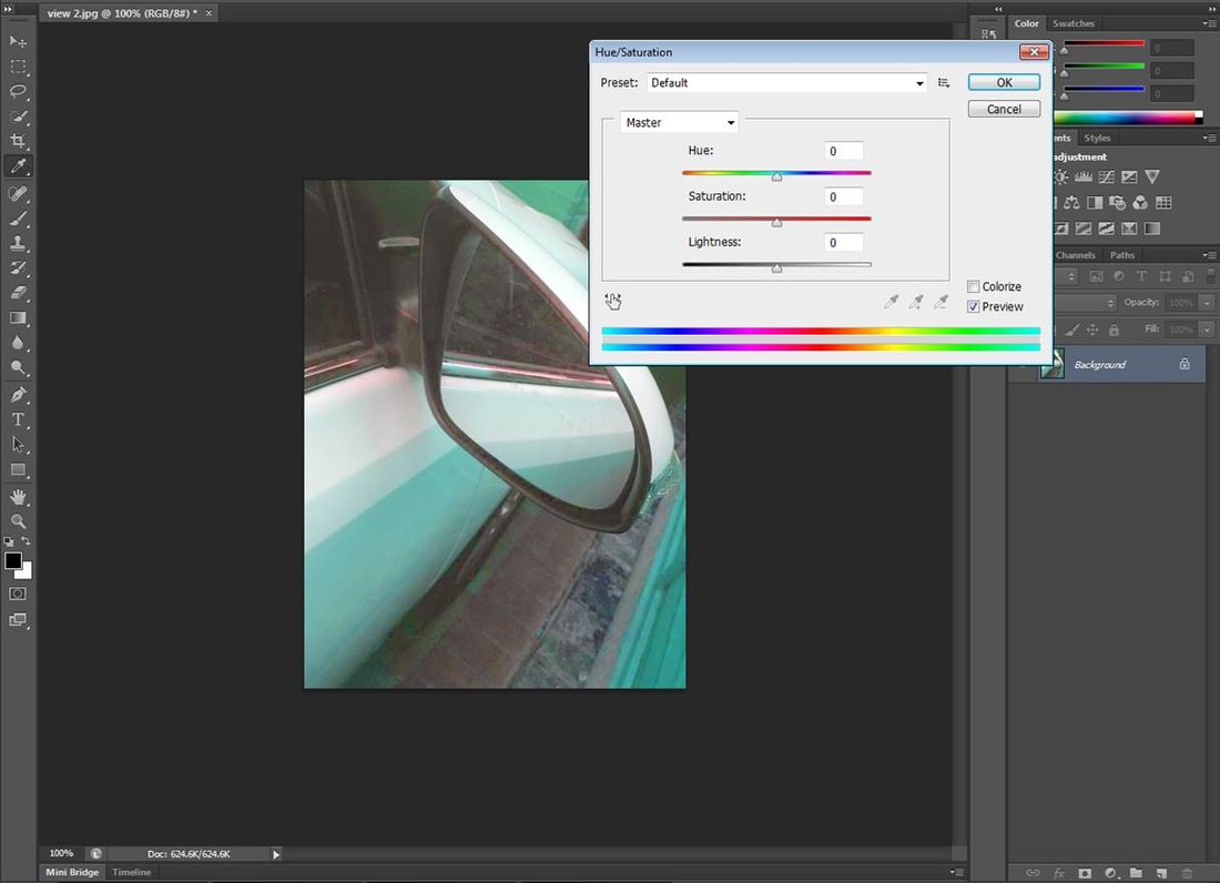
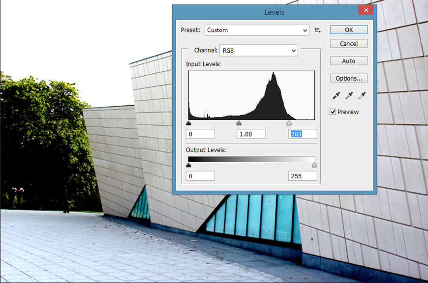
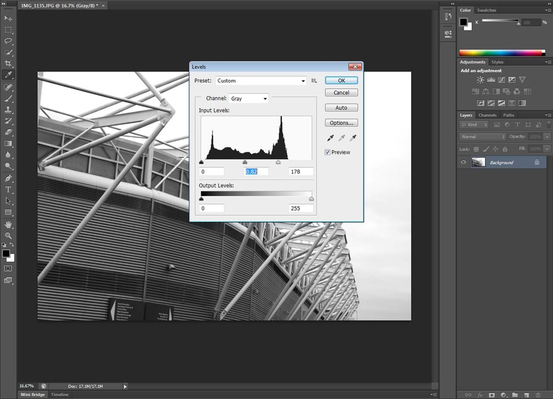
For this image I adjusted the levels to make the shapes much more defined.
|
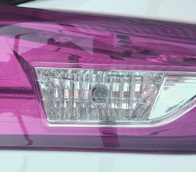
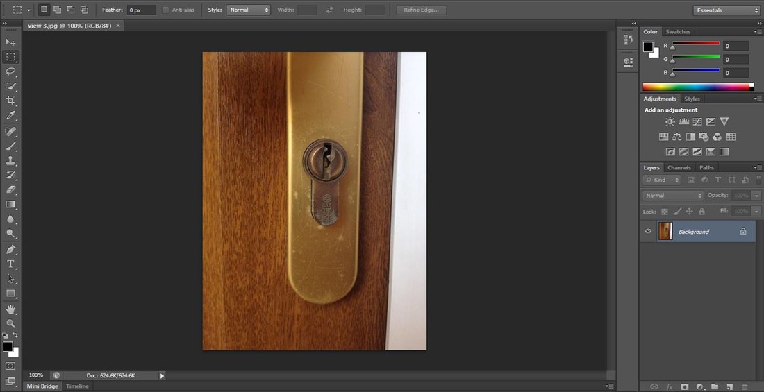
This is the original image, I cropped it down but its too dark to keep as normal.
|
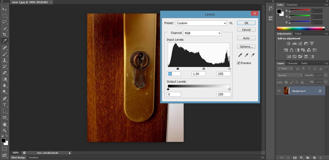
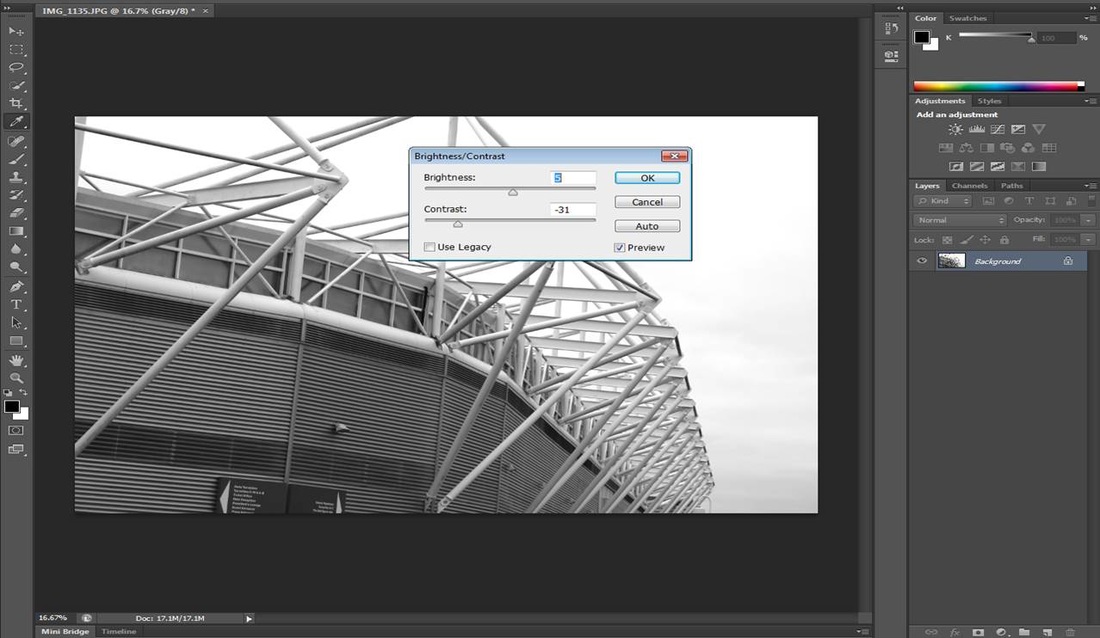
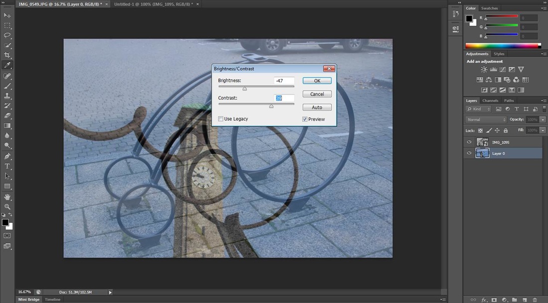
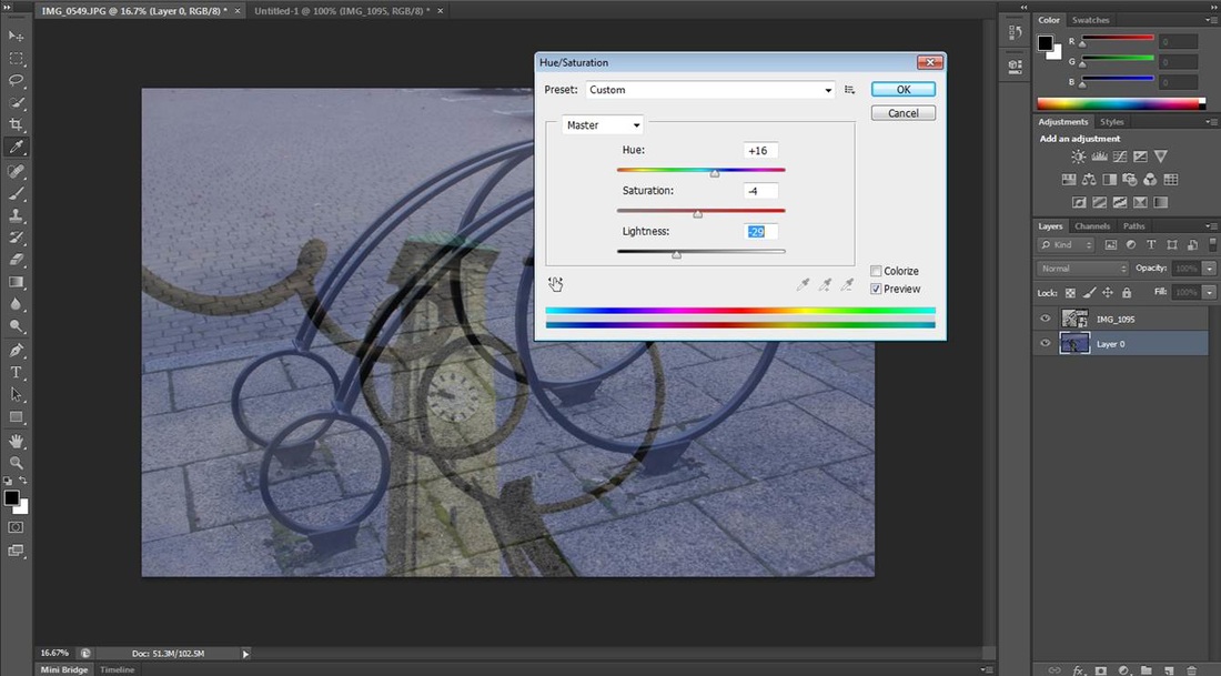
This image I adjusted the brightness and contrast to make the shapes more defined.
|
I then adjusted the levels to make the buildings stand out.
|
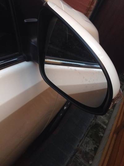
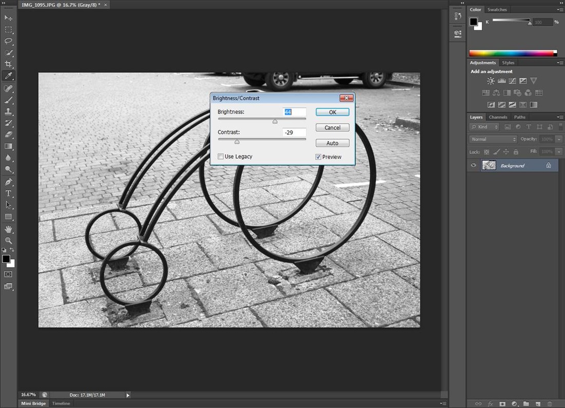
This is the original image. its quite dark.
|
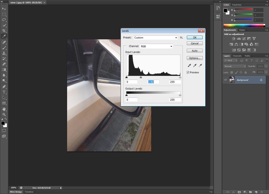
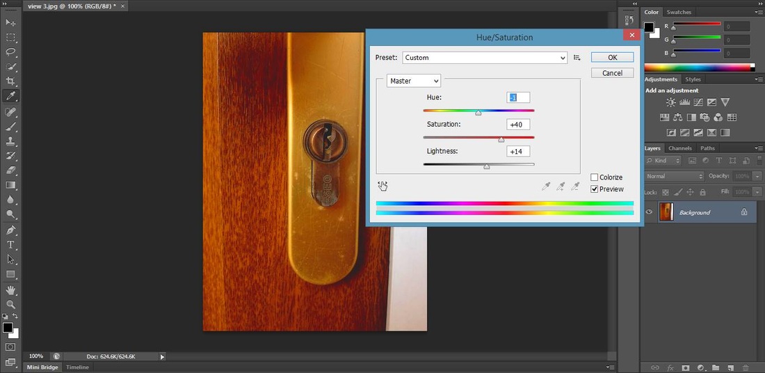
I adjusted the brightness and contrast to make the lines more defined.
|
In this image I then adjusted the levels to define the windows more.
|

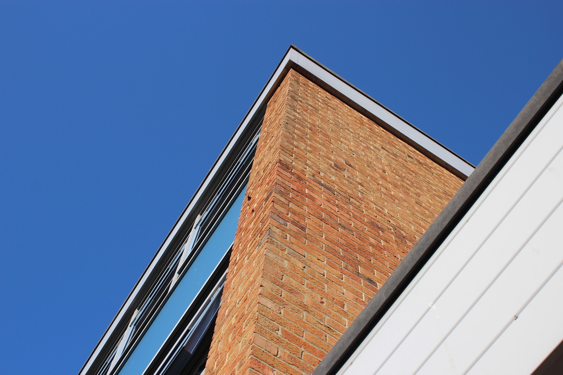
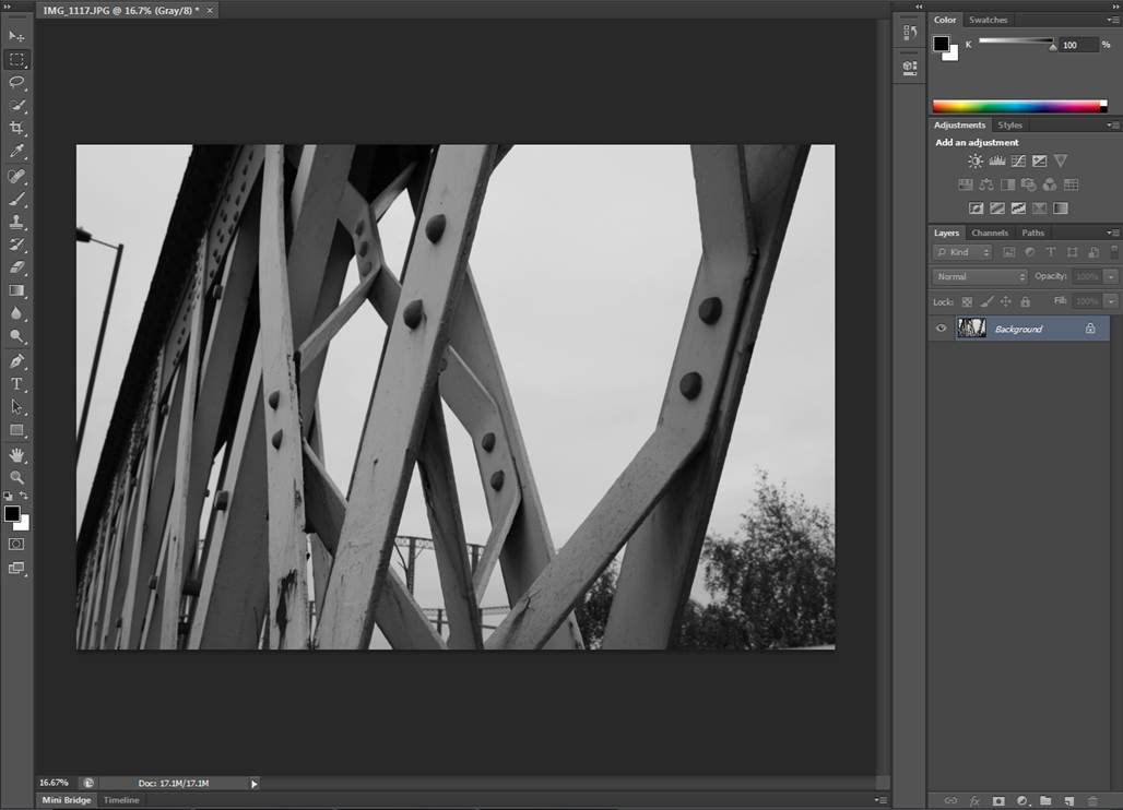
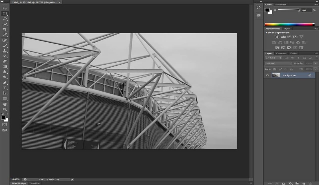
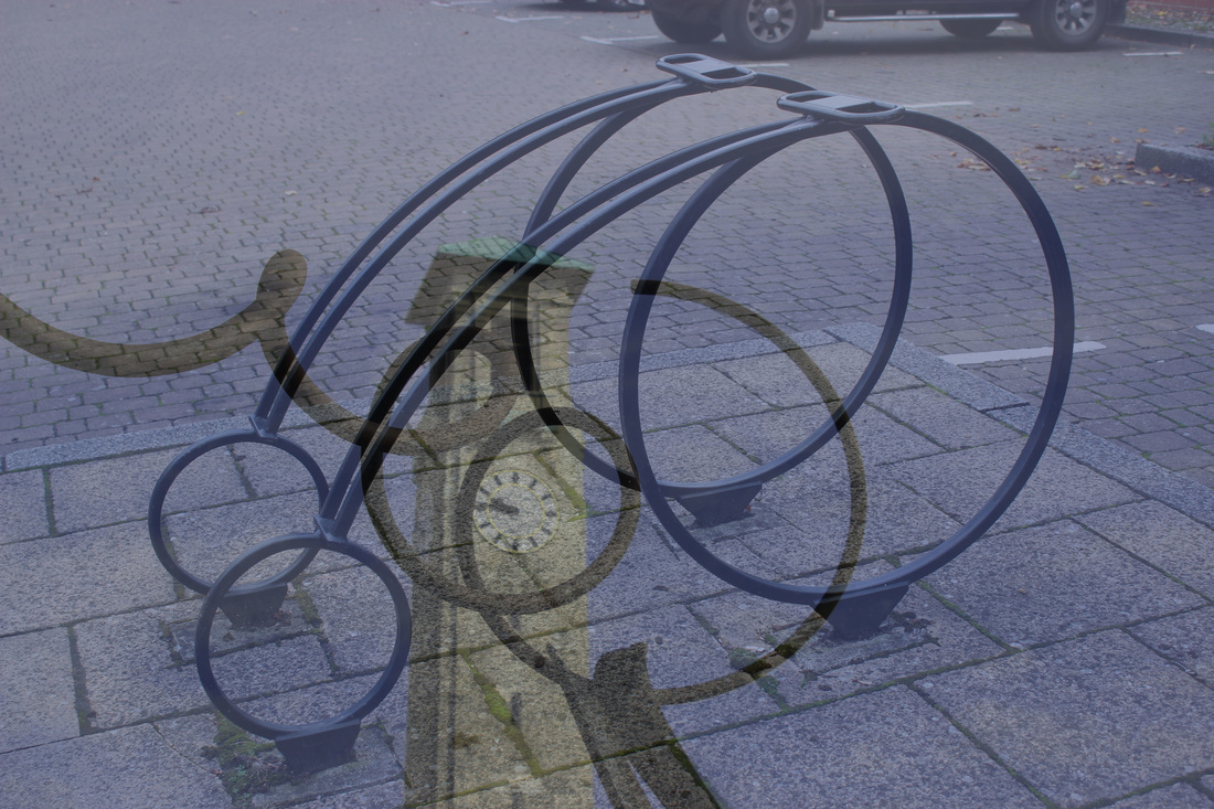
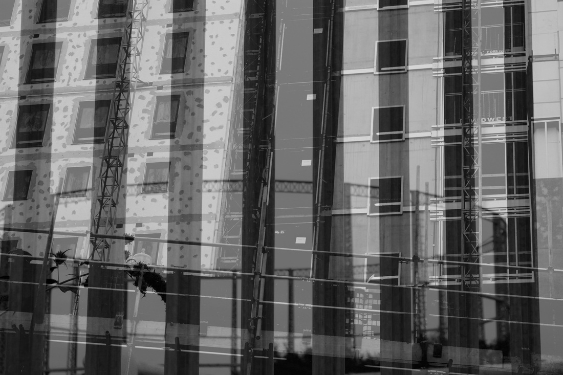
This is my original image, the bottom half of this image is in the style of Michael Wolf.
|
I cropped this image down so that it looks like a Michael Wolff image.
|
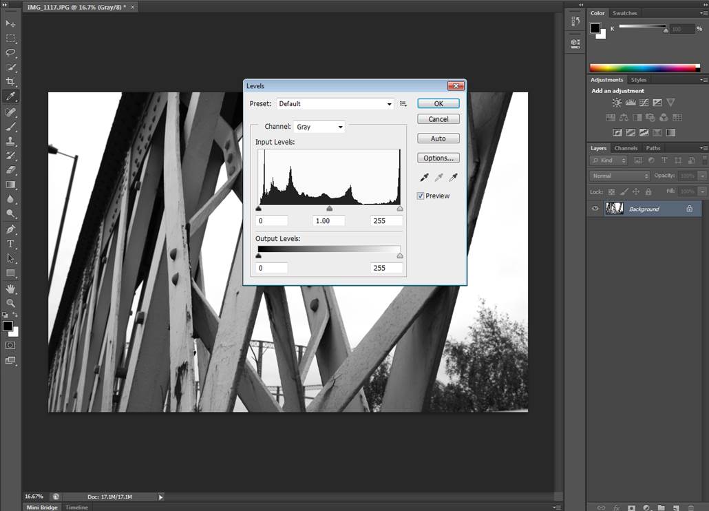
I then adjusted the levels, to make the roofs brighter and make the white of the buildings stand out.
|
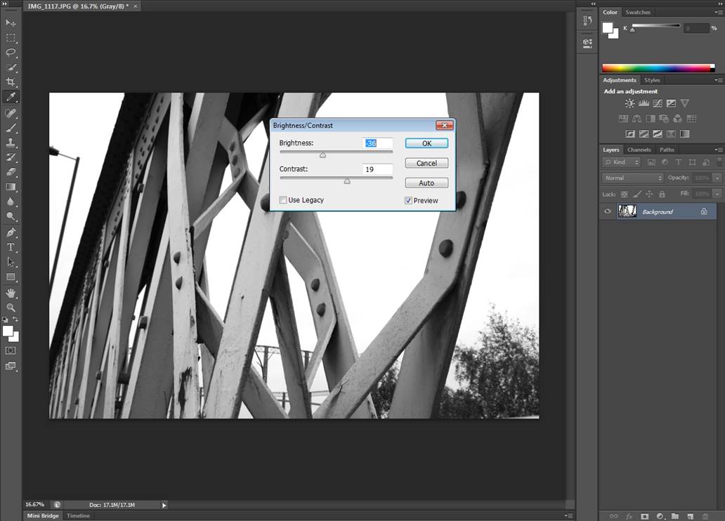
To finalise this image I increased the brightness and contrast to make the lines stronger and more defined.
|
my response to urban capturing the moment.
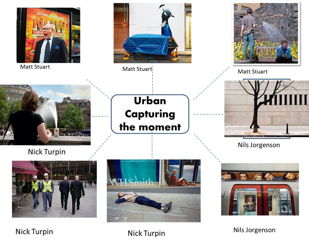
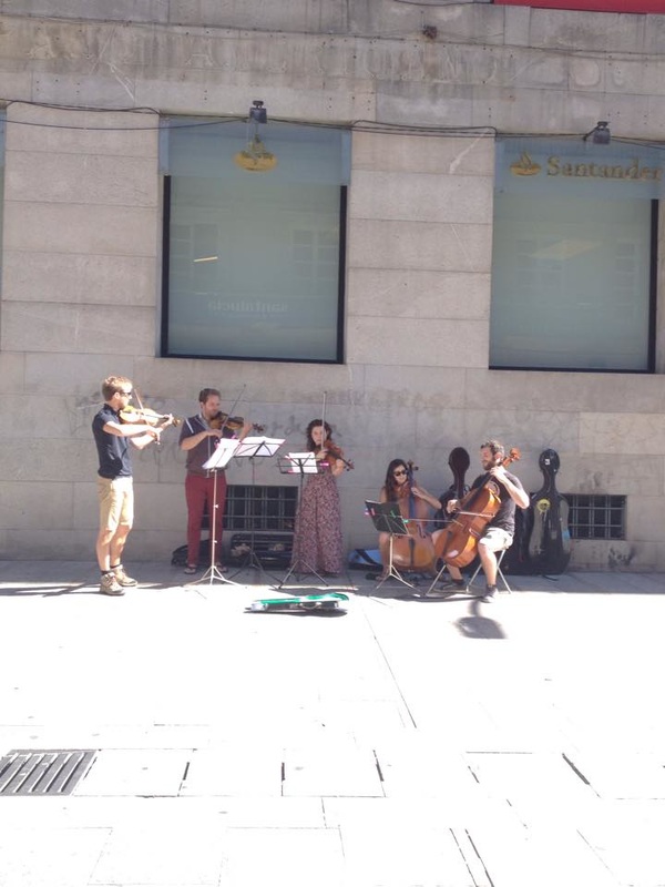
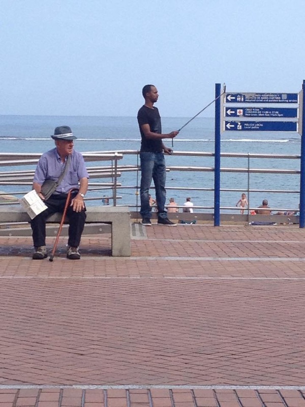

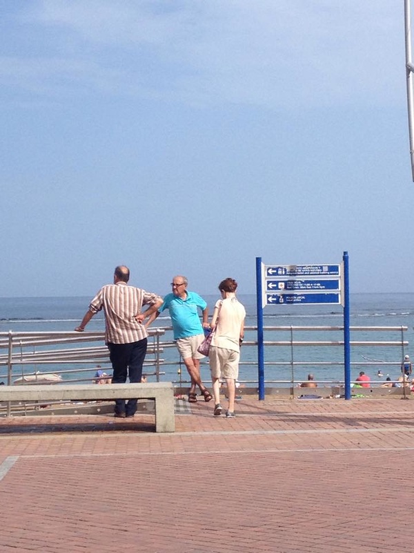
These photos I took over the 6 weeks holiday, of people just doing everyday things at the certain time I took the photo. They are taken in multiple different countries, there are lots of different people doing different jobs or pass times.
|
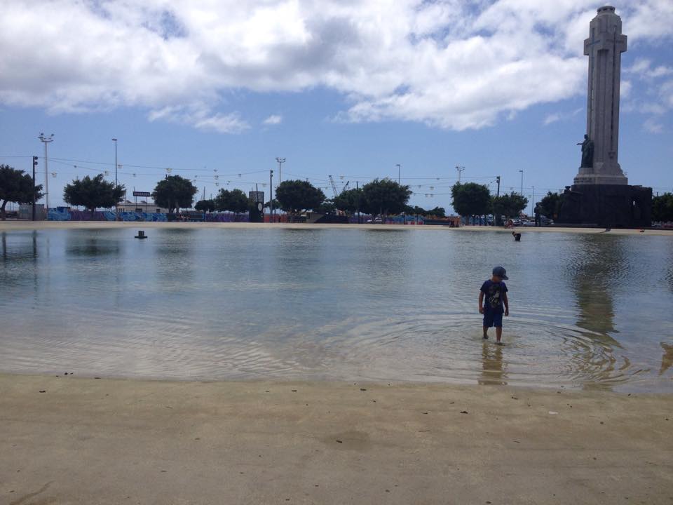
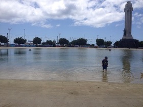
I particularly like these two pictures from my 'Capturing the Moment' photos.
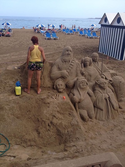
I like the photo on the left because the child is causing a nice ripple effect on the water and the child looks very happy to be on holiday. I like picture on the right because the woman is just working normally oblivious to the crowd that was watching her make her art. |
|
my response to urban REPETITION.
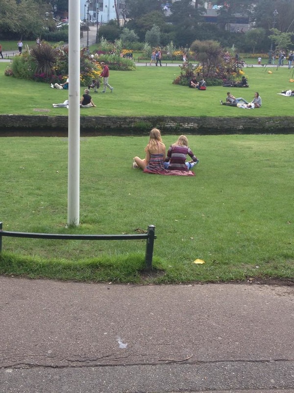
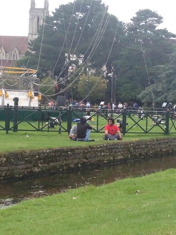
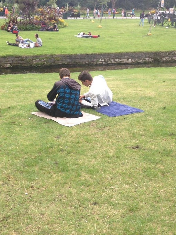
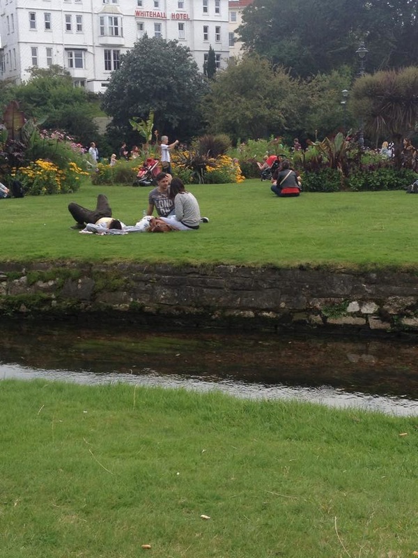
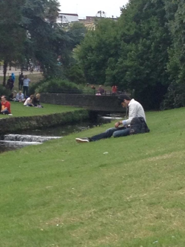
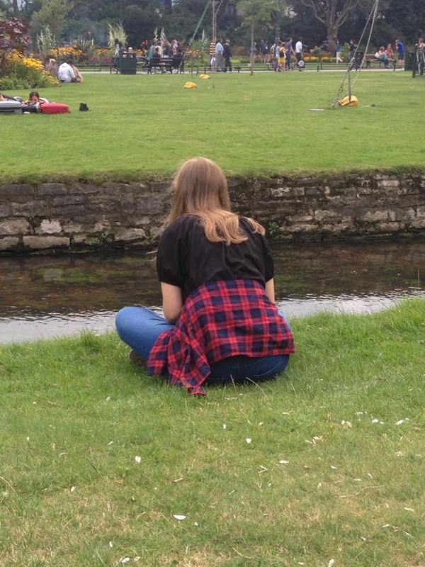
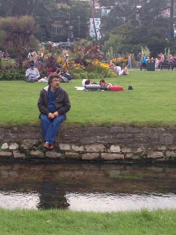
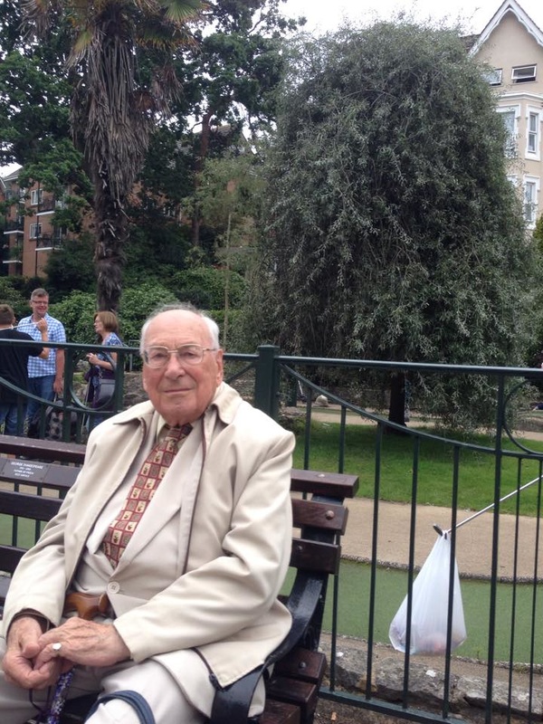
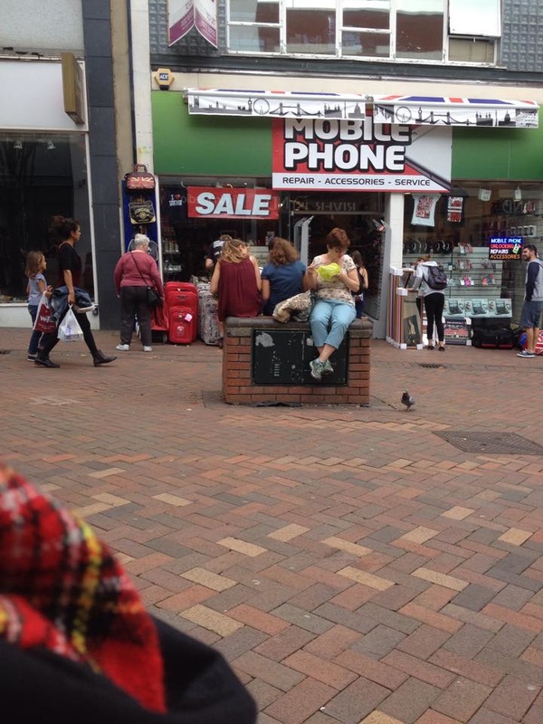
All these pictures have a link, repetition, all the photos have people sat down on all sorts of seats and benches. I have grouped the images into sections, people sitting on grass, groups of people and silhouettes.
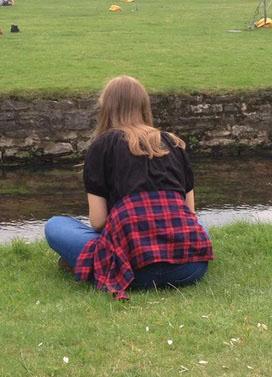
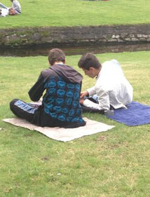
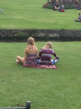
I particularly like these three images from my repetition section because they have a clear link of repetition. All the images have people either individually or in pairs that are facing away from the camera, unaware of their photo being taken. They are all natural images of people doing their own things.
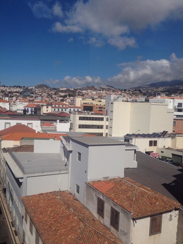
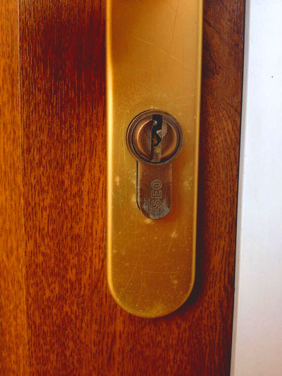
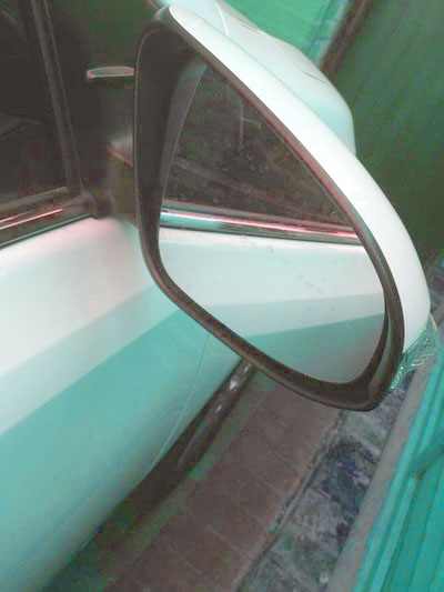
photo shoot 1 - viewpoints.
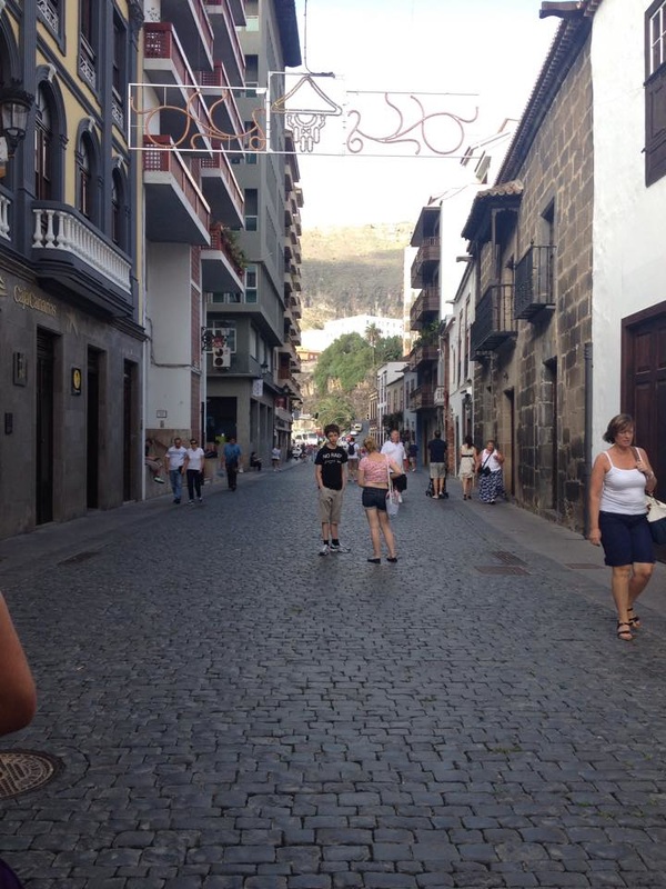
I took these photos of view points for homework. I walked around the outside of my house and my road to see if anything that you see everyday could look unusual as an image. Most of the images look quite normal but with editing they could look really nice.
edits and editing process.


With all three images I edited I used a similar process, I started by changing the levels of the image, this changed the brightness slightly, I then changed the Hue/Saturation. In two of the images I cropped down to make the view point the main focus. I changed the colouring to slightly unnatural colours to add a bit more effect.
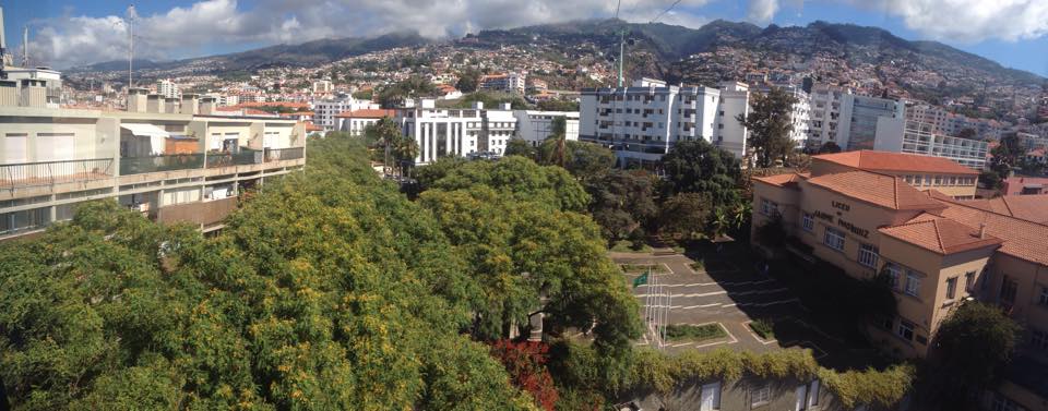
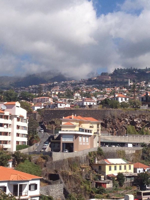
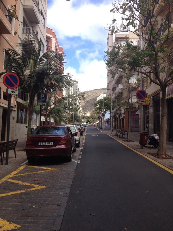
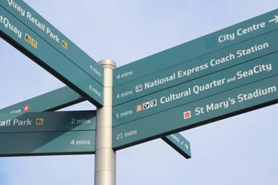
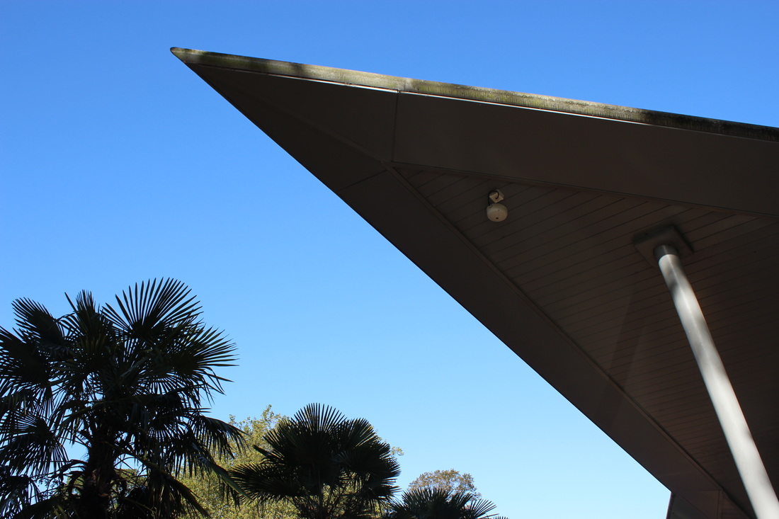
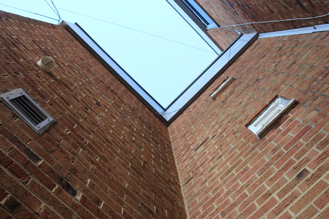
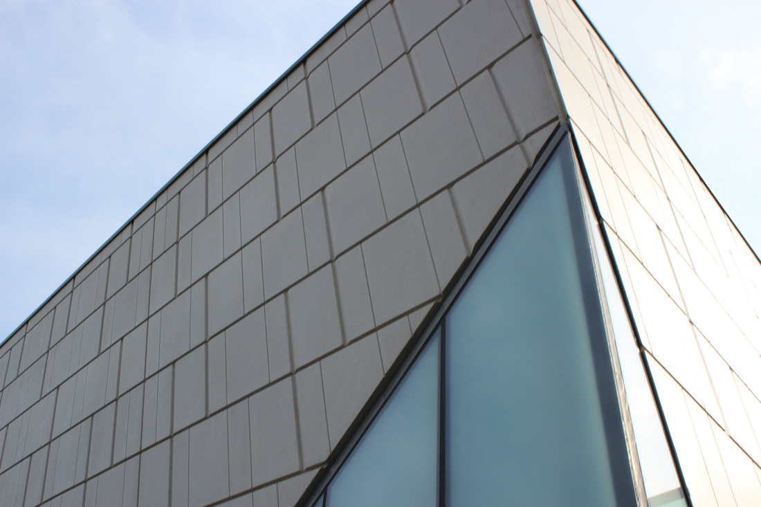
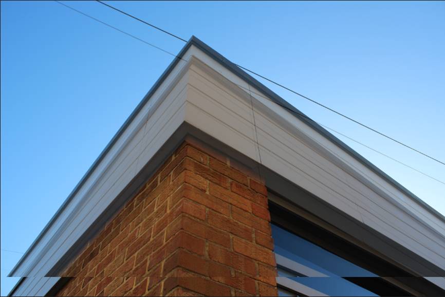
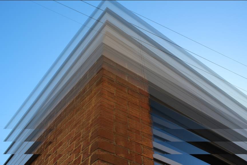
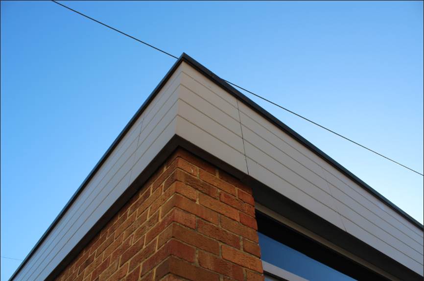
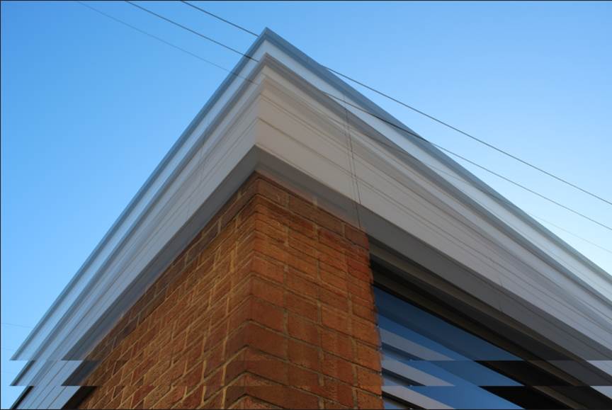
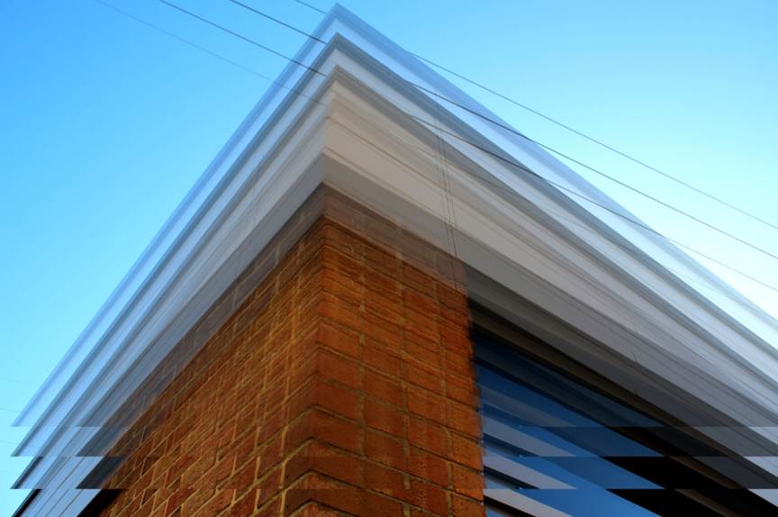
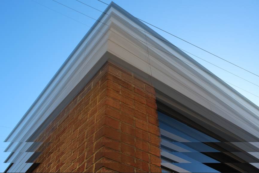
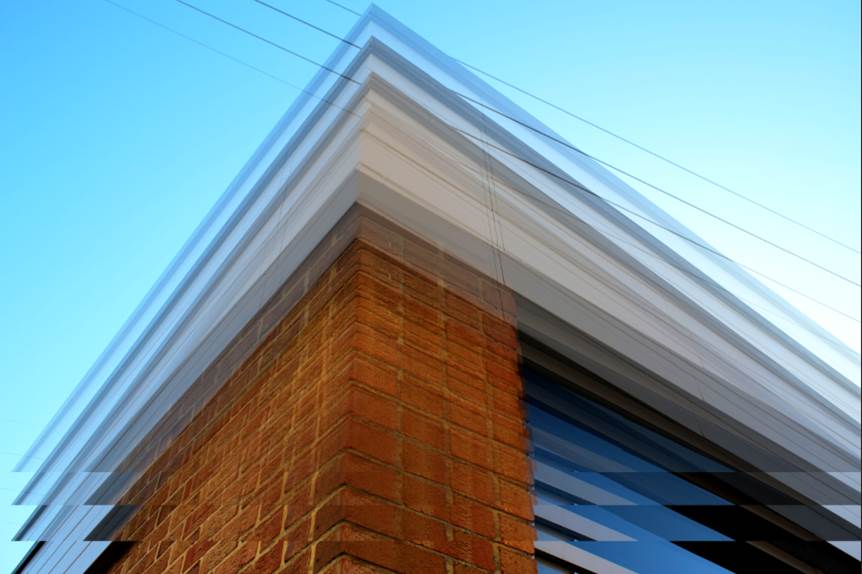
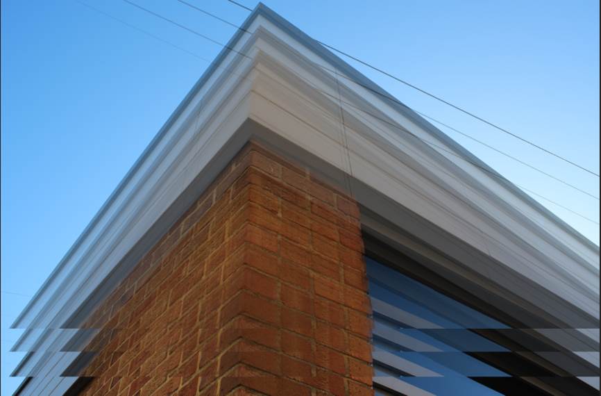
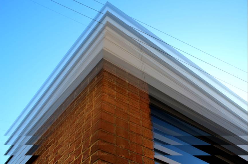
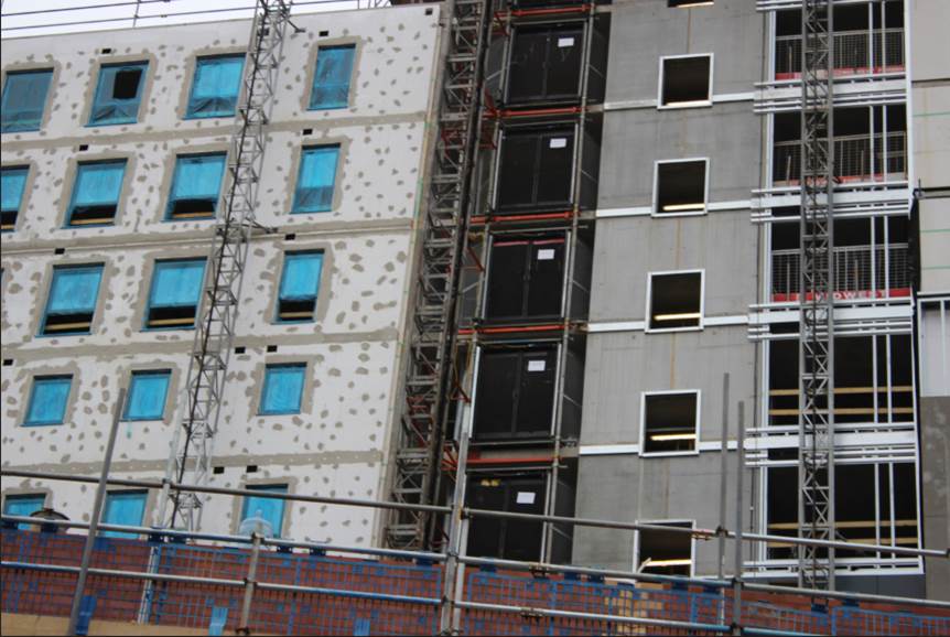
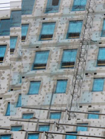
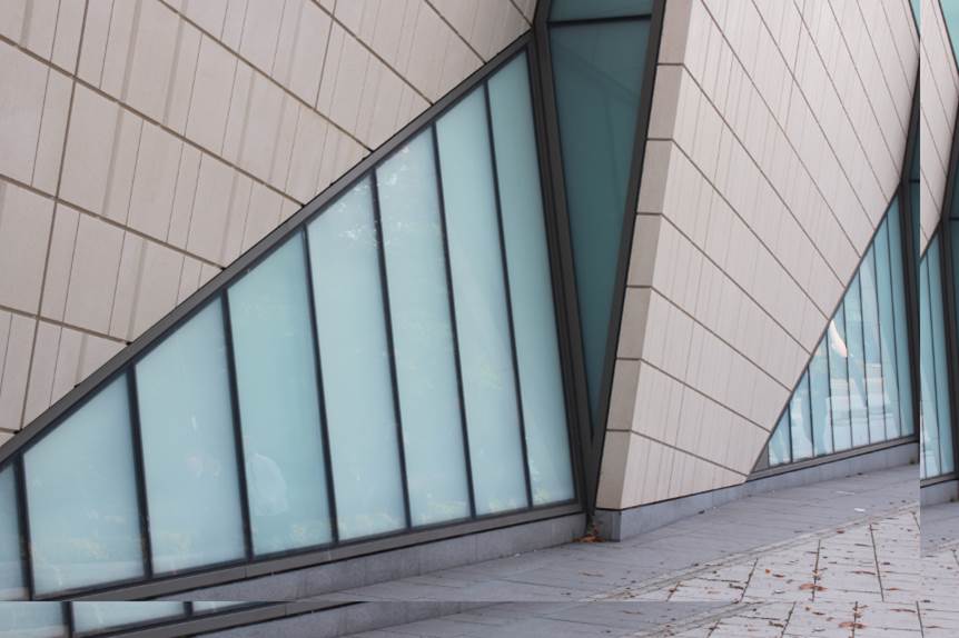
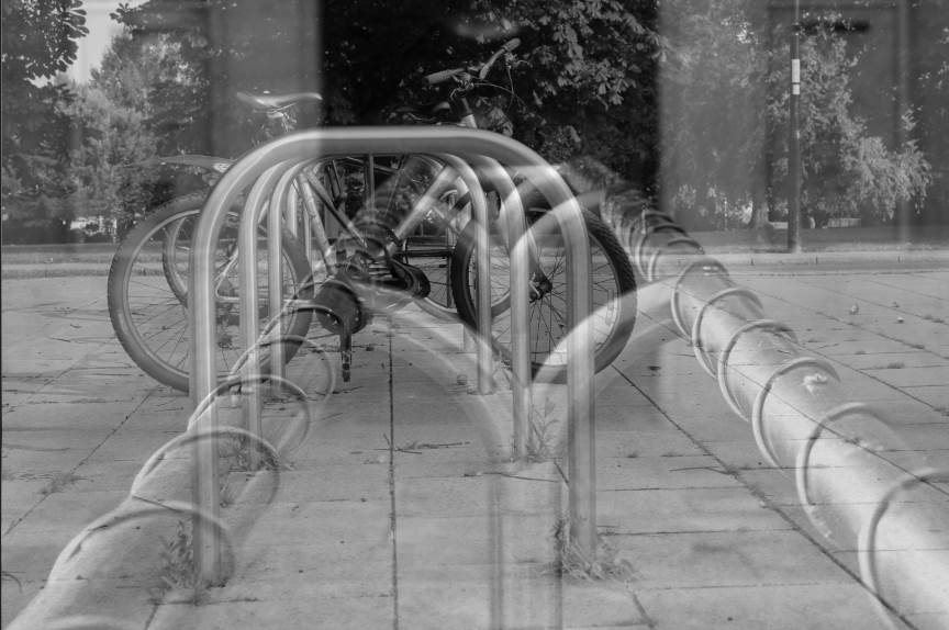
PHOTOSHOOT 2 - CITY CENTRE.
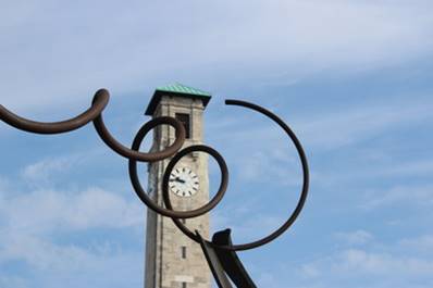
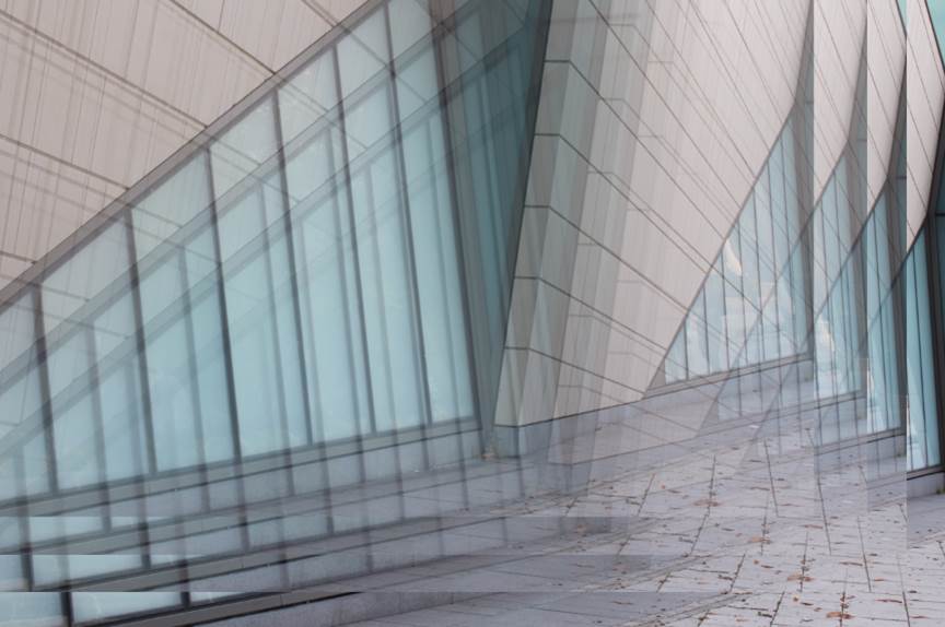
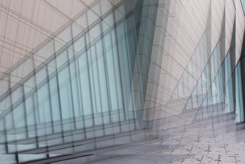
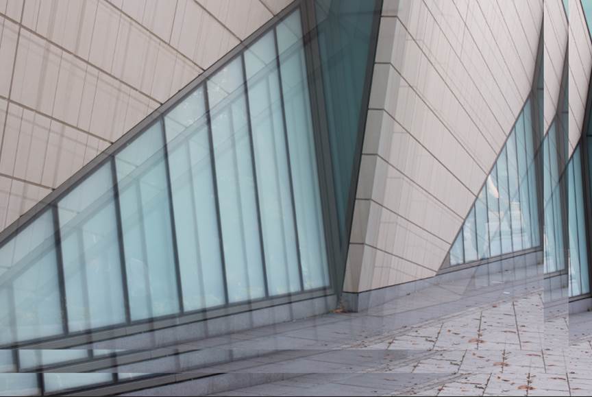
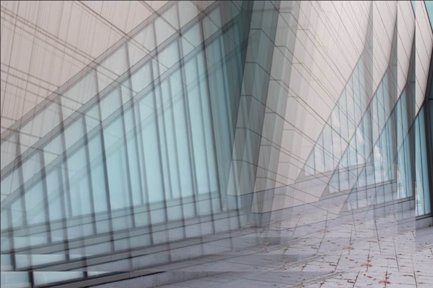
looking up.

EDITING PROCESS.
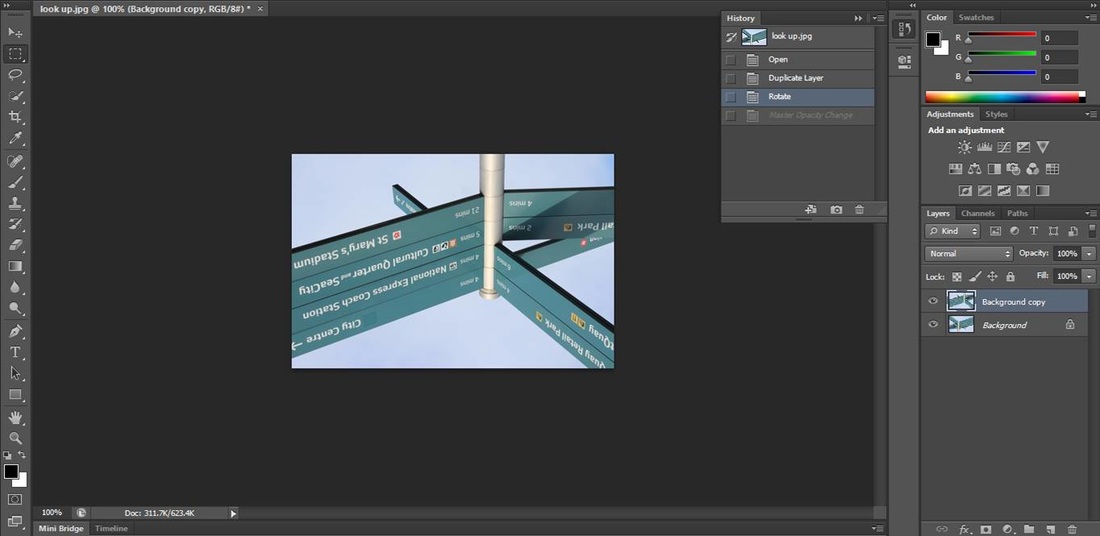
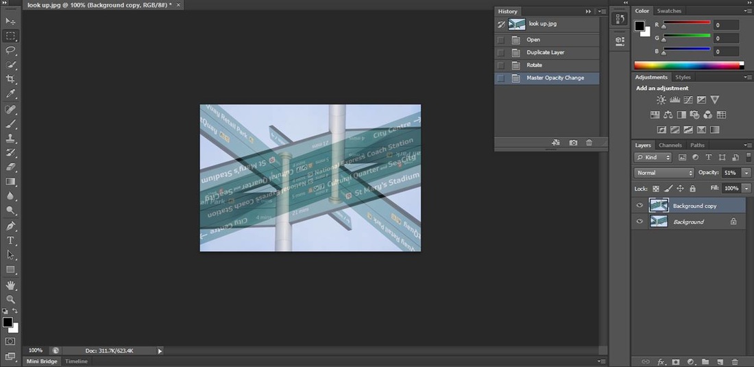
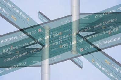
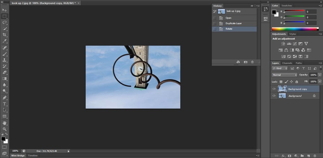
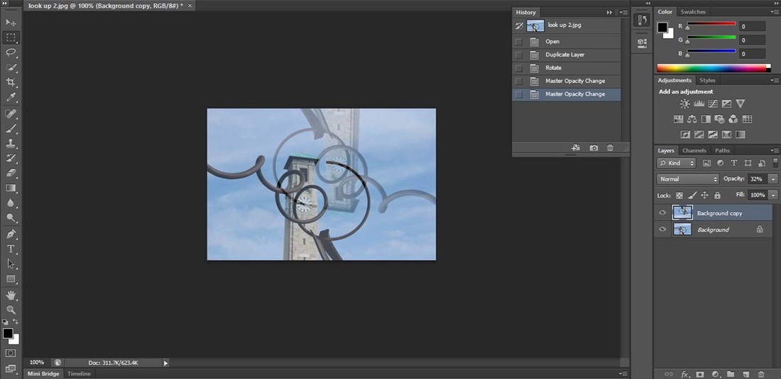

For both of these images I duplicated the layer, I then rotated one of the layers 180 degrees and lowered the opacity to just below 50% to create the images above. I edited these images like this because hey are simple to edit, they look simple but it has an interesting effect.
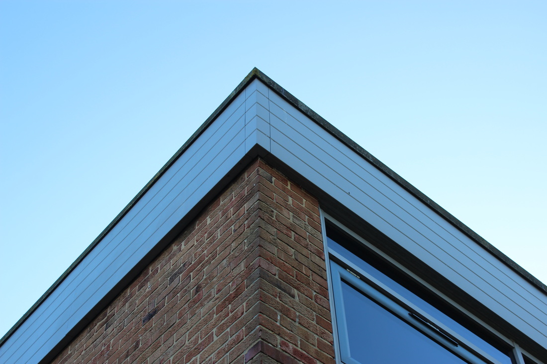
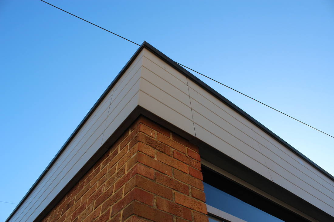
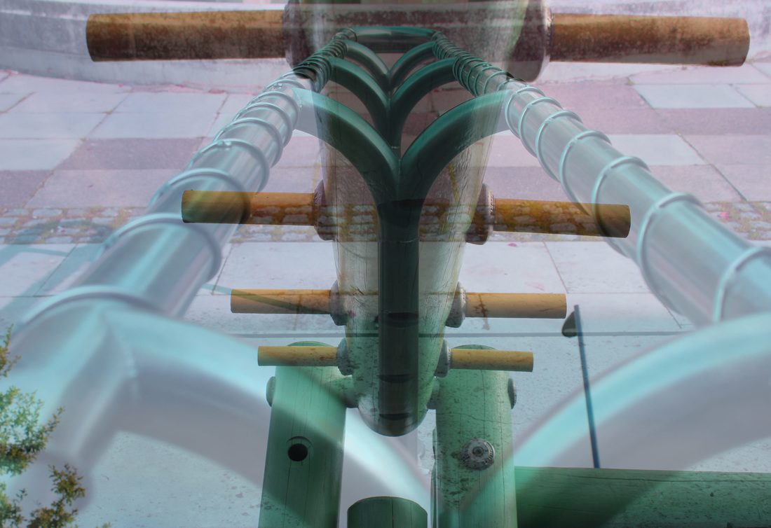
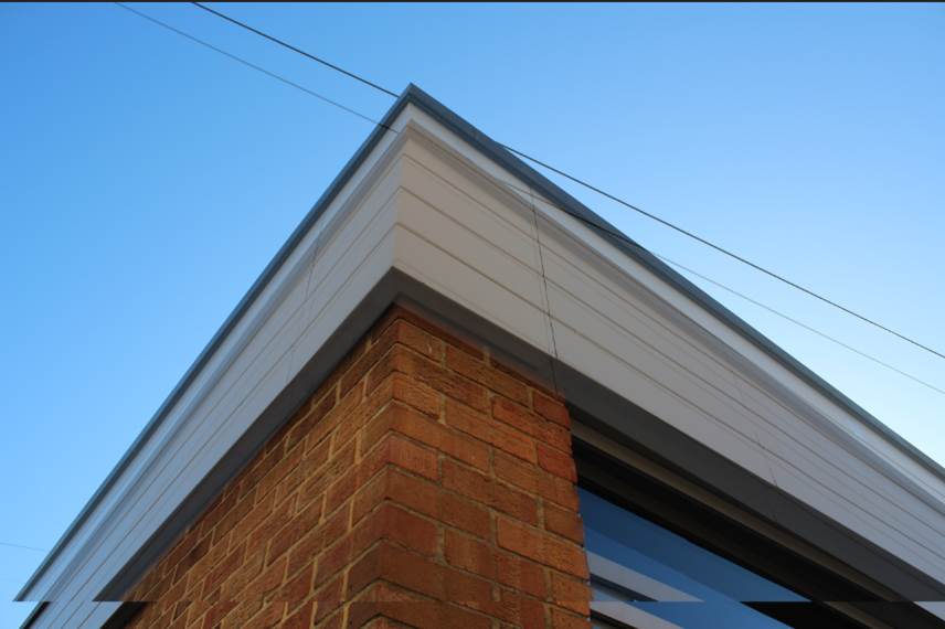
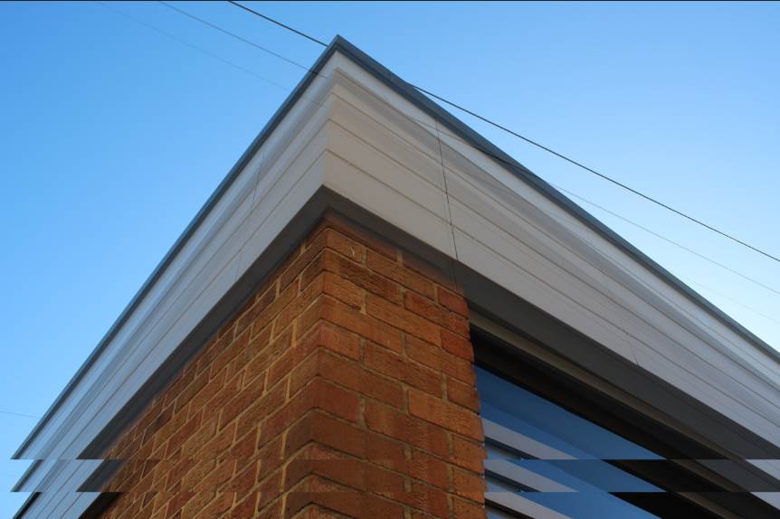
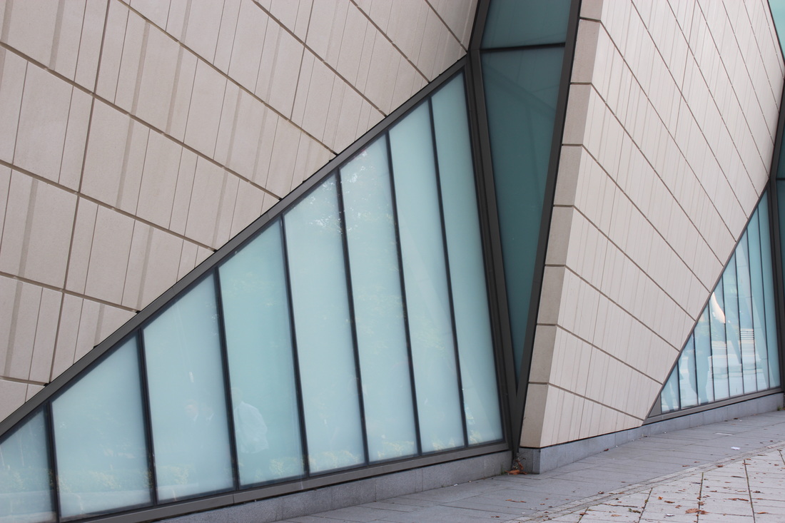
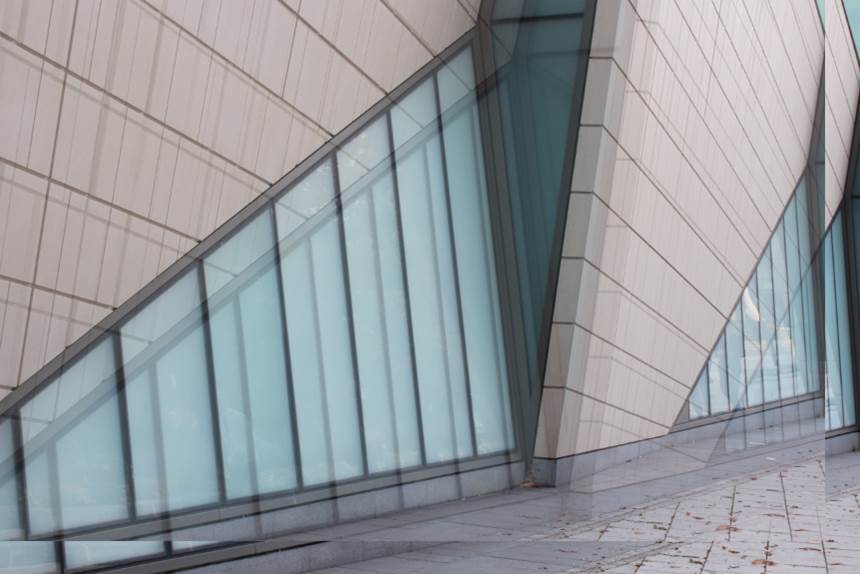
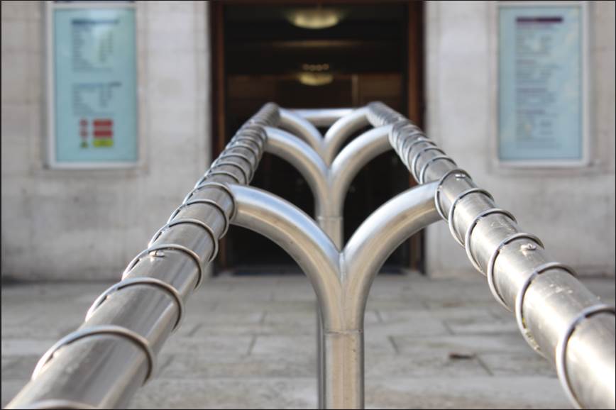
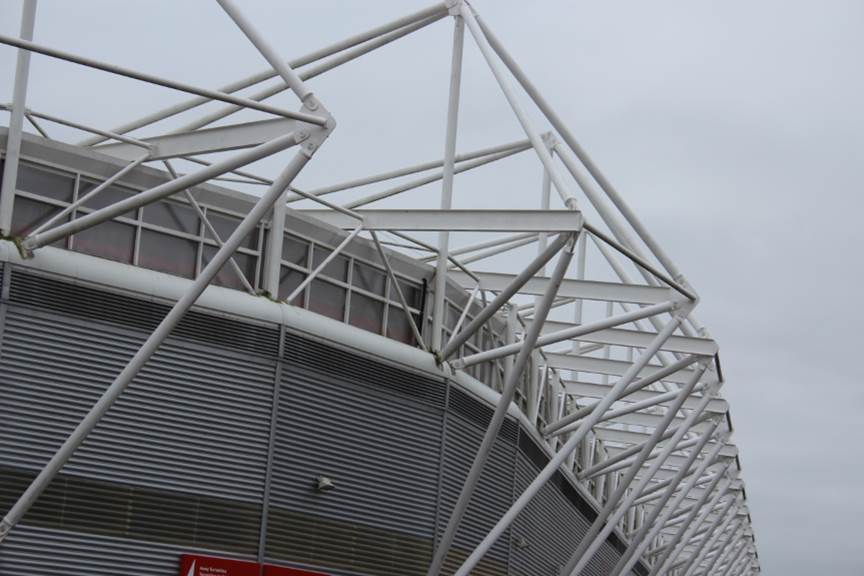
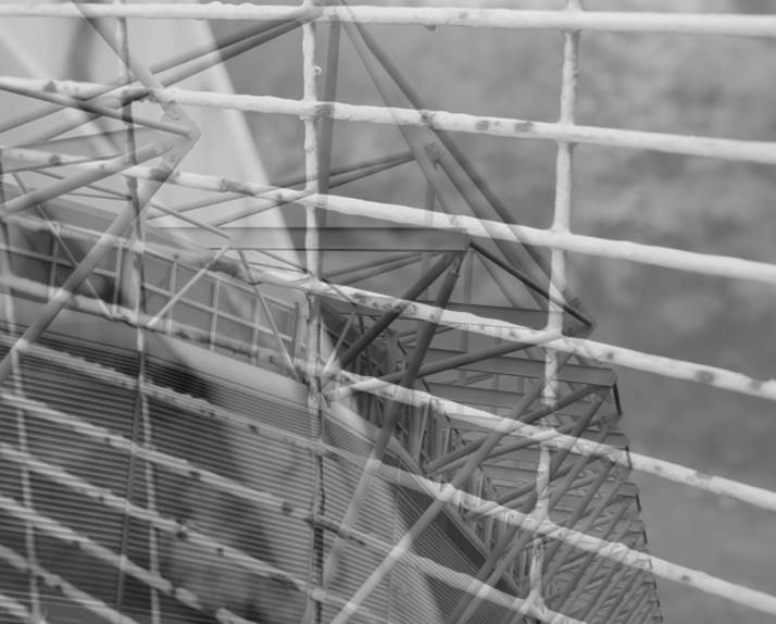
unusual viewpoint.
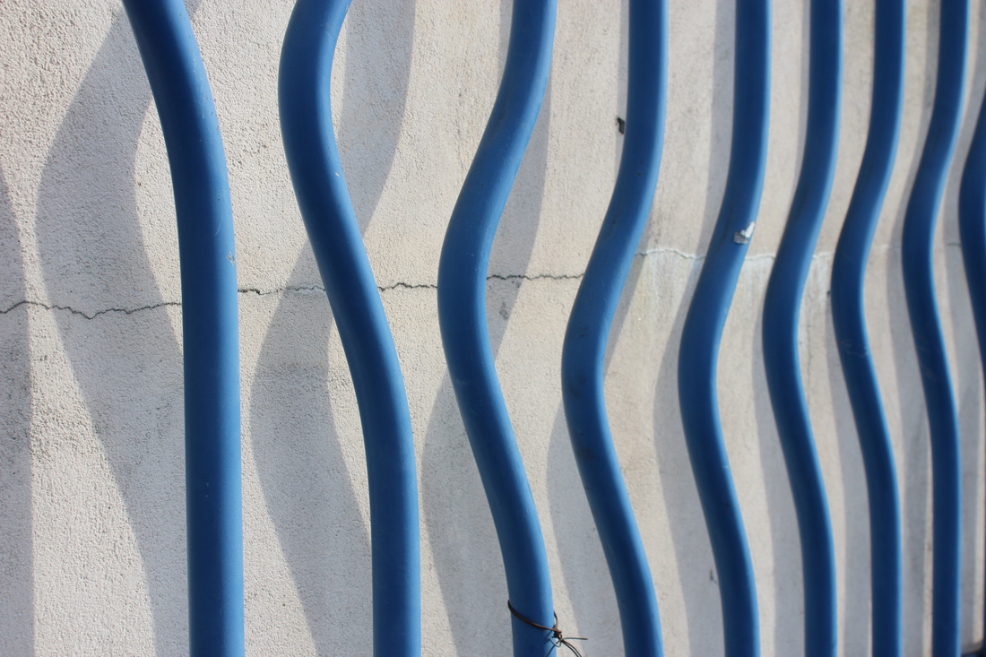
edges.


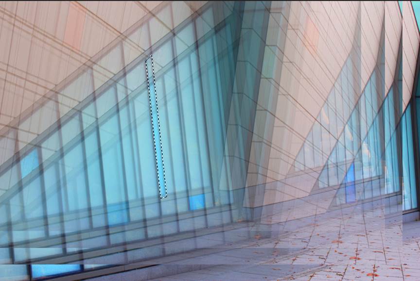
edit process.
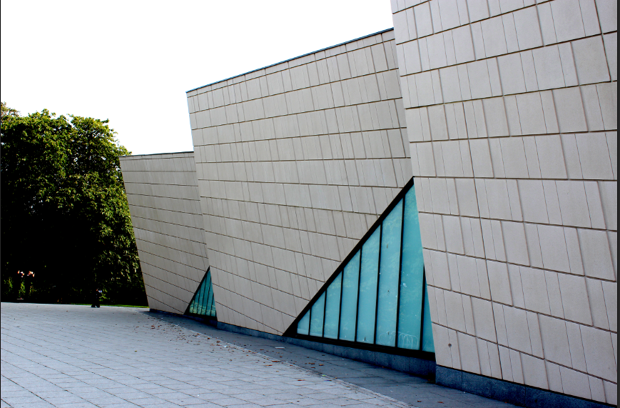
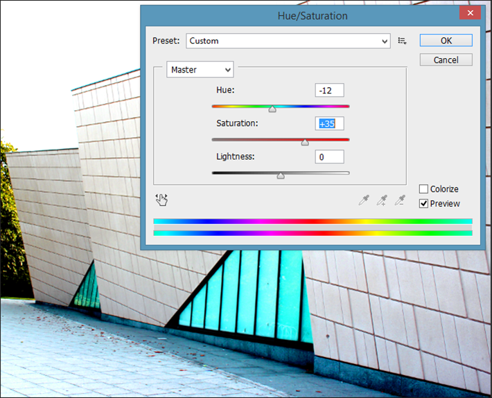

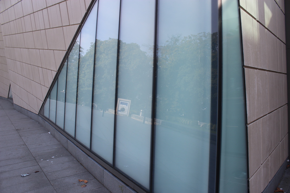
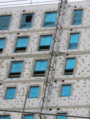
To edit these images, I firstly had to crop the trees out of the back of the image, I then adjusted the levels on the photo to make the image more tonal. Next I adjusted the Hue/Saturation to make the blue of the window even brighter and to make the grid on the building stand out even more to get the final image.
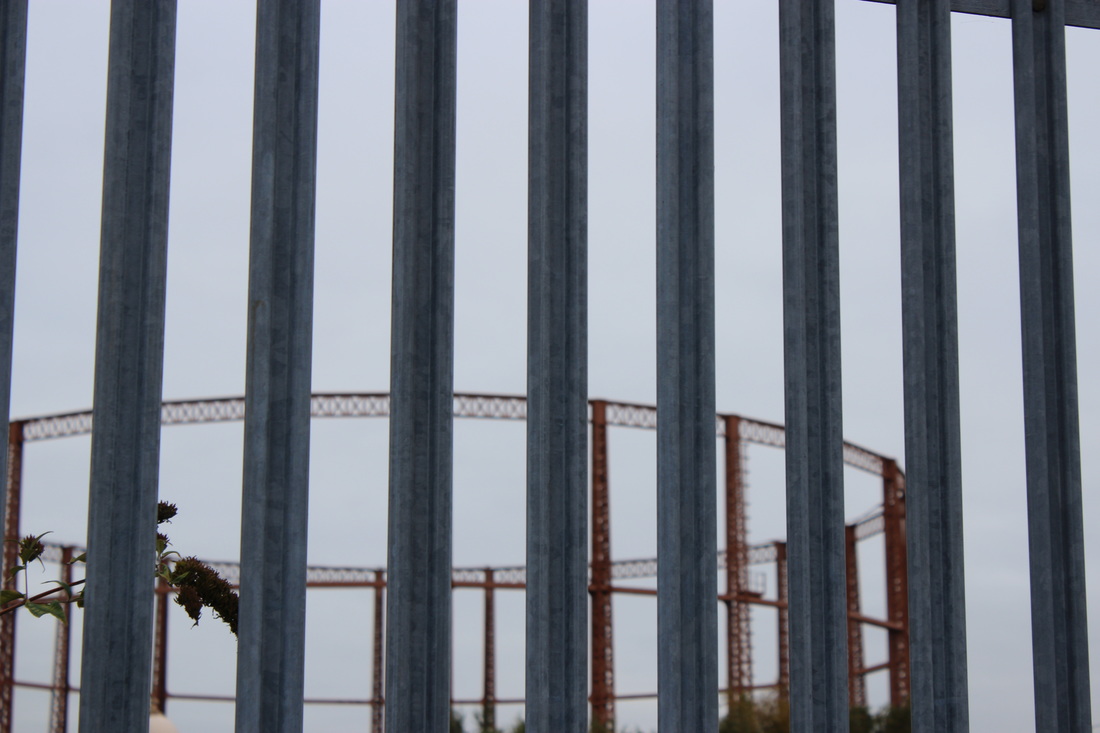
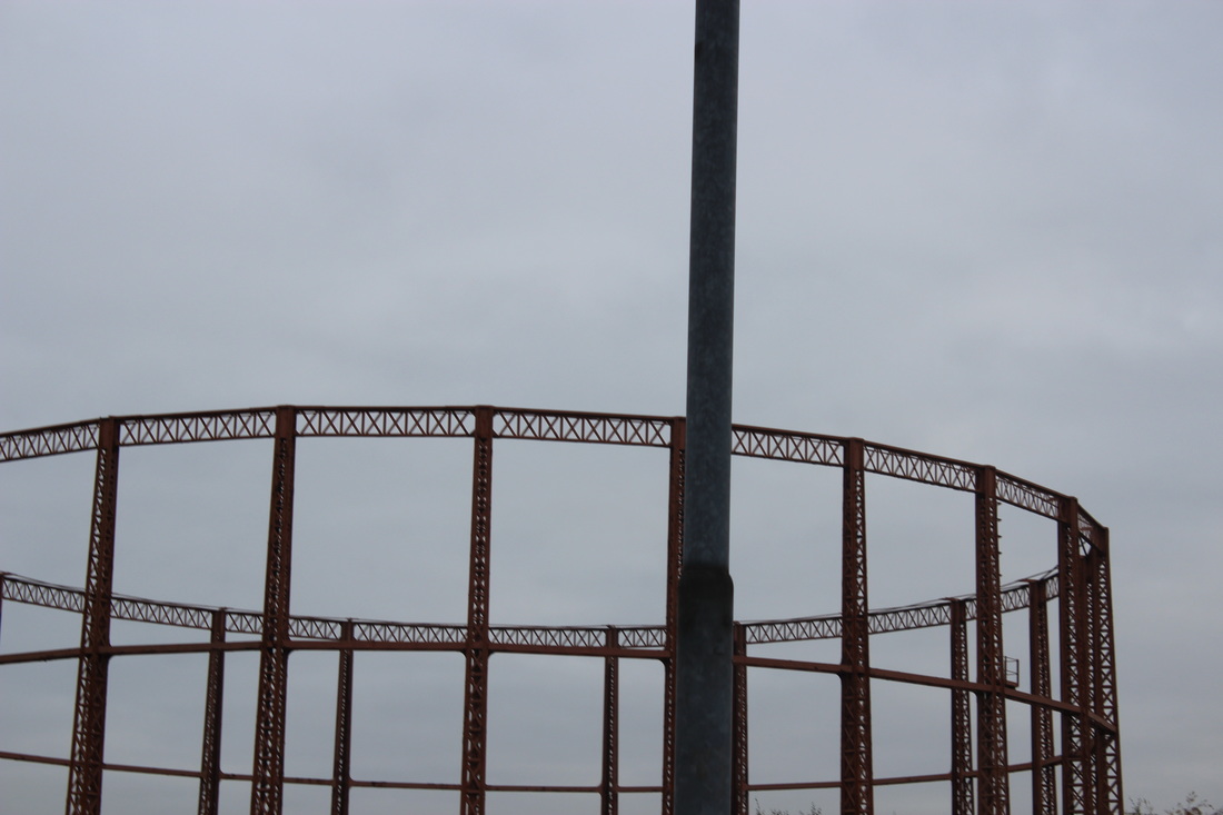
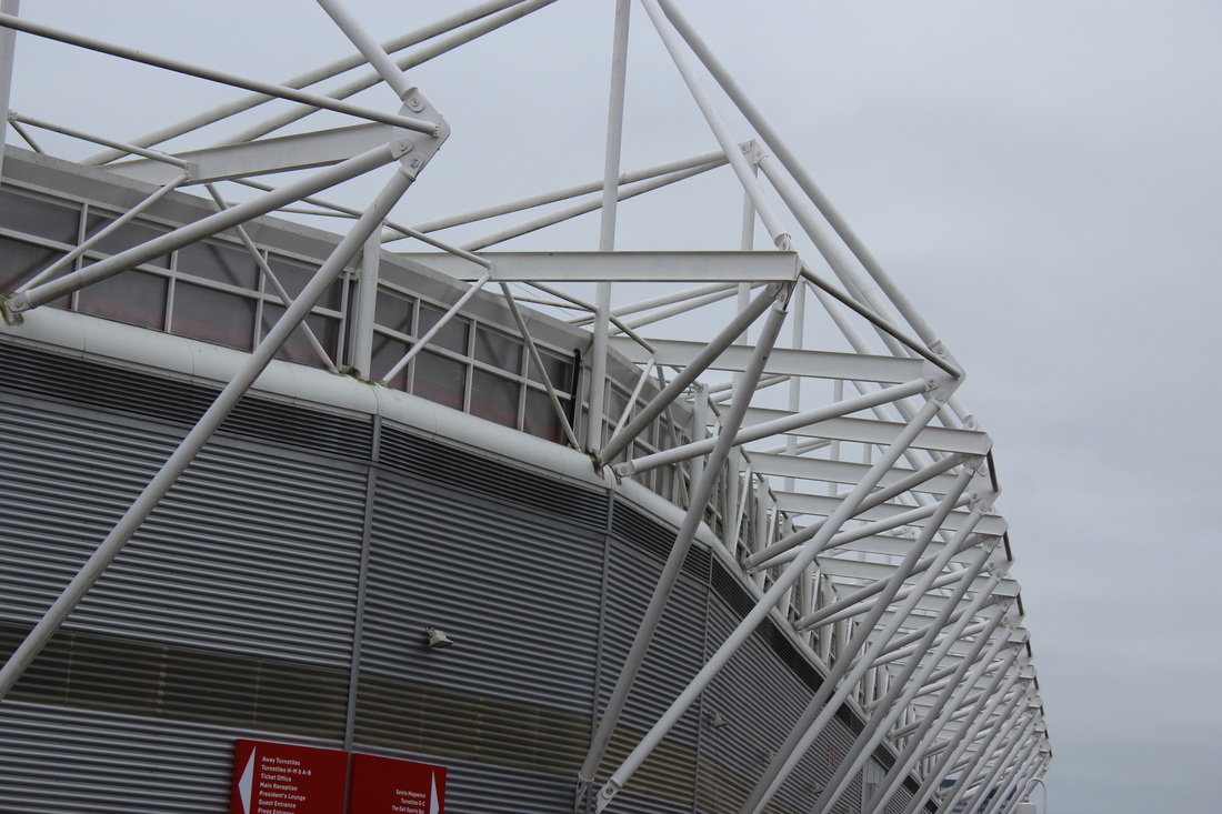
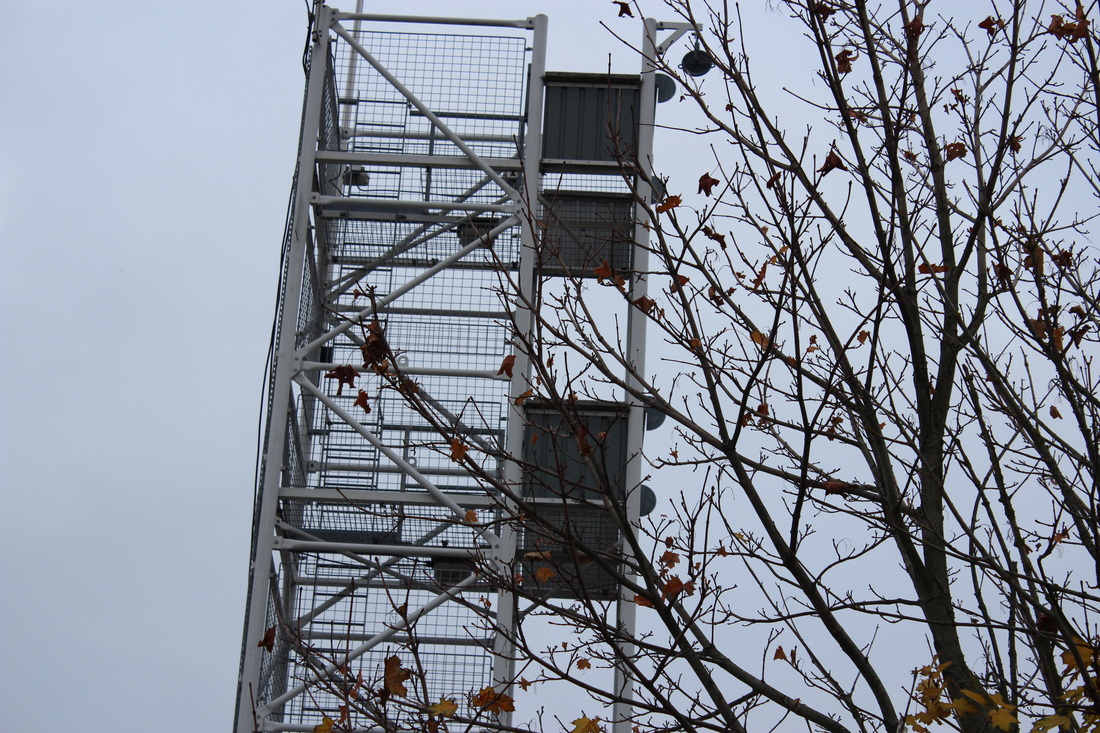
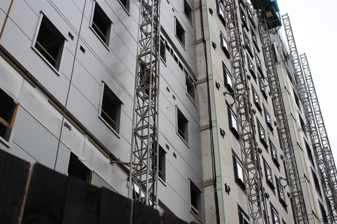
MOHOLY-NAGY.
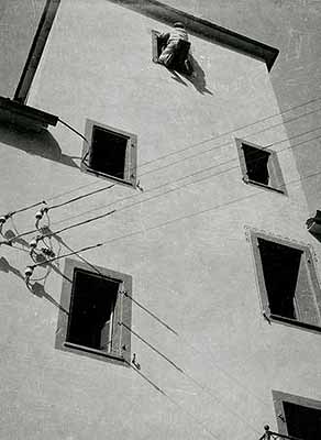
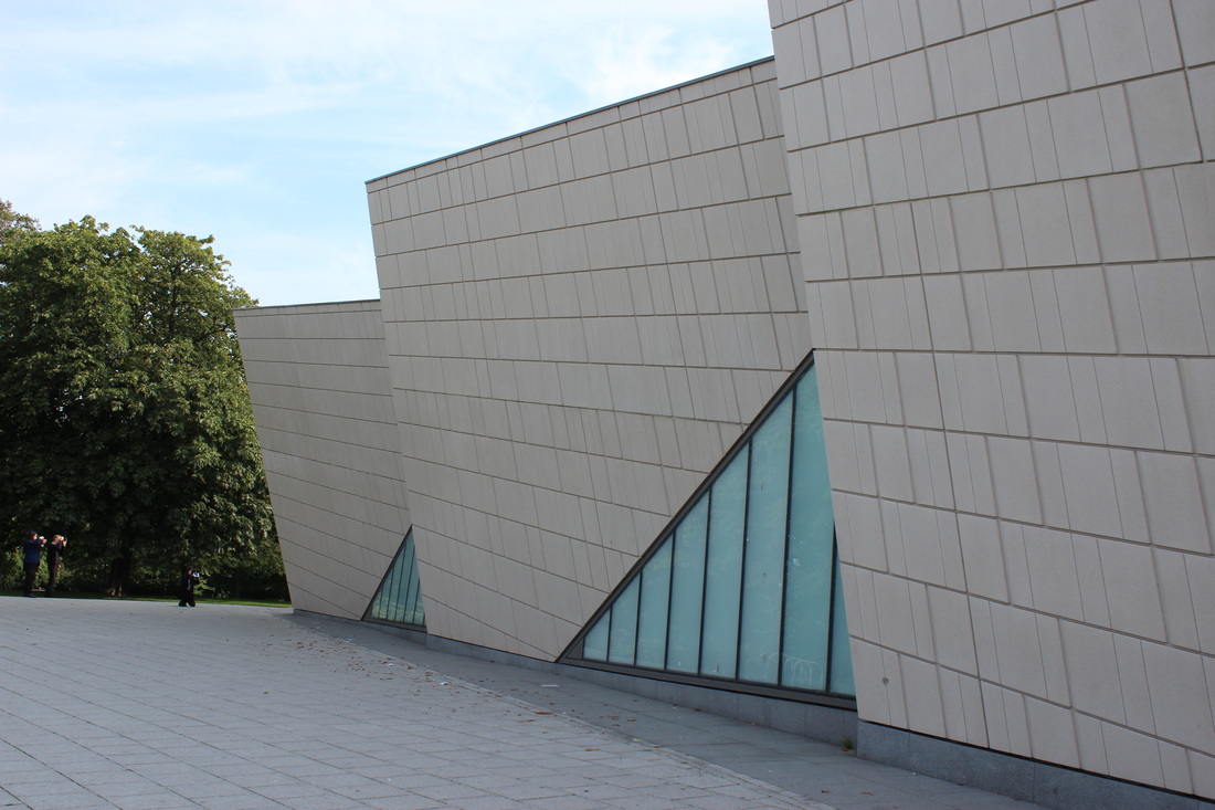
Moholy-Nagy enjoyed taking close up photos of buildings from ground level. He focuses on buildings that are quite modern with really bold and defined edges. Occasionally the photo has a person as a view point, this shows a sense of scale in proportion to the building. The angle he took the photo from is cleverly chosen to make the structure seem taller and bigger making the images more abstract.
LOOKING UP, BUILDING EDGES.
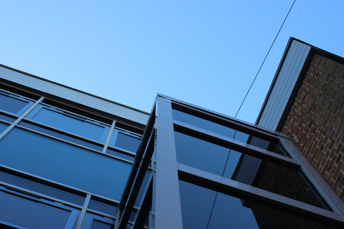
editing process.
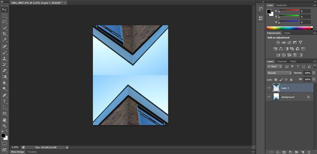
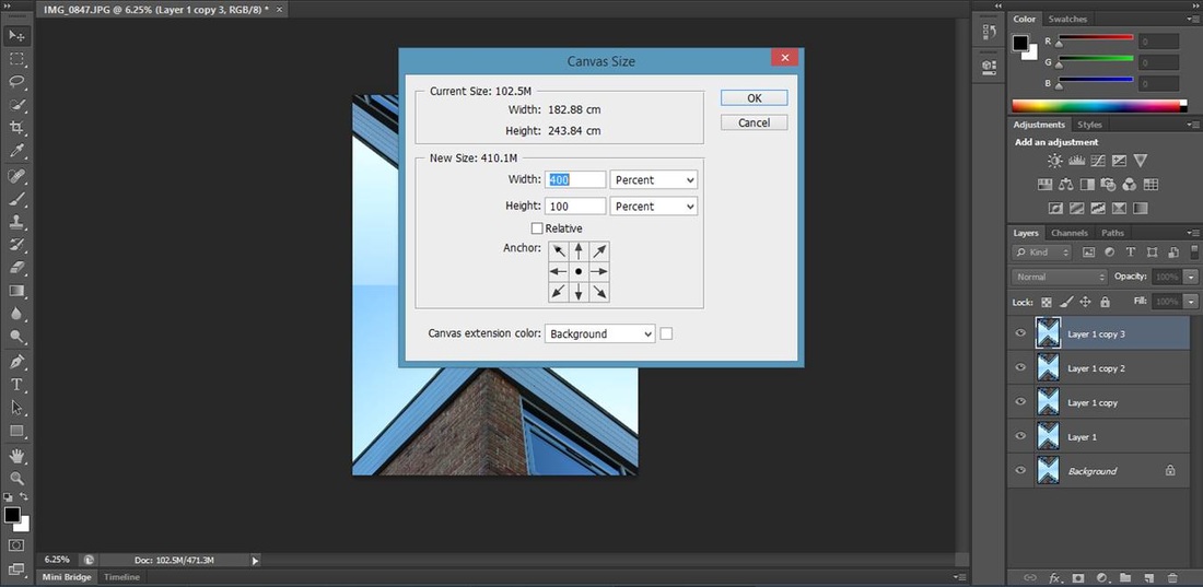
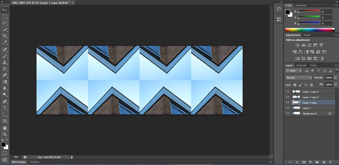
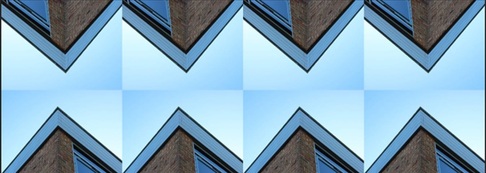
To create this image I firstly duplicated the layer and increased the canvas size to make sure it fit. I then moved the second layer onto the canvas, I then rotated the second layer 180 degrees. Next I duplicated the layer another two times so there is four images, rotated that so that the images are opposite each other. I grouped that whole image, increased the canvas again and copied and pasted it onto a separate window to create the image above.
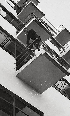
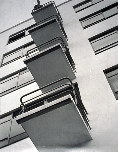
Paul strand.
|
Formal elements.
Focus: Most of this image taken by Paul Strand is in focus, however because it is an older image the edges of what seems to be a table isn't as clear as it could be if it was taken with a newer camera. Towards the bottom of the image the focus gets softer. Light: This image is taken with natural lighting, the darker areas are where something is in the way of the sun creating shadows. The further down the image the darker the lighting gets, underneath the table top is the darkest area where no light is getting to it. The lightest areas are where the natural lighting can get to creating the nice bright shapes on the wall and the table top. The closer the shapes are to the light, the more crisp the lines of the shapes are, the lines on the table are very sharp and bright. The light could be coming through a chairs slats to create the shadow effect. Line and Shape: There are strong curved lines along the bottom of the image where the table sweeps across the centre of the image, these lines are complemented nicely by the geometric lines that are completely straight, these lines are created by all man-made objects. Repetition: The strong strobes of sunlight create the repeated straight shadows that lie on top of the table and across the wall. These create a dramatic looking effect. The repeated slat effect looks like the wooden decking that you can get on the garden. Space: This image is quite a flat however its full, all the space in the image is filled up. Its quite a shallow and well constructed. You cant see the whole of each object in this image so Strand must have been quite close when taking this photograph and used minimal cropping. Texture: All the objects in this image appear to be quite smooth and not very textured. The points on the shadows of the slats look quite sharp but the rest of the image isn't very textured. Value/ Tone: This image has a wide range of tones, starting at very dark underneath the table top and ending very light and bright in the shadow shapes on the table. Most of the picture is mid tone with shades of dark and light browns, none of the darker tones are black, the darker tones are very dark brown. |
|
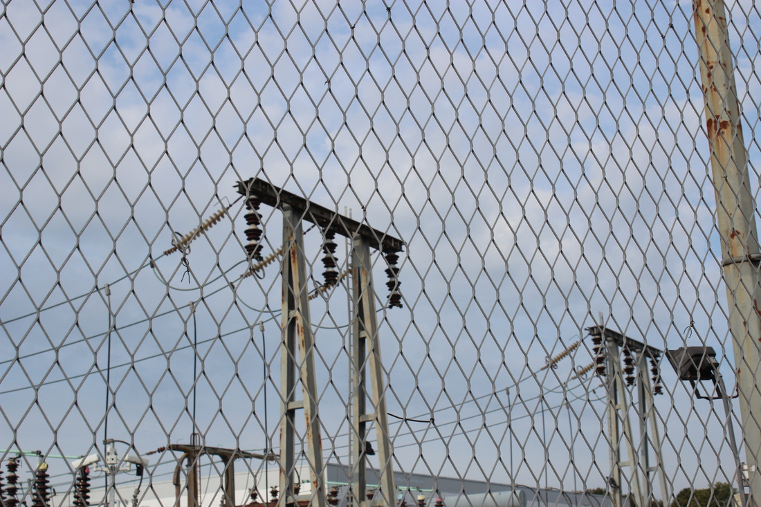
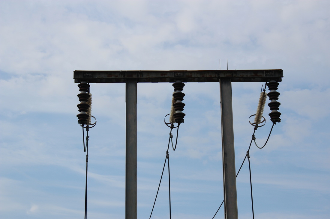
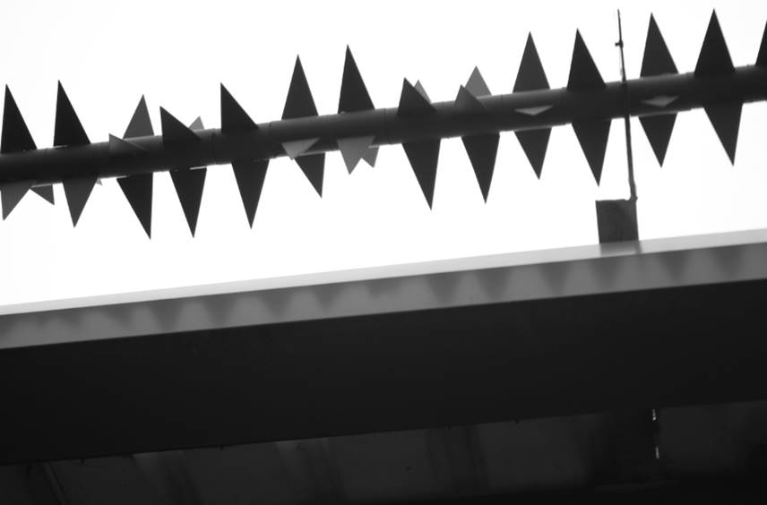
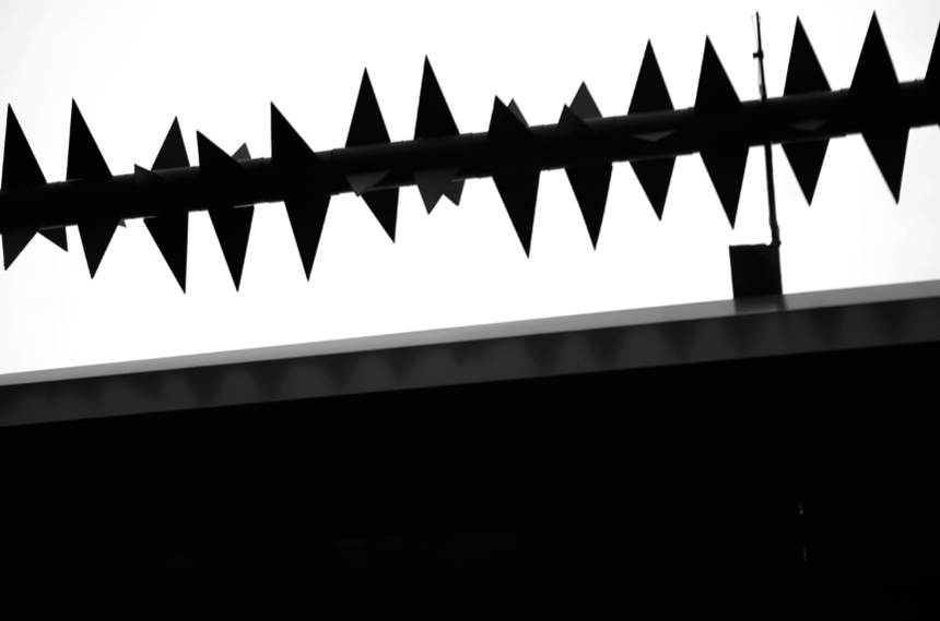
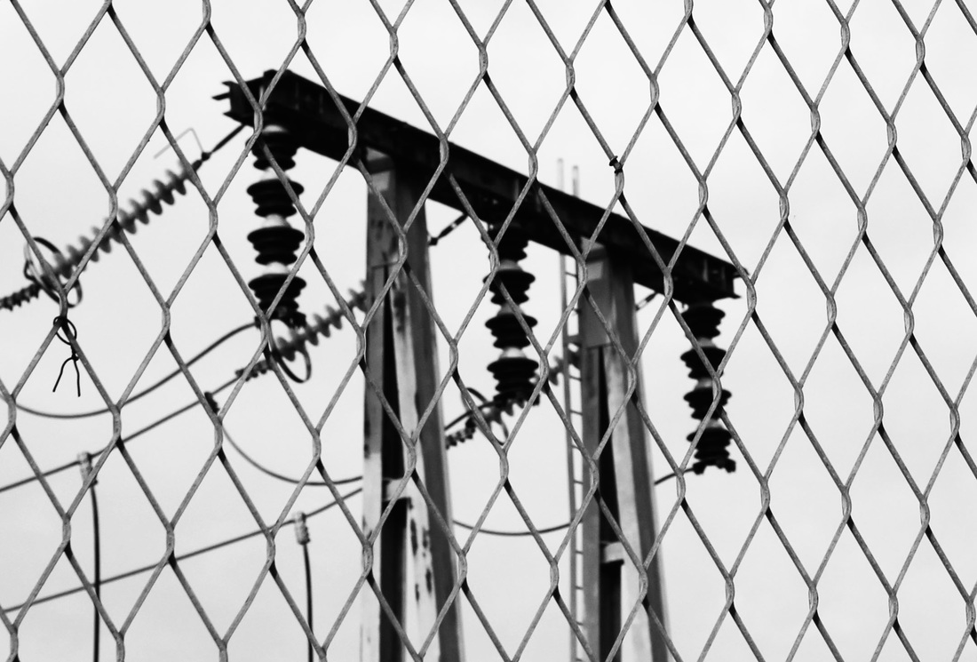
Keld helmer Peterson.
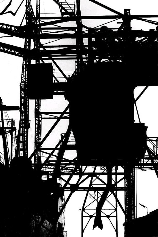
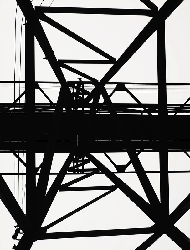
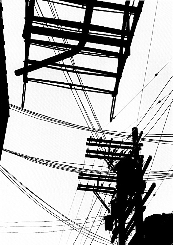
These photos are created by a silhouettes of power lines and all sorts of electrical poles. The silhouettes are created by a normal photo then on photo shop the contrast is put really high to make the sky seem very bright and the structure very dark and detailed. Peterson focused on lines and the structure of these images to make the structure bold and clear.
Petersons images inspire me to recreate them using the formal elements of line and focus. These images will help me investigate the theme of urban environment.
Petersons images inspire me to recreate them using the formal elements of line and focus. These images will help me investigate the theme of urban environment.
my response.
This is the original image.
|
I cropped the image down to the centre of the image.
|
I then changed the image mode to grayscale.
|
After that I adjusted the levels to make the background buildings more defined.
|
To finalise this image I altered the brightness and contrast to make the silhouette stand out.
|
This is the original image, it didn't need cropping because the shapes in the image create a good effect.
|
Next I changed the image to grayscale to discard all the colour.
|
Finally I increased the contrast to the highest it goes and decreased the brightness slightly to create the silhouette effect and make it into the style of Peterson.
|

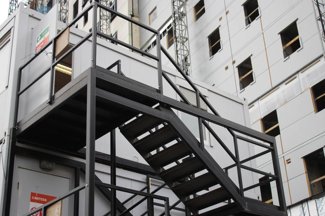
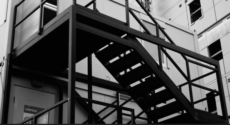
This is the original image.
|
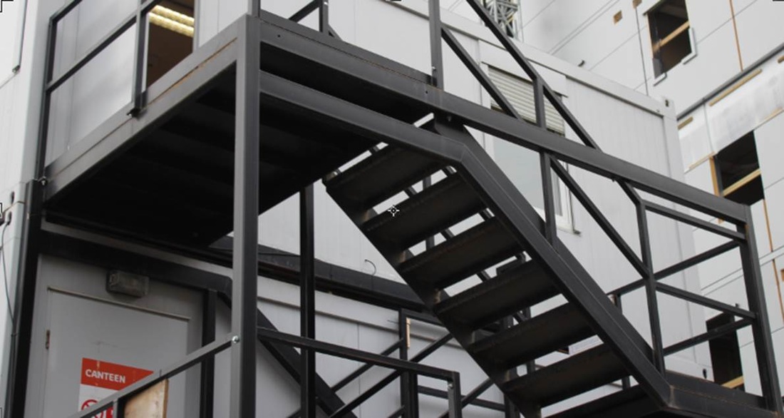
I cropped the image down to just the staircase because the stairs are the only section of the image that are in the style of Peterson.
|
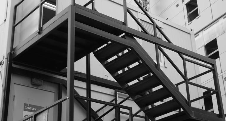
I then discarded the colour on grayscale.
|

Finally I increased the contrast to make the image in the style of Peterson.
|
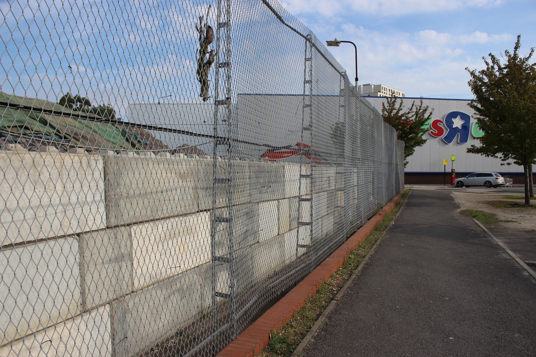
photoshoot 3. pattern, shape and repetition.
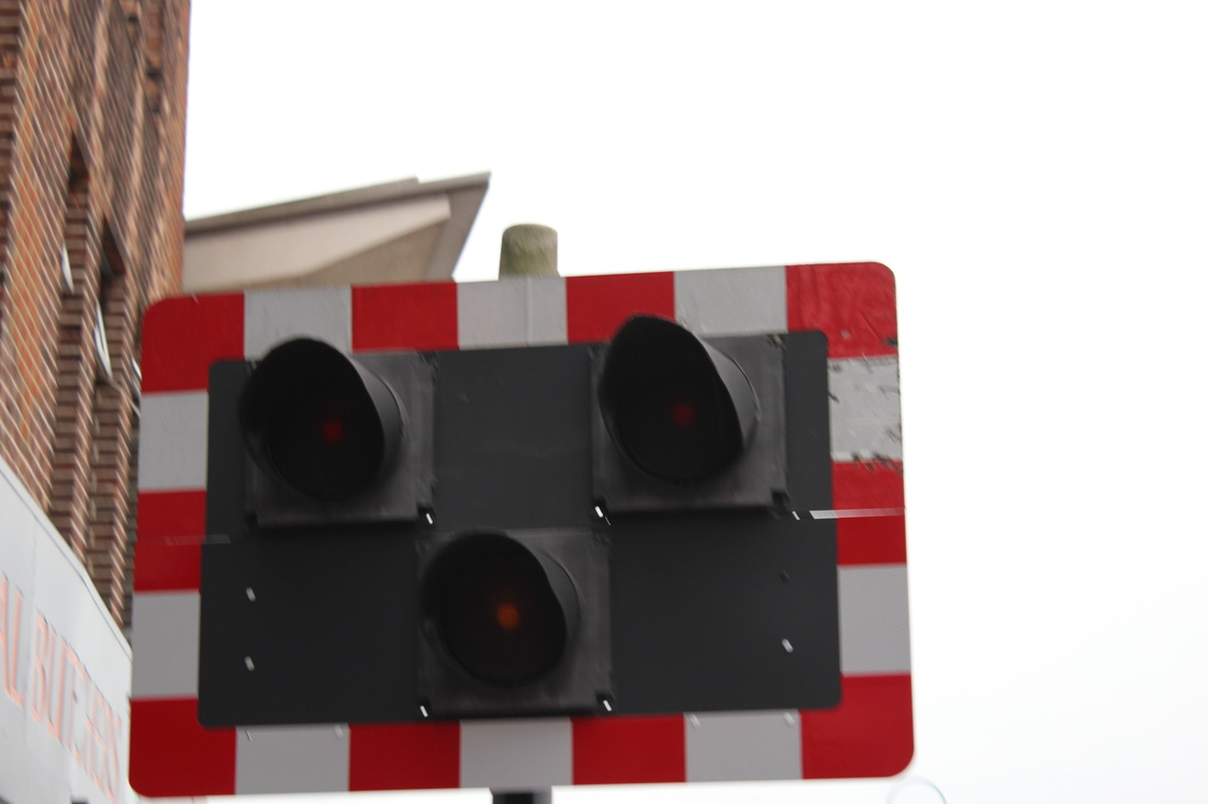
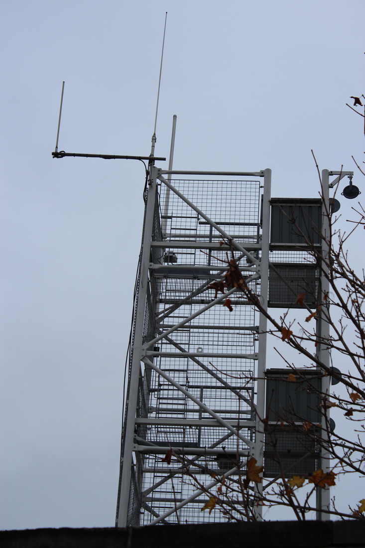
In these images I looked at shape, repetition and pattern. The photos were taken on city streets and are all man made structures. I have grouped the photos into the certain categories that they fit into. The first are shape, the next are repetition and the last are pattern.
Shape.
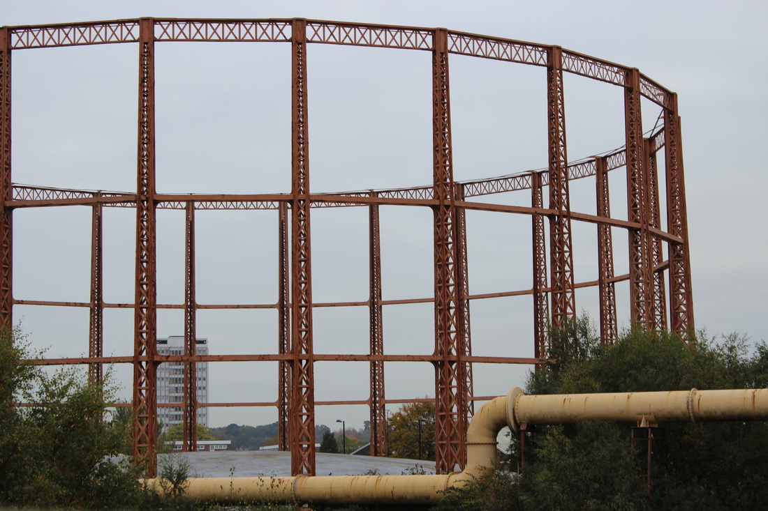

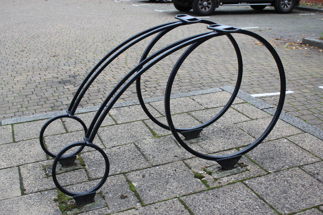
line.

Repetition.


I chose these 12 images as my best images. On this photo shoot we were inspired by Keld Helmer Peterson, Michael Wolf and Moholy-Nagy. I think these 12 photos are most effective because they all have a link to one of the photographers.

For all six images I firstly put grayscale on them to discard the colour so they are completely black and white. I then adjusted the levels. Once I did that I then adjusted the brightness and contrast to make them more effective. These images show a link to Peterson because the silhouettes are the main focus of the image.

10 best images.


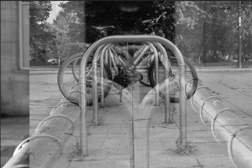
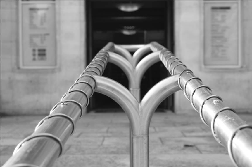
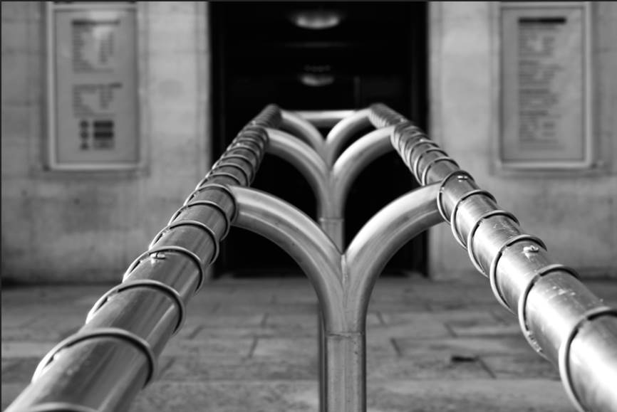
These images are the 10 best images that I have taken through out this project. The last two images are edits that I am pleased with but the rest are normal images that I have taken. All these images have a theme of strong lines.
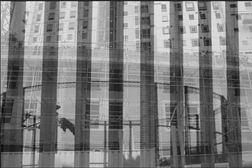
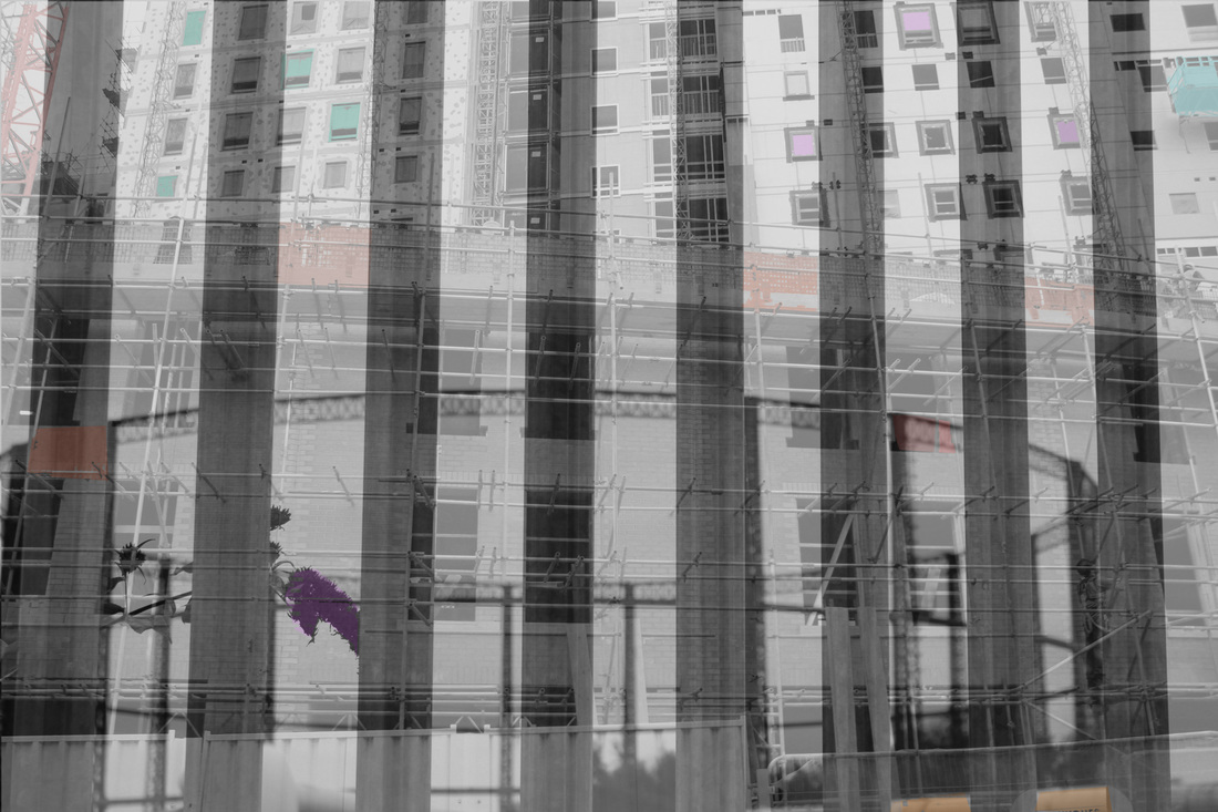
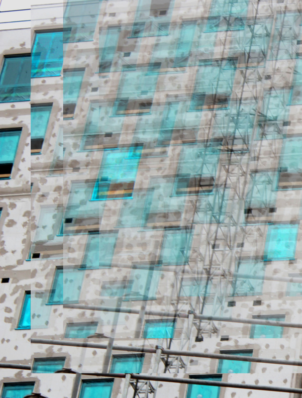
For these images I firstly copied and pasted one image onto the second layer. I then lowered the opacity of one of the images. Next I lowered the brightness and made the contrast higher. Then I adjusted the hue and saturation to create the slightly unnatural colouring.
To create this image I firstly cropped the image down so its just the image focus. I then duplicated the layer and moved it up to the top right corner slightly and lowered the opacity to 75%.
|
Next I repeated that process again and lowered the opacity again to 50%.
|
Then I repeated it again lowering the opacity again to 25% to create this shadowed / repeated effect on the image.
|
|

|
|
To create these image I firstly cropped the image down so its just the image focus. I then duplicated the layer and moved it up to the top right corner slightly and lowered the opacity to 75%. Next I repeated that process again and lowered the opacity again to 50%. Then I repeated it again lowering the opacity again to 25% to create this shadowed / repeated effect on the images.
final piece.
For my final piece I am going to create two types of edits. One being where an image is repeated as the opacity is lowered creating a shadowed effect. Another edit being two black and white images layered on top of each other with slight colour added into it.
I decided to do this because these two types of edits were the two that have turned out best through out this project.
I decided to do this because these two types of edits were the two that have turned out best through out this project.
Image one.
This is my original image. I didn't need to crop it down or edit it to start with because there is so unnecessary space in the image, also the lighting is just right.
Next I lowered the opacity of the layer two to 50%, this created the gradual ghosting effect.
Next I adjusted the vibrancy and saturation of the image.
|

Firstly I duplicated the background layer, I then moved layer one up slightly.
I then duplicated layer two and moved it upwards again.
Finally I adjusted the brightness and contrast of the image.
|
Next I lowered the opacity of layer one to 75%. I didn't lower the opacity too dramatically the first time because otherwise the image wouldn't have the gradual shadowed effect.
After moving the layer upwards I lowered the opacity again to 25%. I went down by 25% each time because it gives the image an equal and gradual shadow.

|
Then I duplicated layer one and moved that layer up.
Once I had finished adjusting the opacity and positioning of the layers I then moved onto editing the image. Firstly I adjusted the levels to make the tones of the image more equal.
|
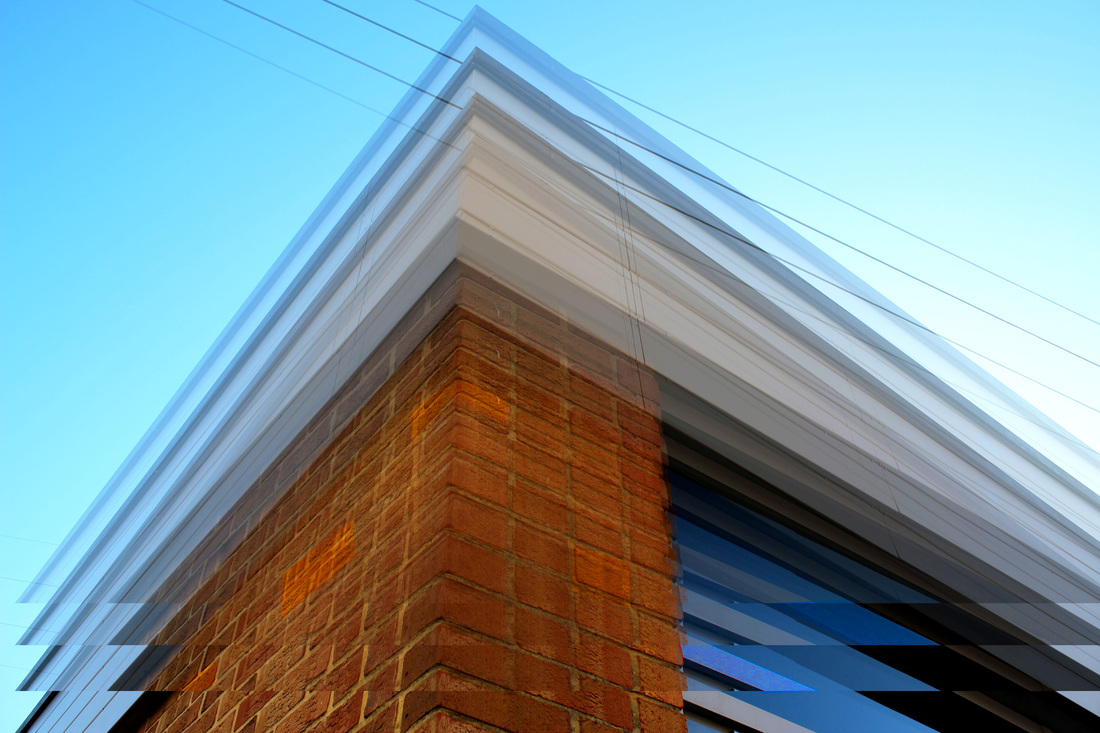
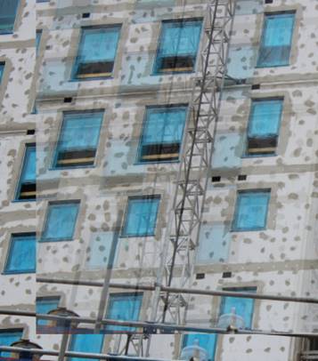
image two.
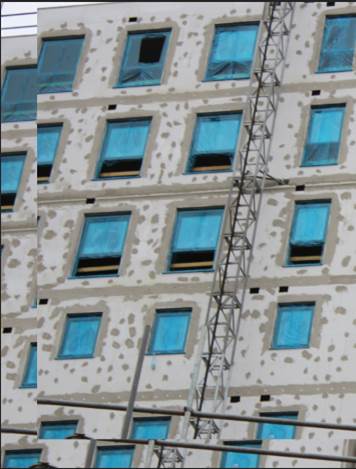
This was my original image. It did need cropping down because the right half of the image wouldn't work with the repetition theme.
I then duplicated the first layer and moved it up further into the right hand corner trying to line up the windows so they create a kind of chain in the end.

After I had adjusted positioning I started editing. Firstly I adjusted the levels which didn't make much of a difference to the image.
|
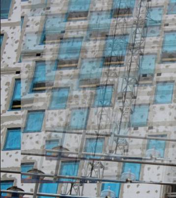
This is the image once I had cropped it down.
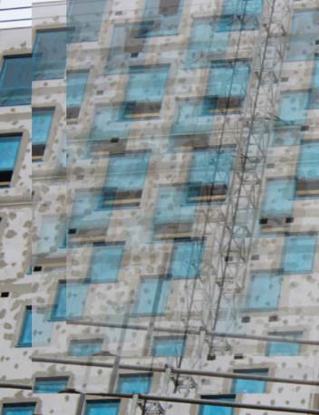
I lowered the opacity of the second layer to 50%, here you can see the slight chain through the windows.
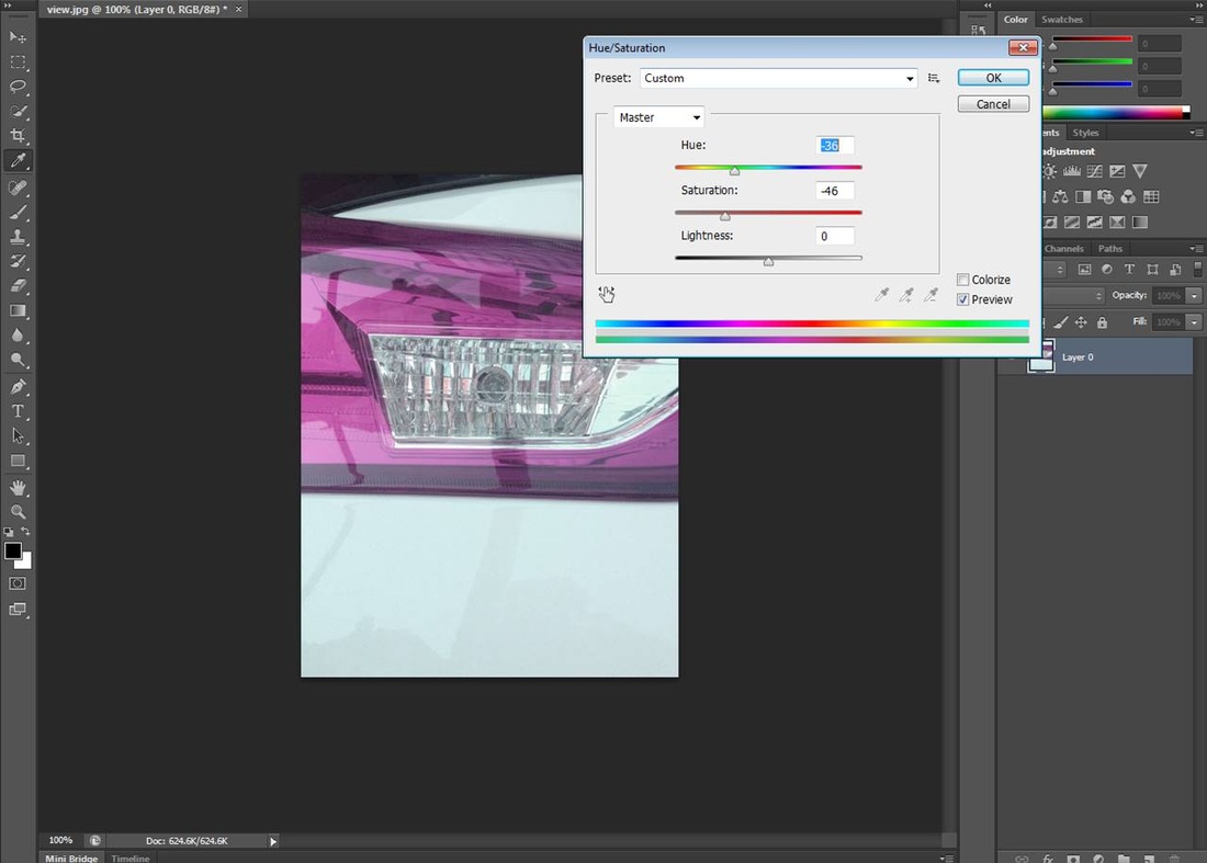
I then adjusted the vibrancy and the saturation of the image which again didn't make much of a difference.
|
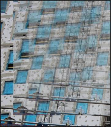
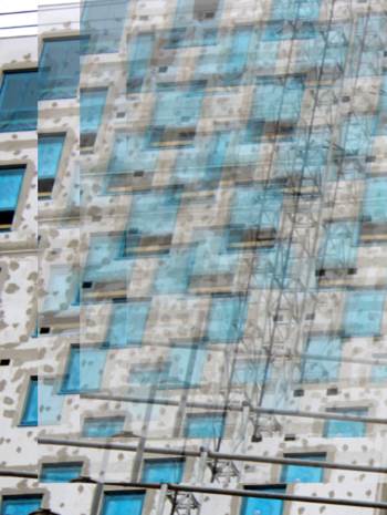
I duplicated the background layer, and then moved the first layer upwards to the right hand corner.
I then duplicated the second layer and again moved it upwards to the right hand corner.
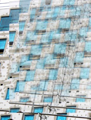
I then adjusted the brightness and contrast which did make a difference because it made the windows seem much brighter and the white wall brighter as well.
|
Next I lowered the opacity of the first layer to 75% to create a gradual pattern.
I lowered the opacity again to 25%. this created the nice chain pattern between the blue windows.
Finally I used the polygon tool to select areas of the image, I then increased the saturation of the image to make them the most noticeable sections of the image.
|

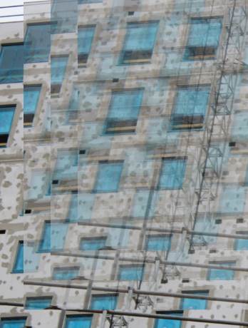
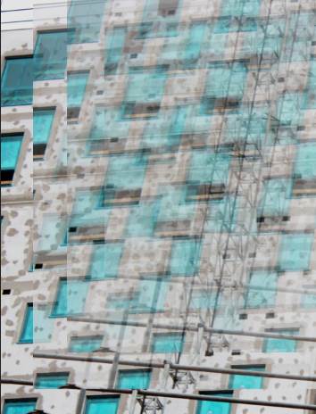
image three.
This is the original image, I didn't need to crop it down as I wanted to use each part of the image.
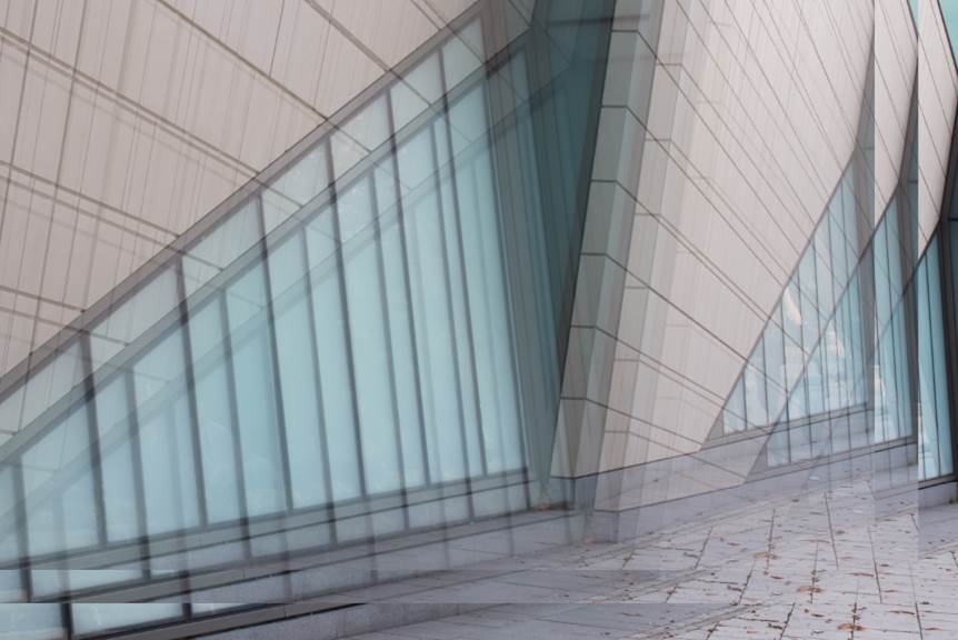
Again I lowered the opacity by 25% to 50% to make it more translucent.
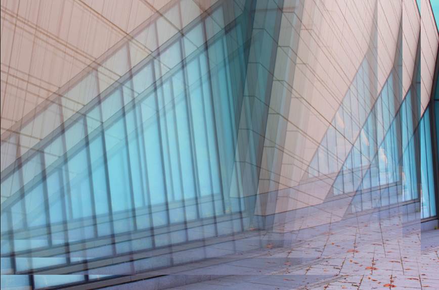
I then increased the saturation on the image to make the windows and the wall brighter.
|
I have used a very similar editing process for all three of these images. Firstly I duplicated the background layer and moved it up to the left this time.
Next I duplicated the second layer and moved it up to the left again.
To complete this image I used the Polygon Tool to select a few shapes on the image. I then increased the saturation further on these selected areas to make those areas the focus point of the image.
|
Secondly I lowered the opacity down 75% to create the repeated effect.
Then I lowered the opacity to 25% to give the shadowed effect across the image.
|
After that I then duplicated the first layer and moved it up to the left again.
Next I adjusted the levels on the image to make the main lines more defined.
|

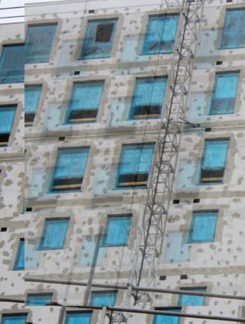
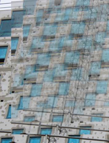
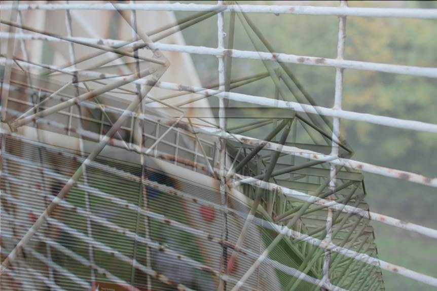
image four.
This is the original image. It didn't need cropping down because I needed to layer the other image on top before.
I then positioned the images how I wanted them and lowered the opacity to create the image above.
|
Firstly I cropped the image down slightly.

After that I adjusted the levels further to make the certain areas how I wanted them.
|
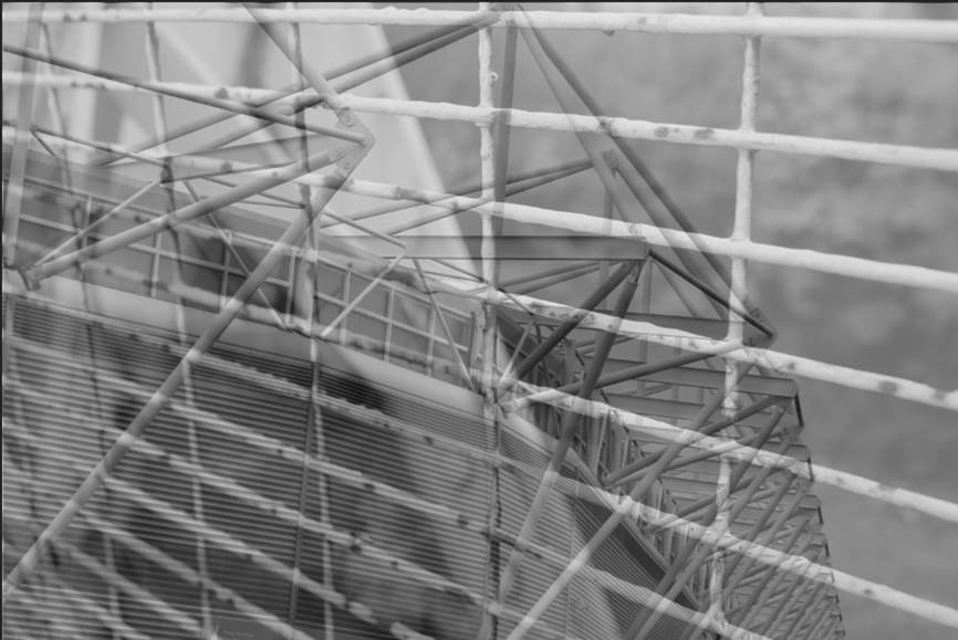
I then adjusted the contrast right to the top.
To finalise the image I cropped to down so that the empty areas weren't in the image.
|
Next I put the second image on top of the first, it had already been put in grayscale for me.
|
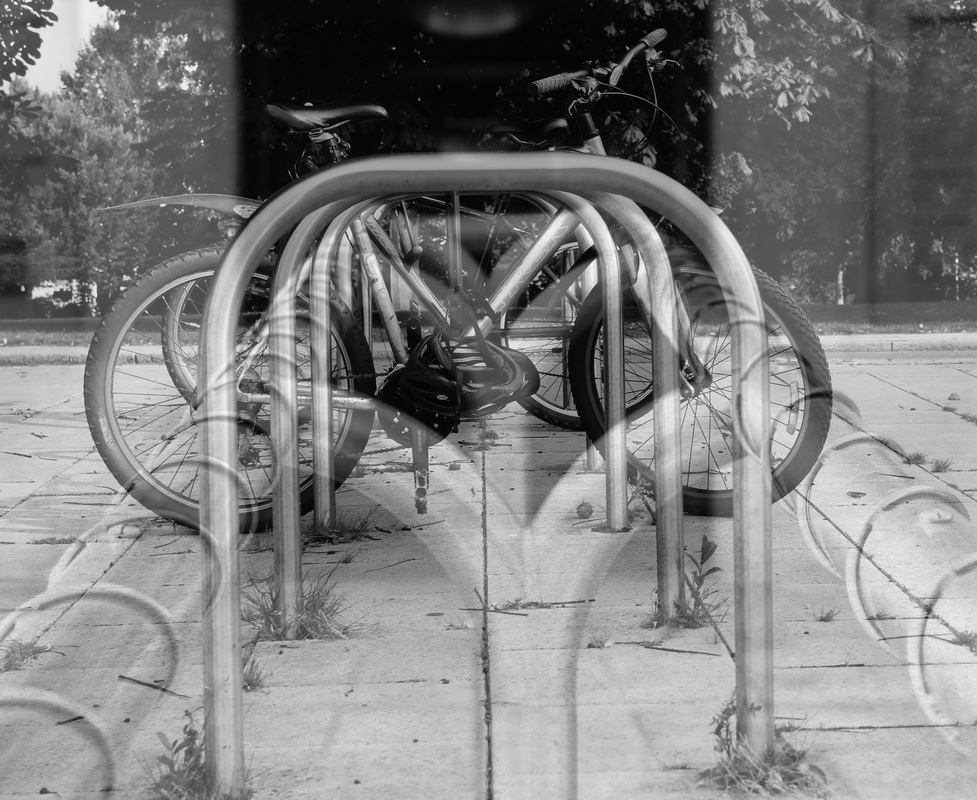
image five.
This is the first original image.
I then cropped the image down to get rid of any empty spaces.
|
This is the second original image.

To finalise the image increased the contrast of the image to make the lines even more defined.
|
Firstly I put the first image on top of the second, I then decreased the opacity to create the image above.
|
Next I changed the image to black and white.
|
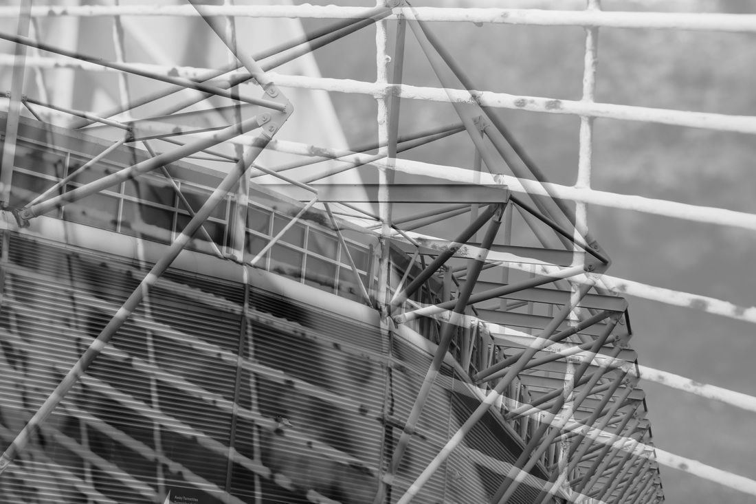
image six.
This is the first original image.
|
This is the second original image.
|
Firstly I layered the two images together. I then decreased the opacity on the second layer.
|
To finish this image off I adjusted the brightness and contrast to make certain lines stand out.
|
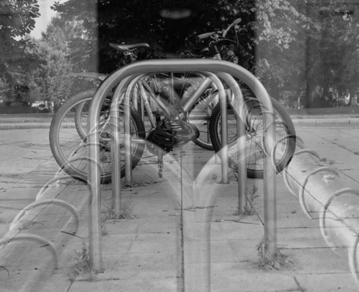
final six images.


final images.

|

|

|
Out of the final six images, I chose to use these three as my final piece because they are the strongest images. They all complement each other nicely with the high contrast and low brightness. All the images involve formal elements, mainly strong lines and shapes, this is what makes the images so strong.
project evaluation.
Throughout this project I have researched the photographers, Michael Wolff, Moly Nagy and Keld Helmer Peterson, through studying their work I have learnt the art of using specific angles when taking photographs, I have also learnt the importance of cropping, I have always been used to keeping all of the image in the edit but these photographers, especially Michael Wolff, have taught me that not all the image is needed, it is the focus of the image and the quality of the photo that is important. I mainly explored the theme of 'Abstract Buildings' throughout this project. To begin with I thought that this theme would be very difficult to make a nice project out of however the more in detail I got into this project I realised that there is so much involved in the theme. There is so much you can do with this theme, I didn't realise how open it actually is at first.
Throughout the theme I used many different techniques on photo shop to create many different images. One of the first techniques I used was when I took a simple image, flipped it 180 degrees and decreased the opacity of the top layer to create a simple yet interesting image, I enjoyed that technique because it created a nice image that wasn't too complex to create or look at, it had the image focus.
I think that my final three images worked the best because they all complement each other nicely. Throughout the whole urban course I found that taking images that fit the certain topics quite challenging. At the start of this project I didn't really have an idea of how it would end up. Now its finished I am pleased with the out come.
